Aduro Products - Auto Basics Branding
Art Direction | Brand Development | Graphic Design | Packaging | Photography
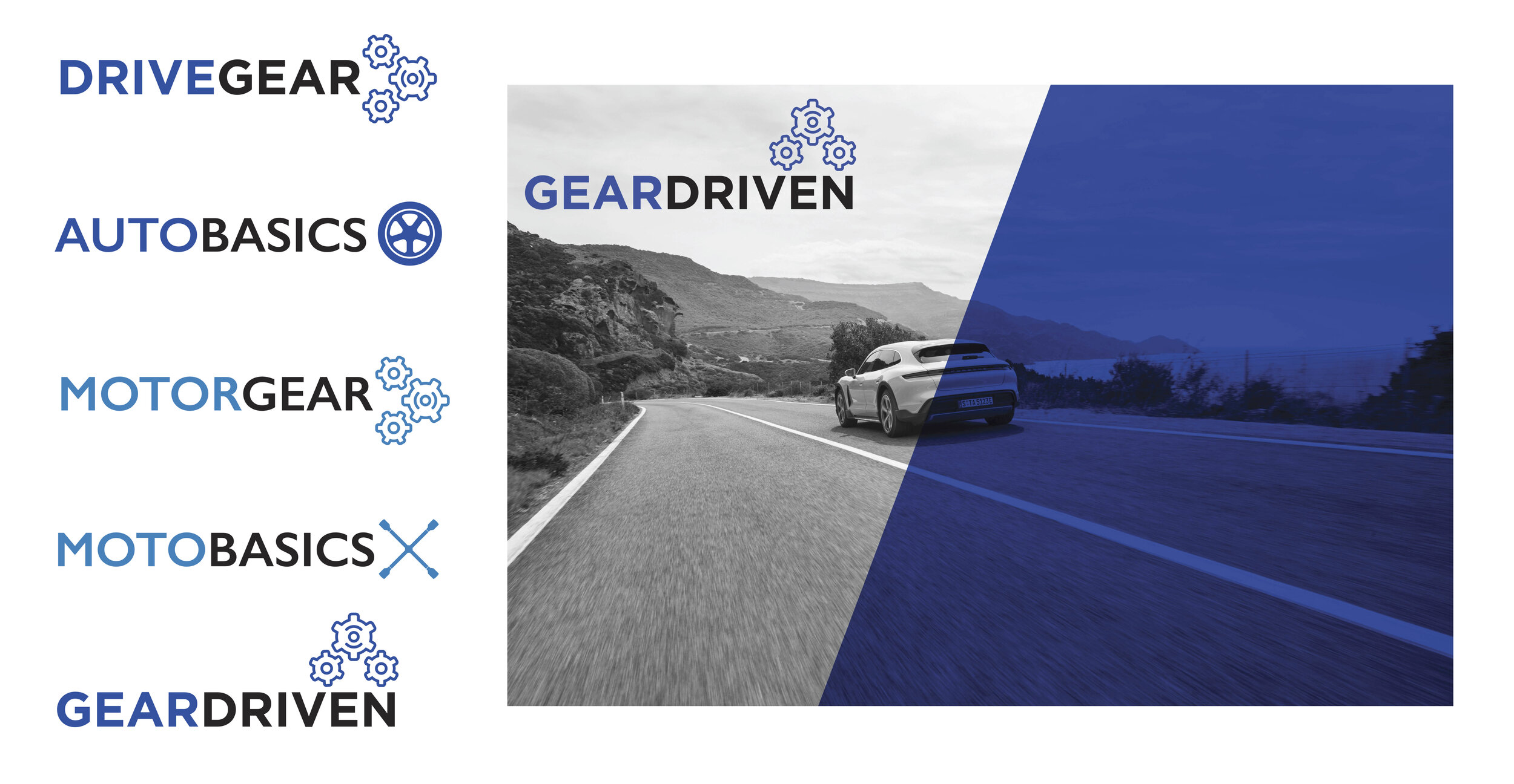
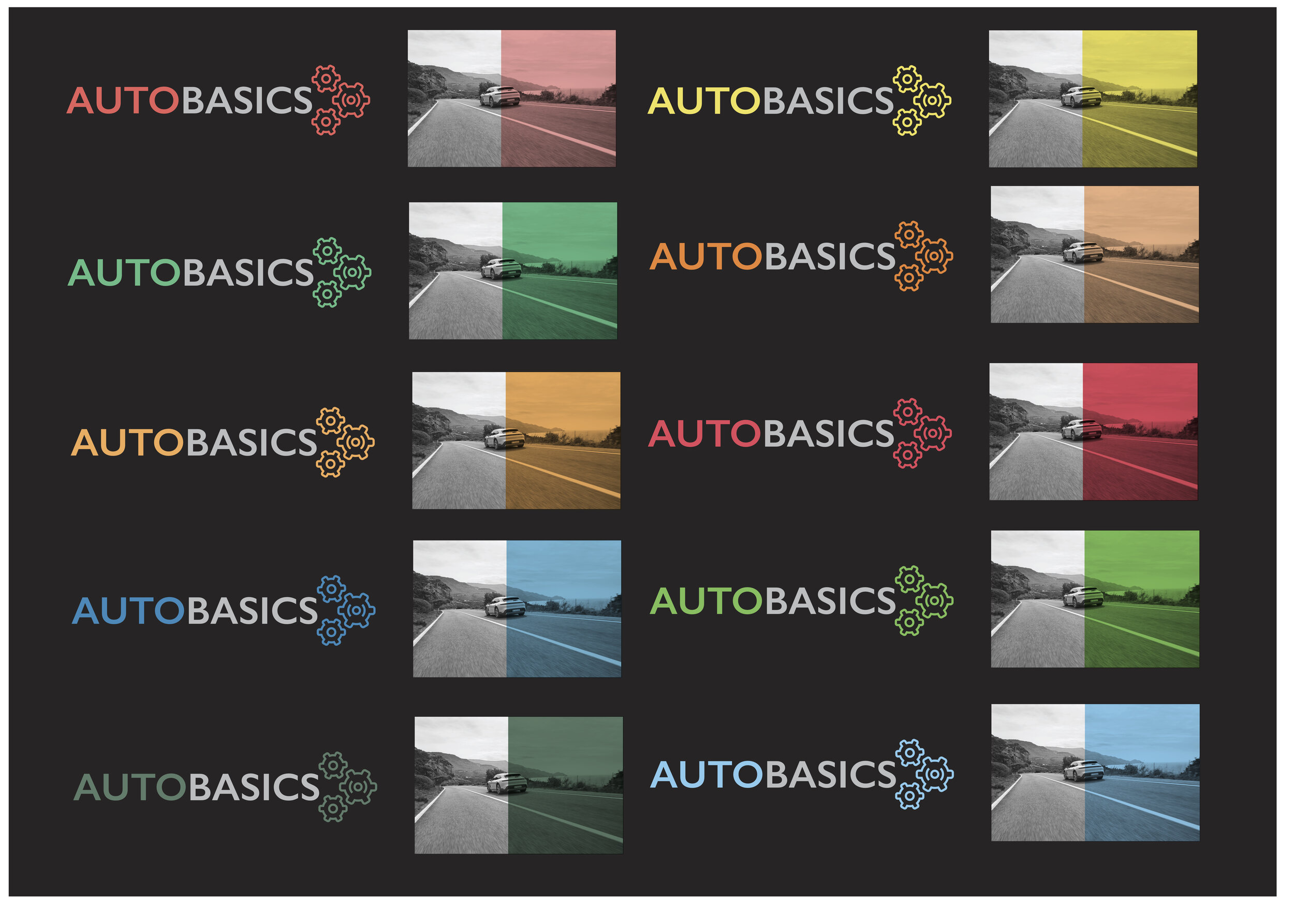
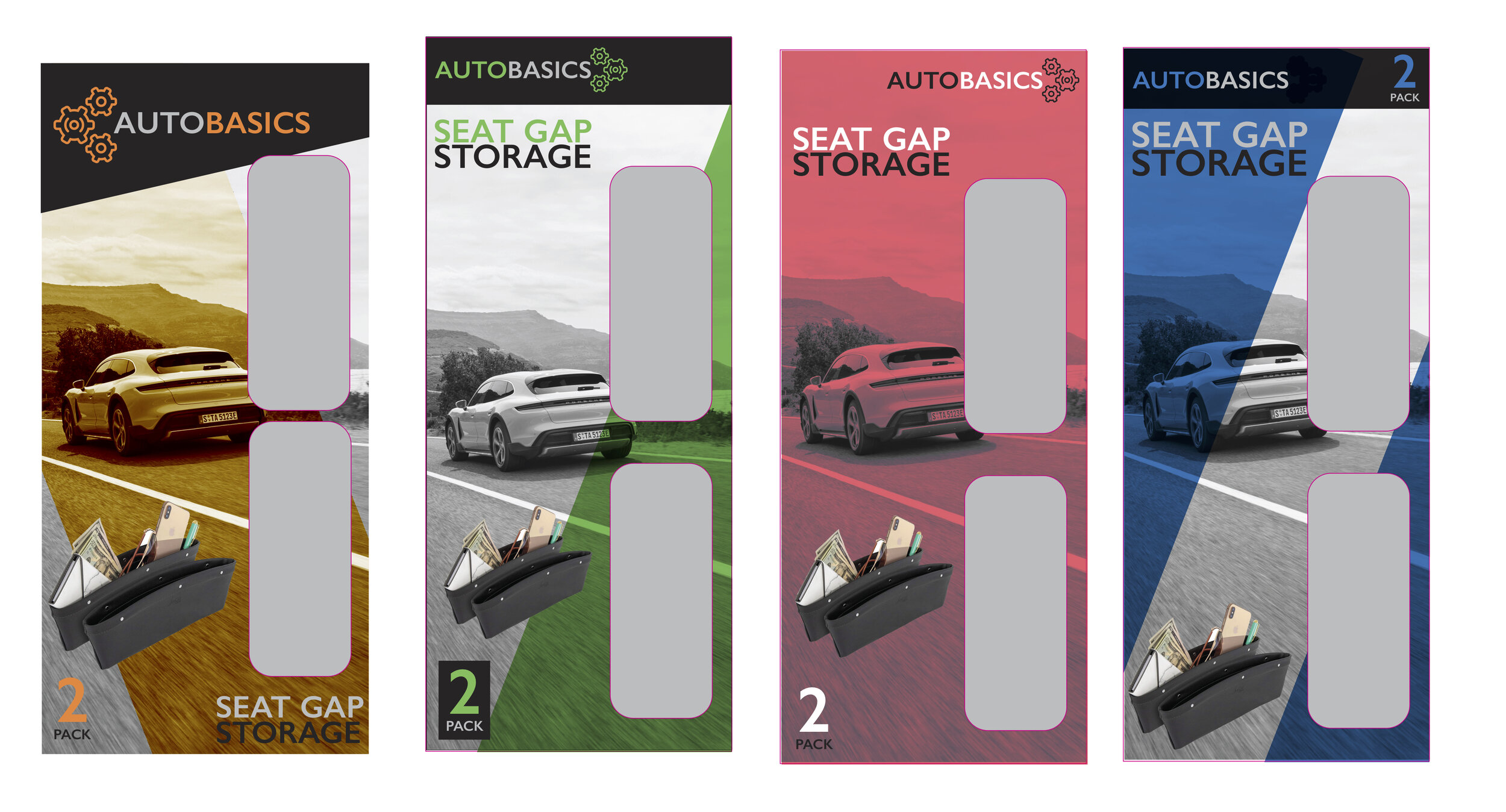
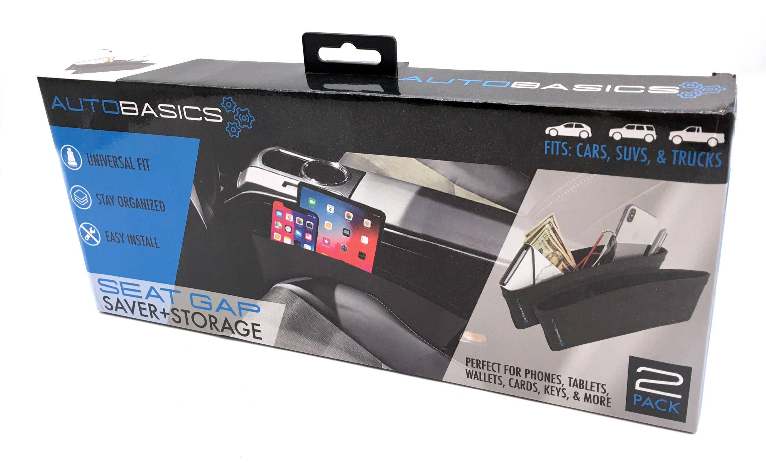
Aduro Products then moved into the auto accessories product category, an overcrowded category, but one not deeply explored with our retail partners. We wanted a universally understood name, but with a classy and unique packaging look that would stand out. Through the adoption of bold color and a system of diagonals, this goal was eventually achieved.
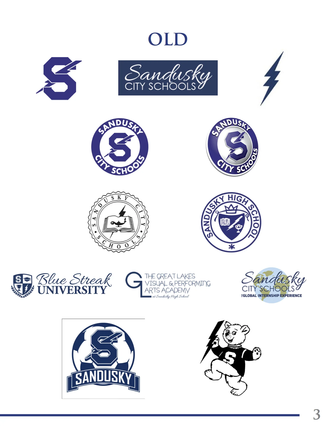
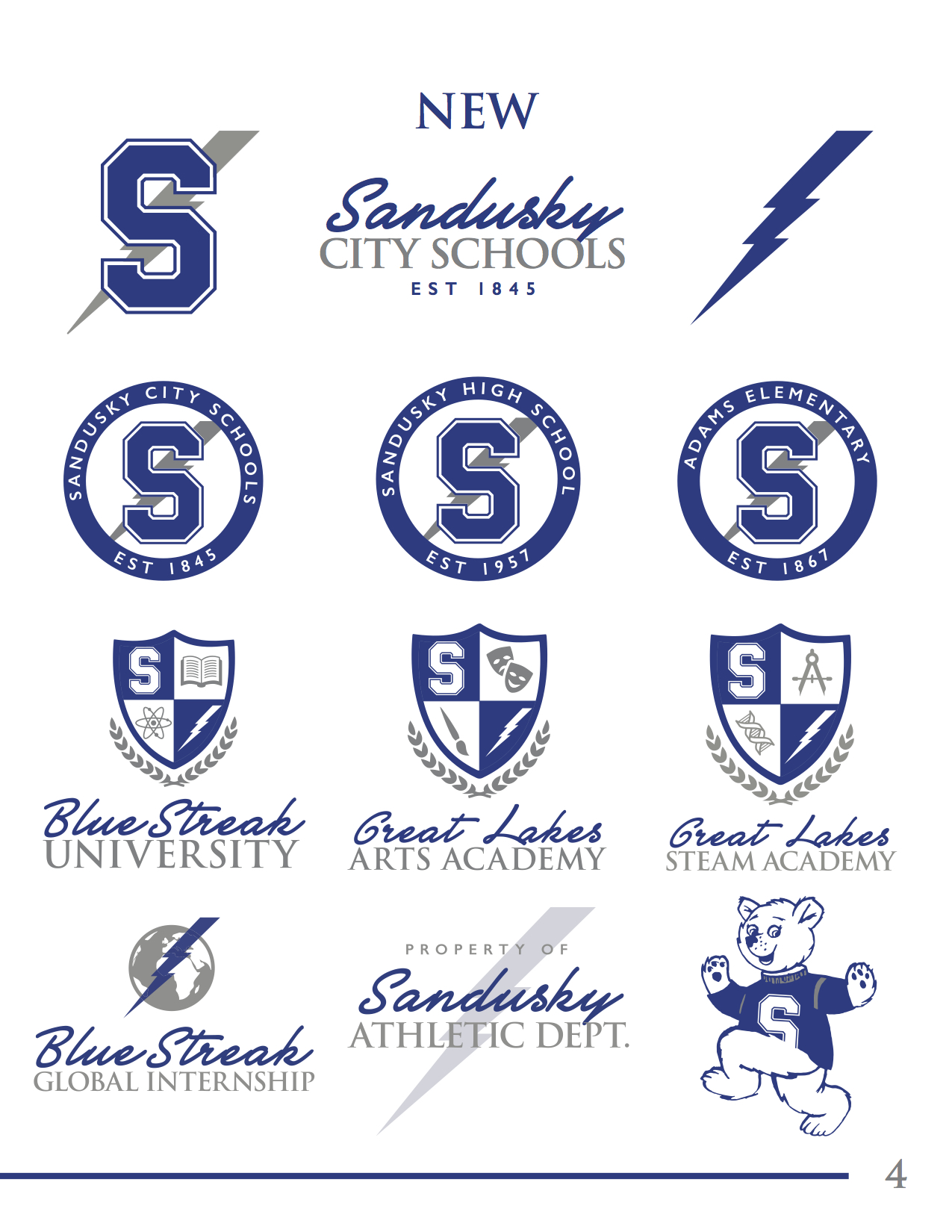
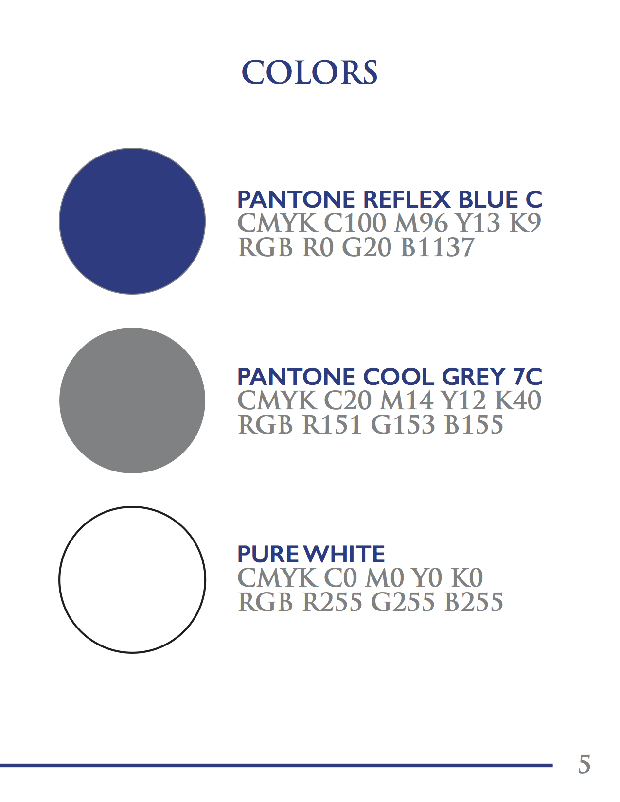
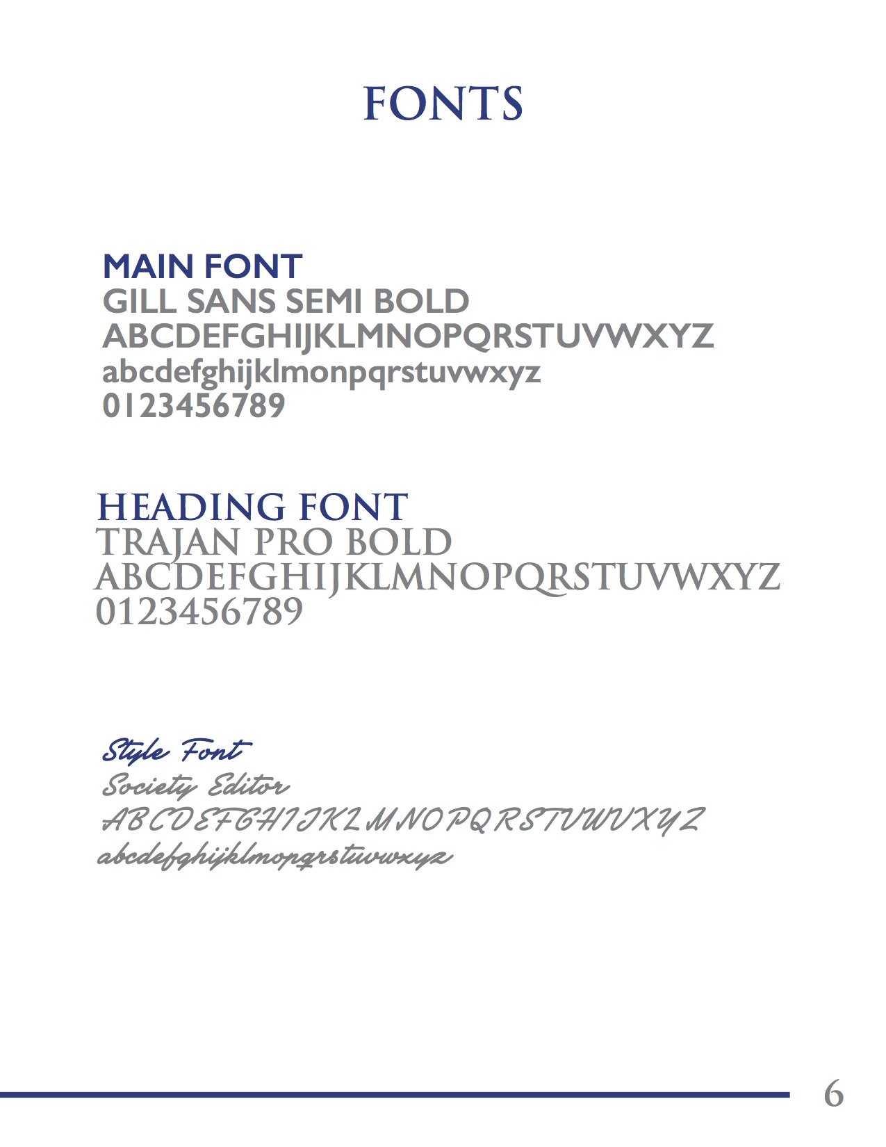
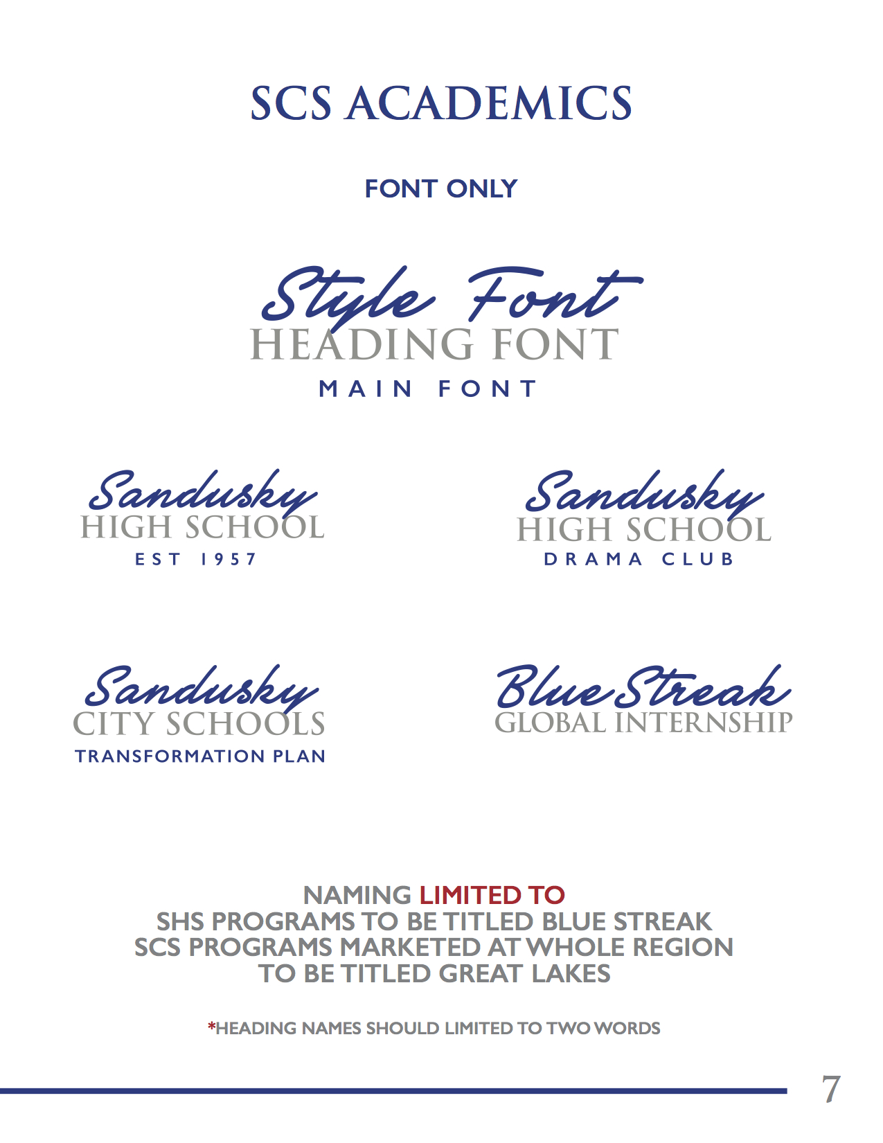

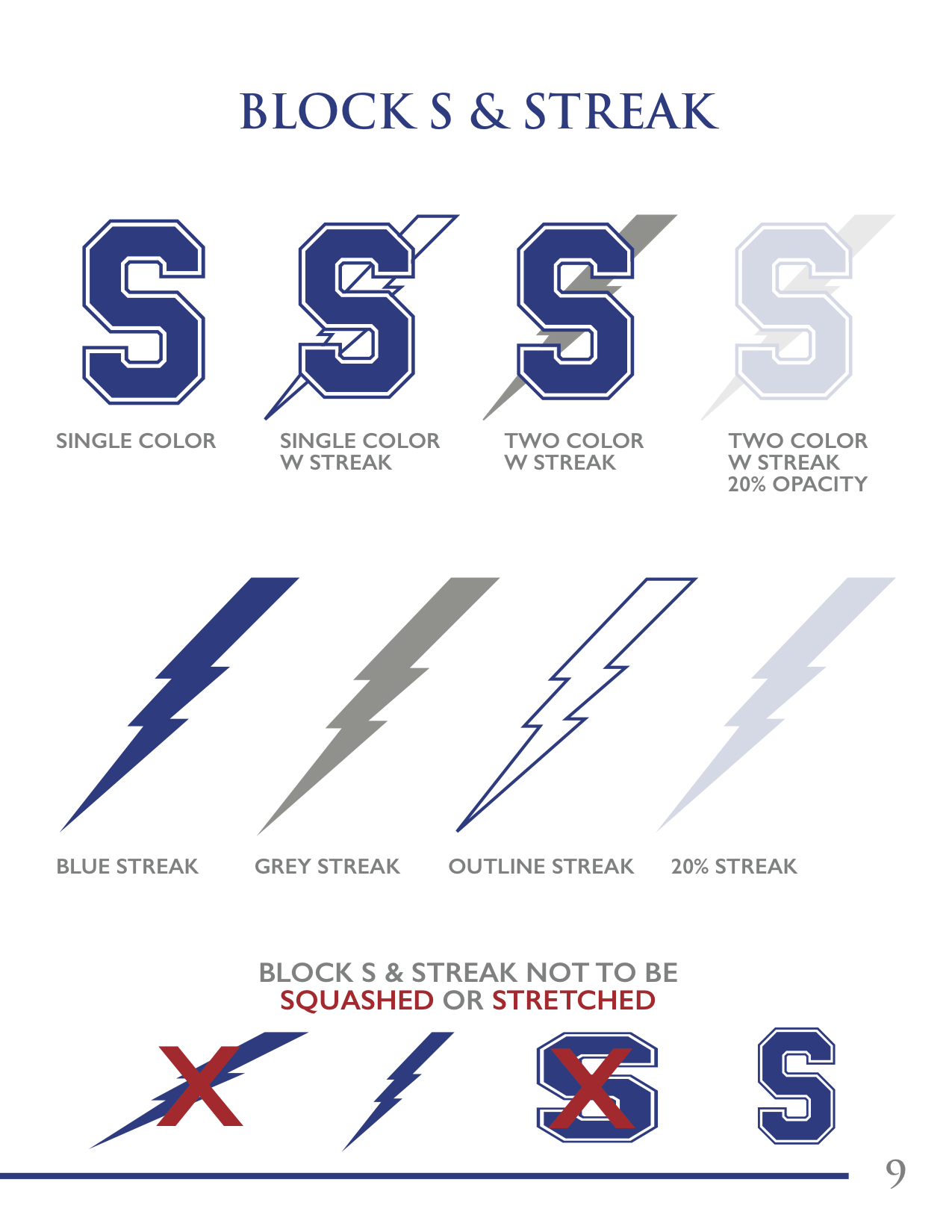
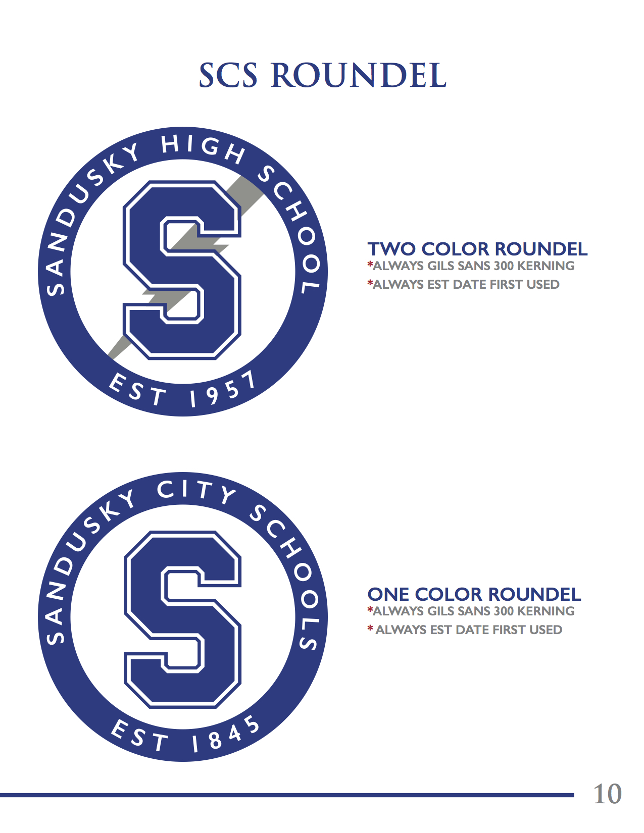
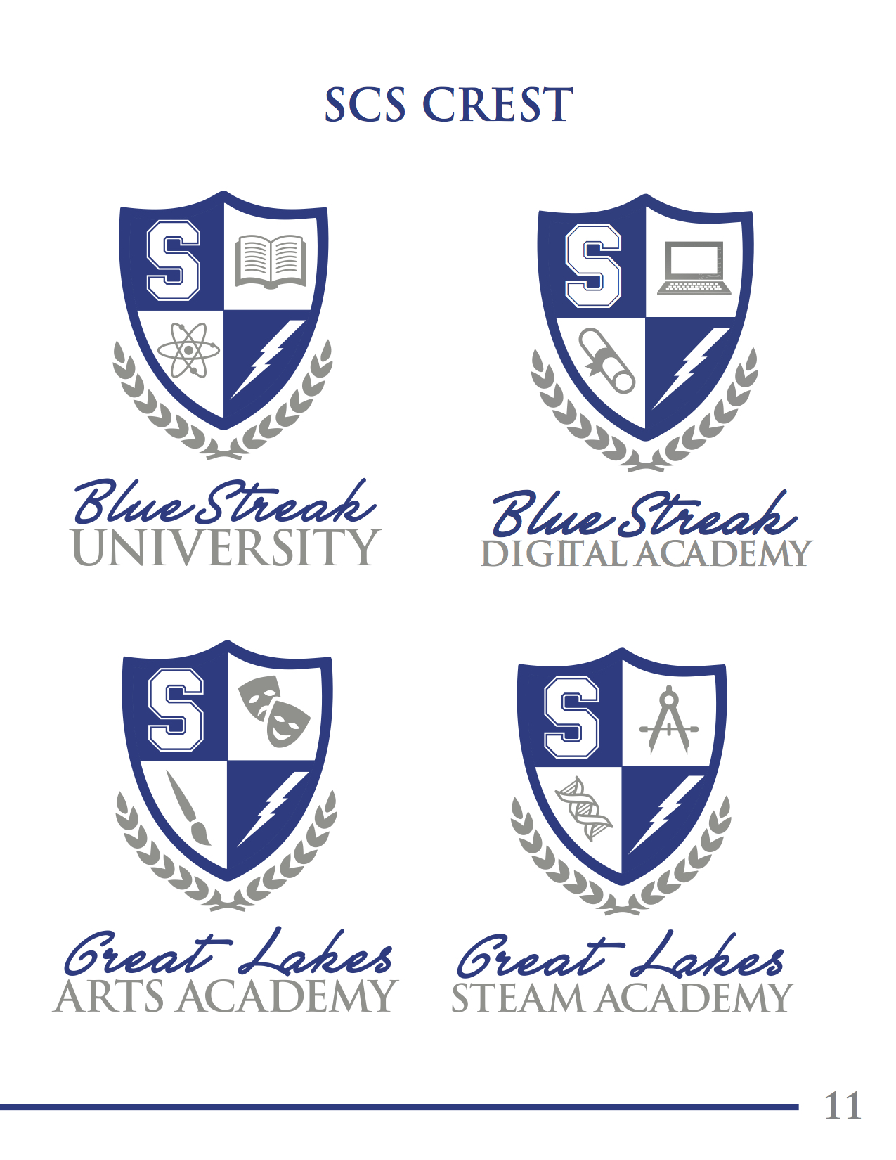
Sandusky City Schools
Art Direction | Brand Development | Graphic Design | Standards
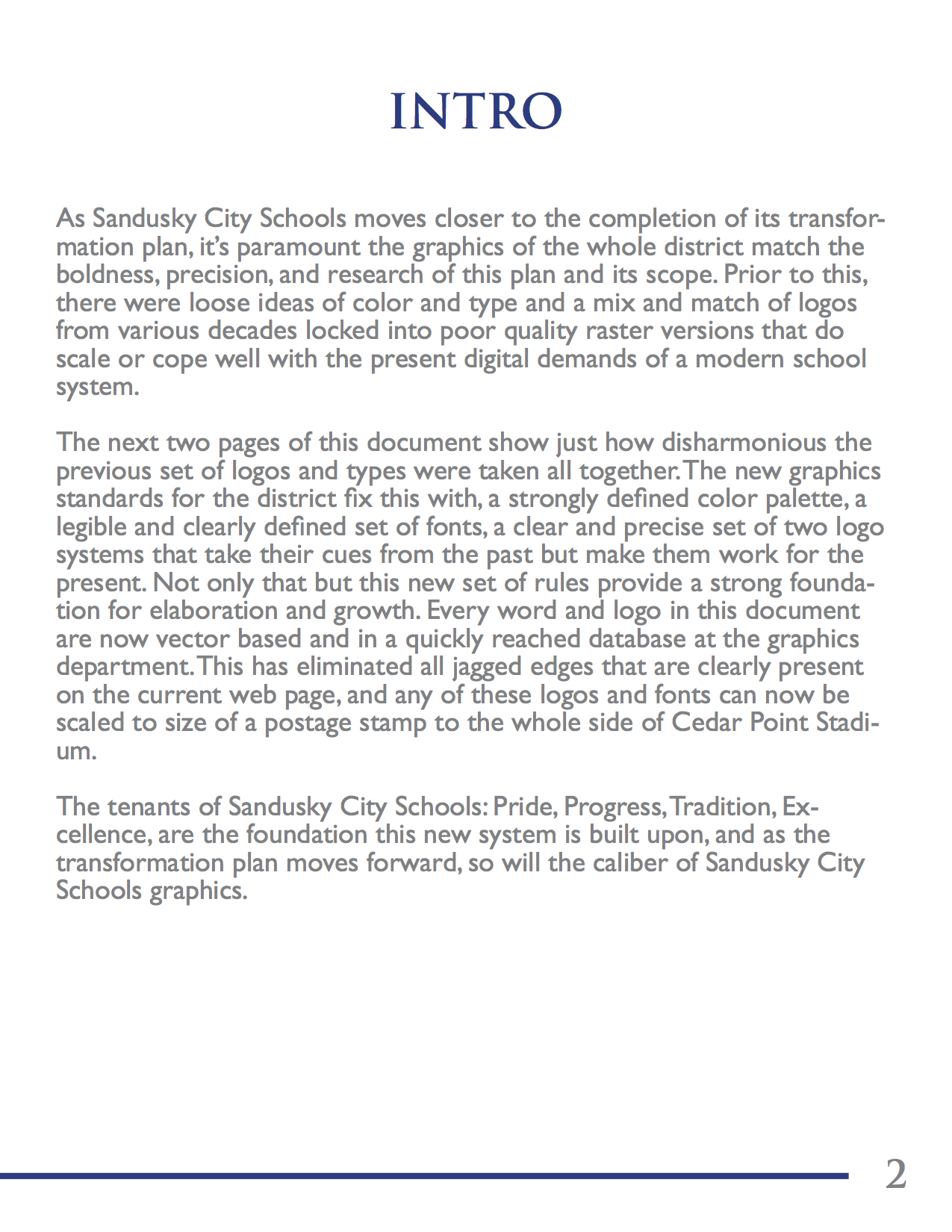
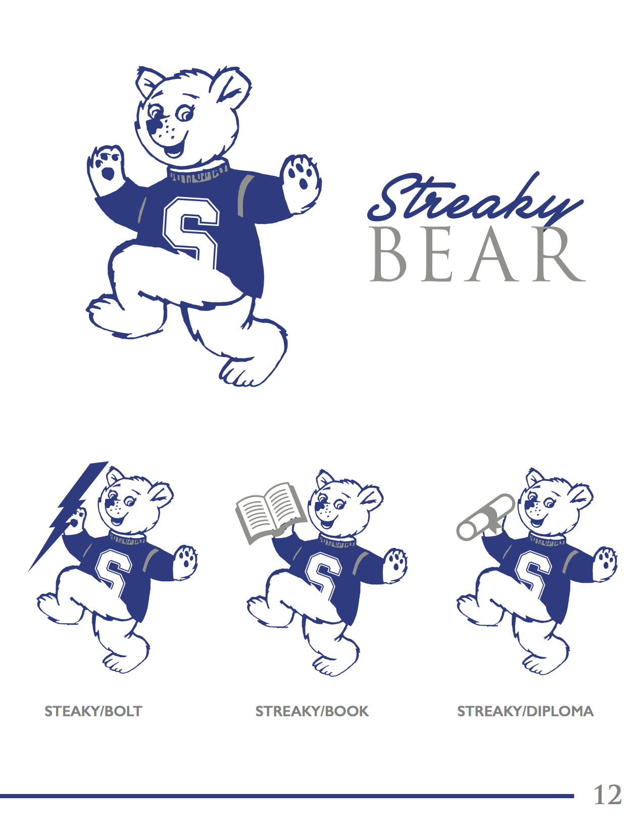
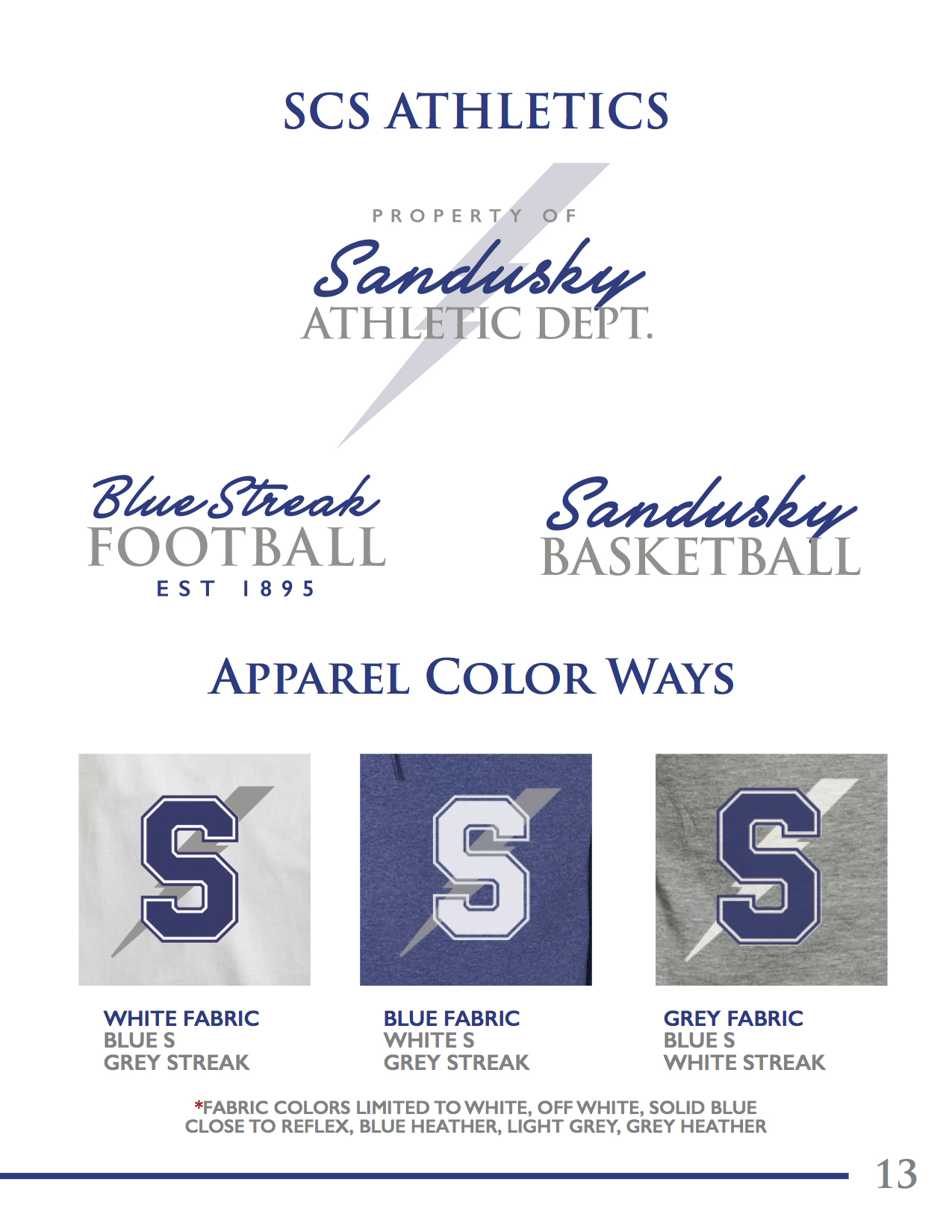
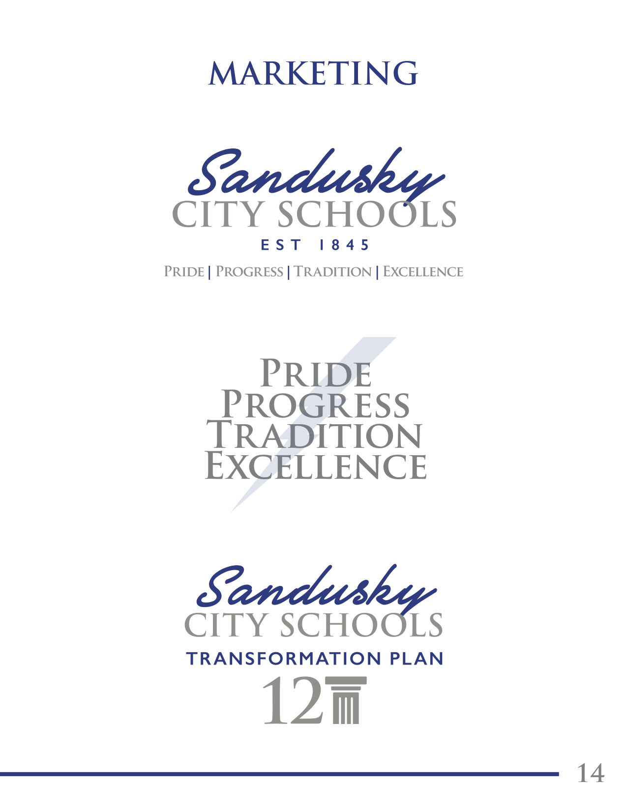
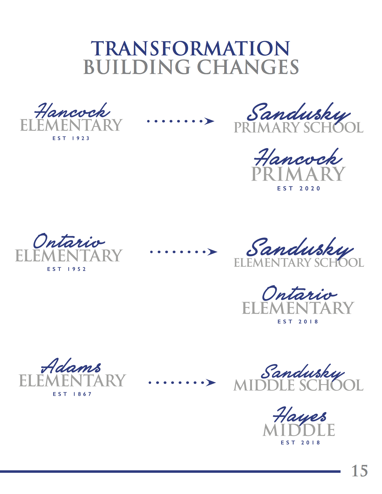
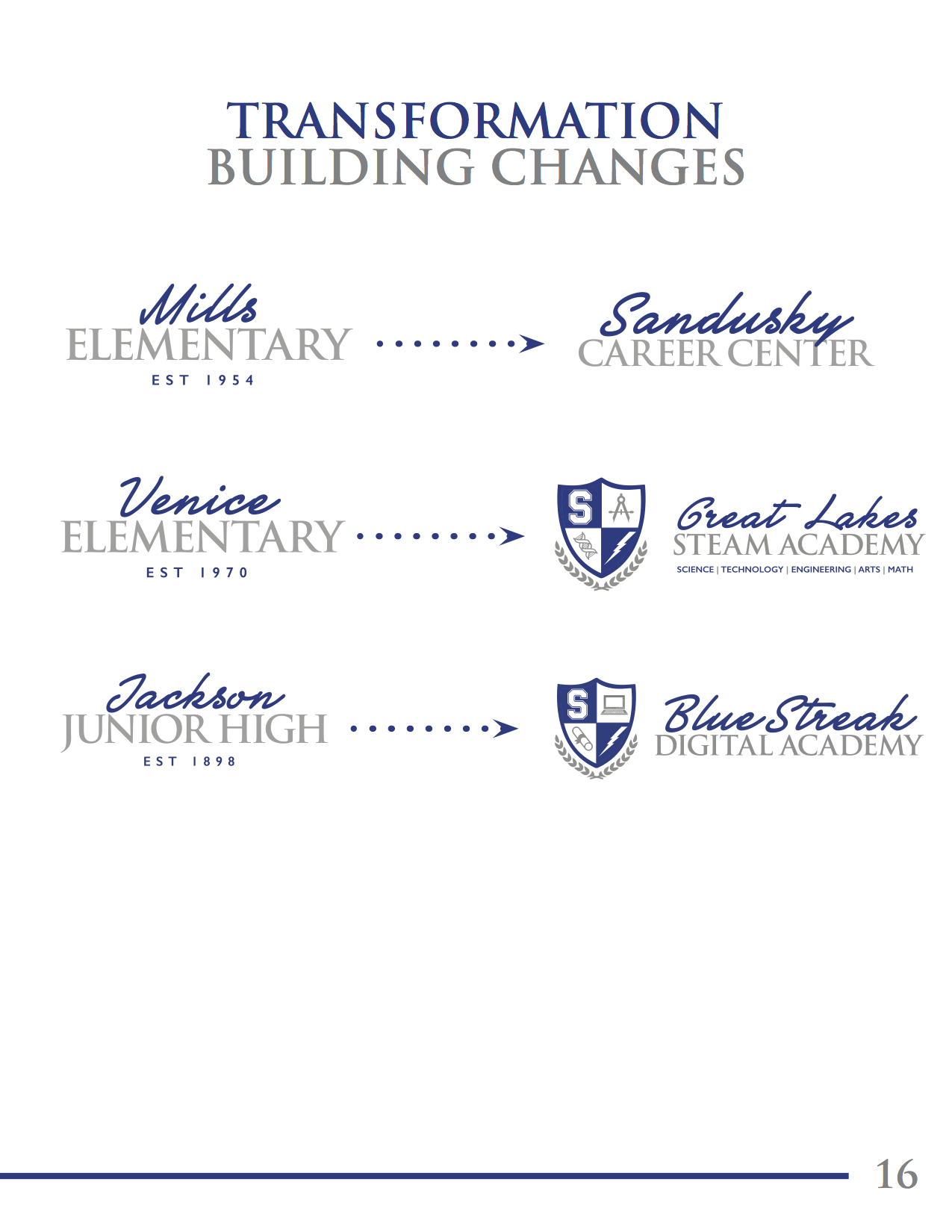
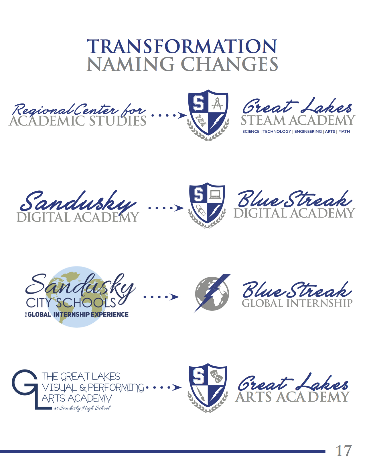
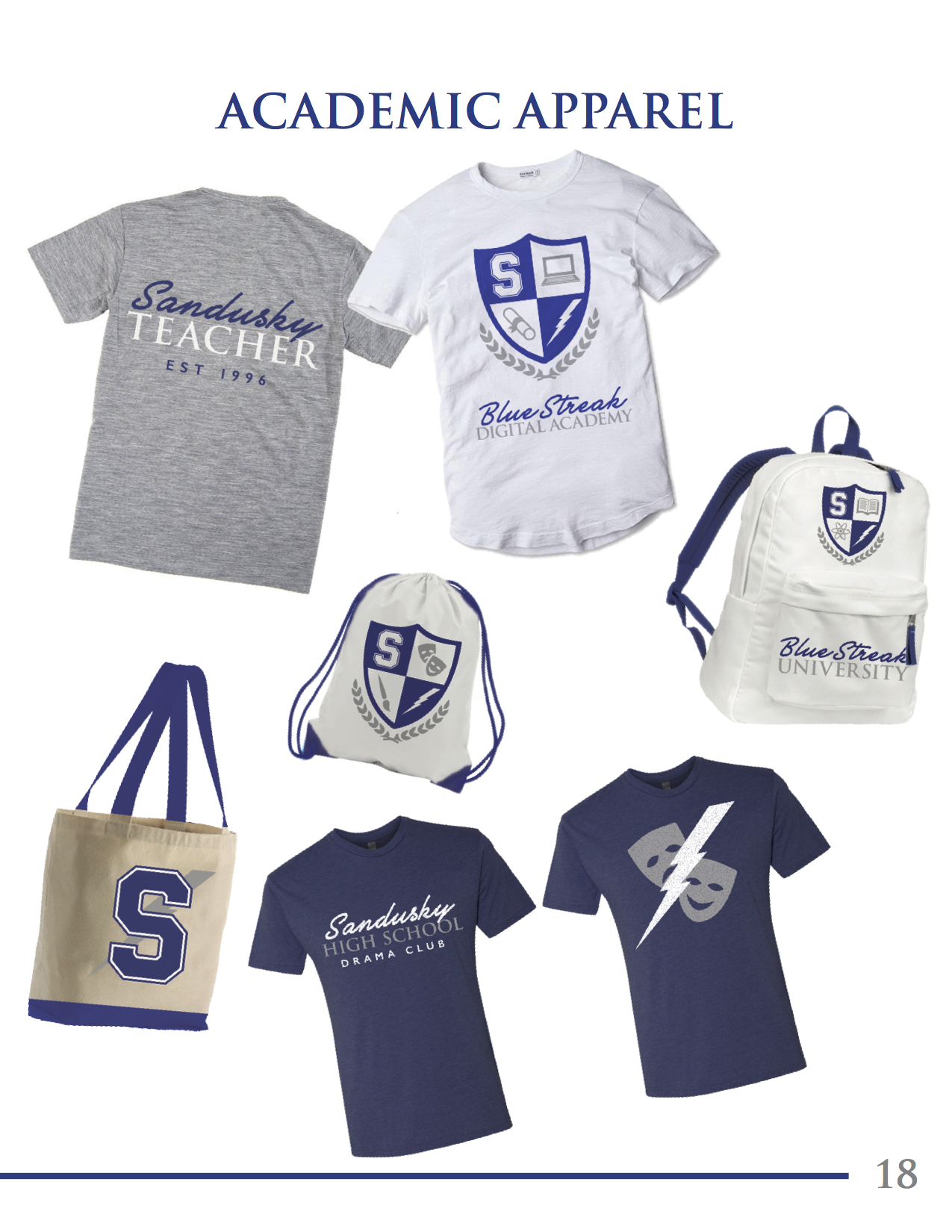
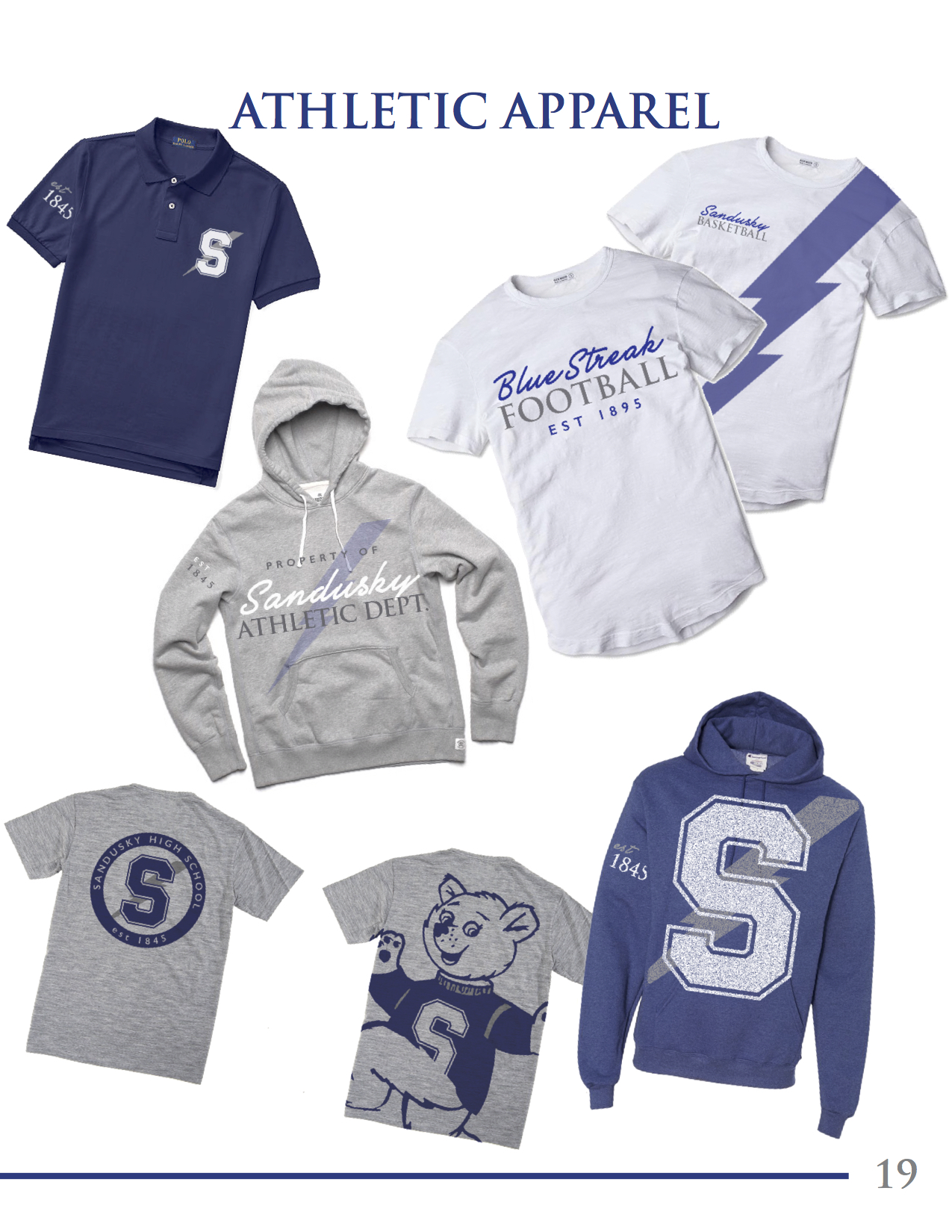
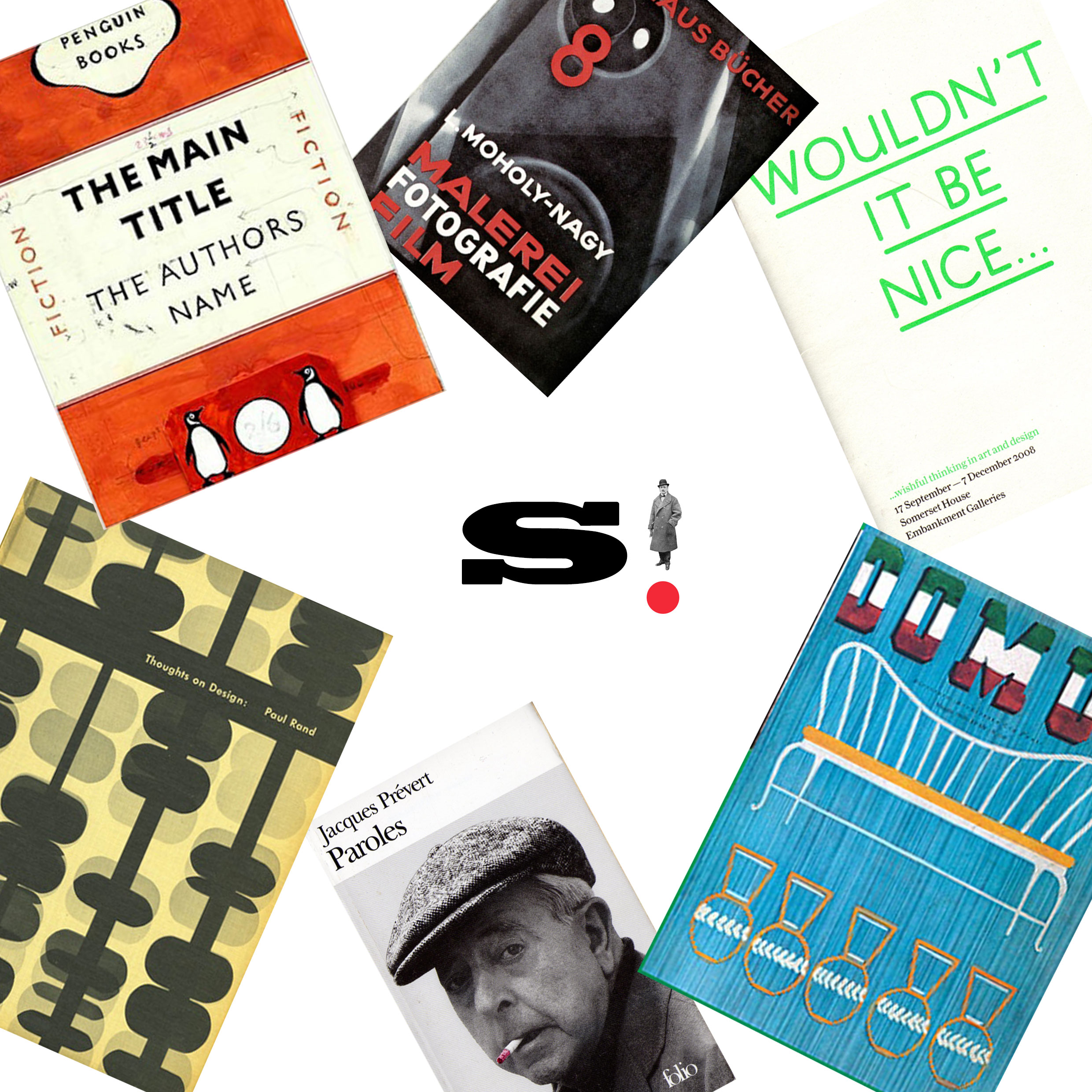
Sandusky City School where I went to High School had a mess of hand drawn logos from various decades that did not lend themselves to quick and clean reproduction in the digital age. On top of this there was a loosely defined color palette and no set fonts for the district, or how to implement them. Some 3D logos and bad clip art versions had also snuck in. In creating the style guide we first set out to create a backbone, the Block S and Blue Streak. In moving to a single bolder and easily reproduced Block S we firmed up the strength and tradition of the school. In moving the Blue Streak to vector we found the largest possible version of the old one and went from there. Then we streamlined the academic side of logos by settling on two systems, the roundel which has existed in various versions for a long time, and crest for the special programs, with vector icons to match. Along with a comphrehensive set of Do's and Dont's the style guide also aim to bring the apparel of the district in line and bring a clear and focused looked for Schools and they move forward with its transformation plan.
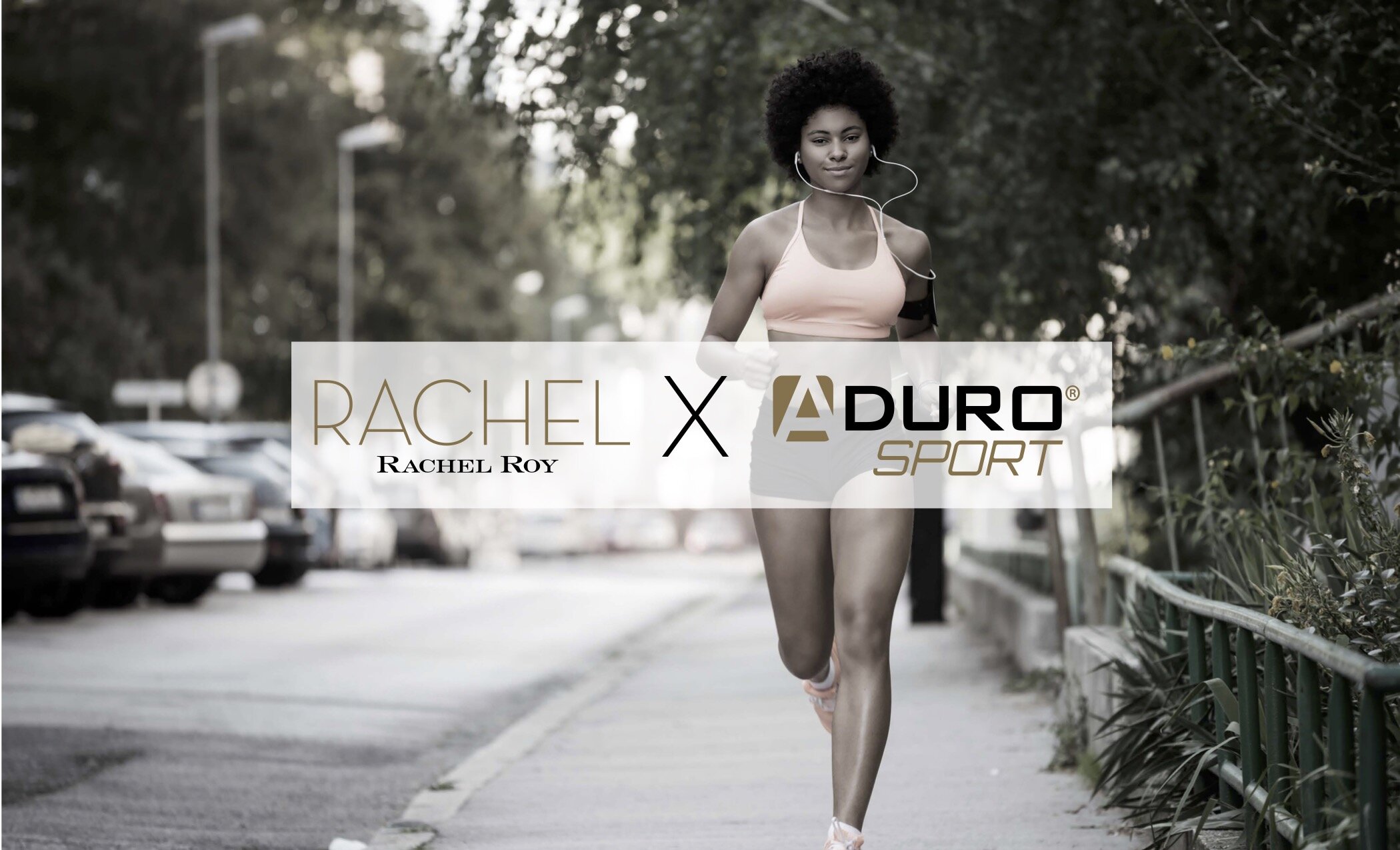
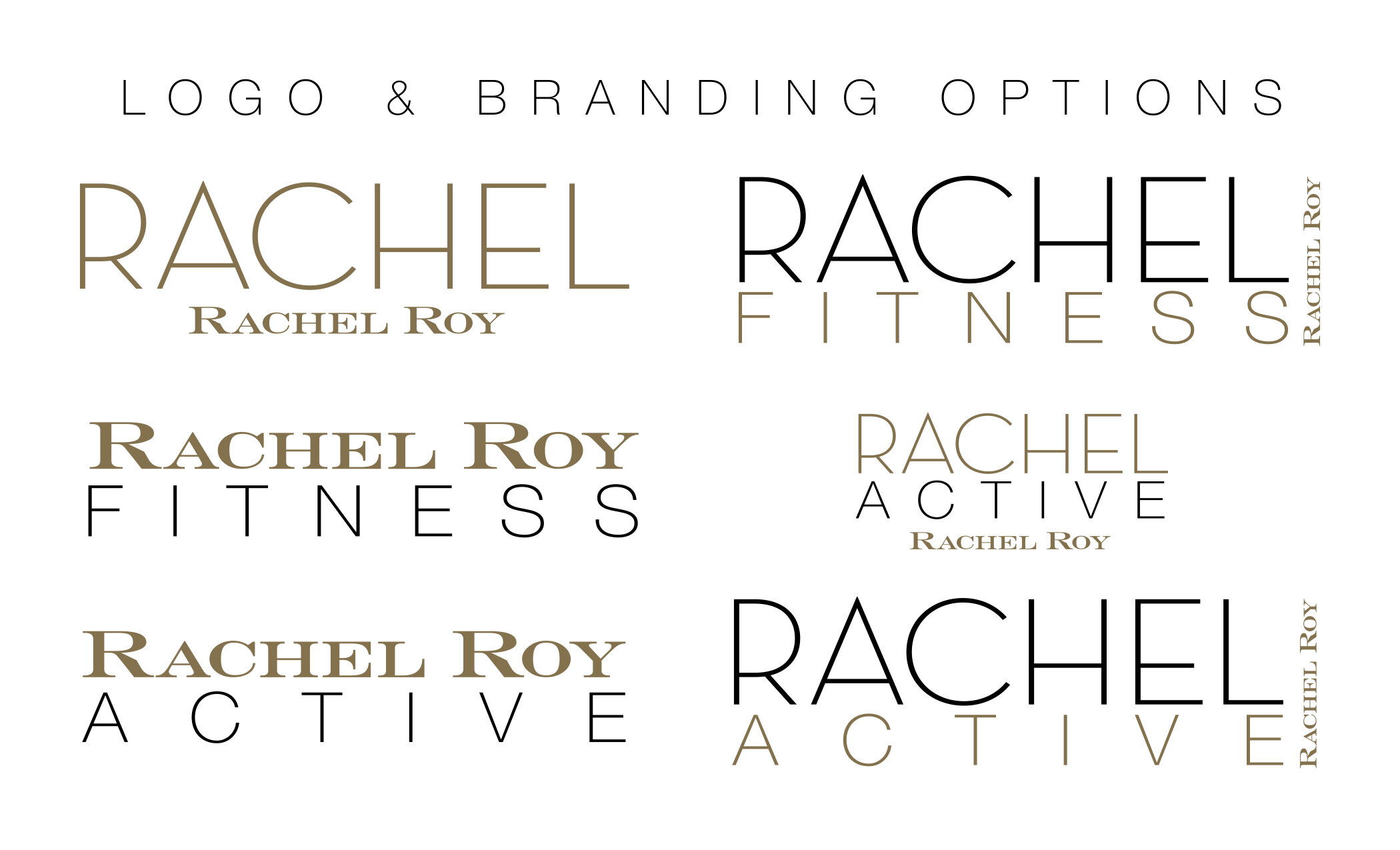
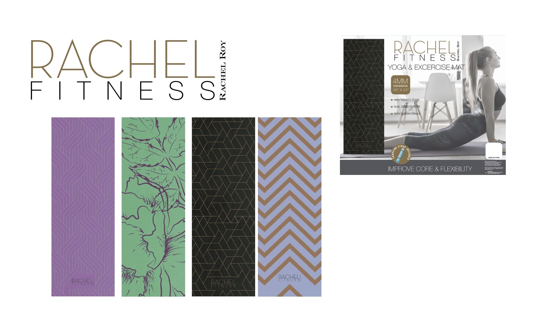
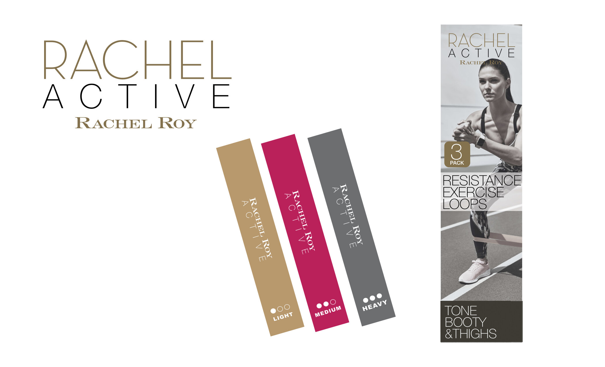
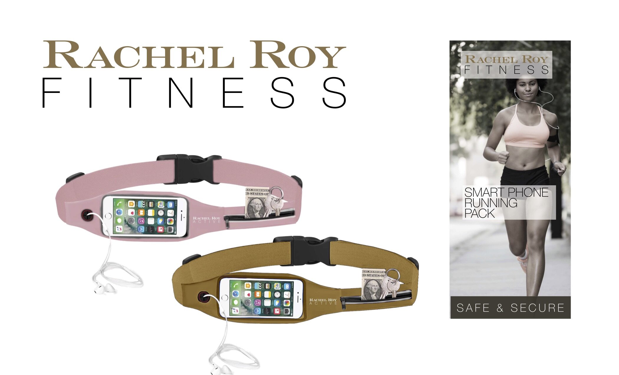
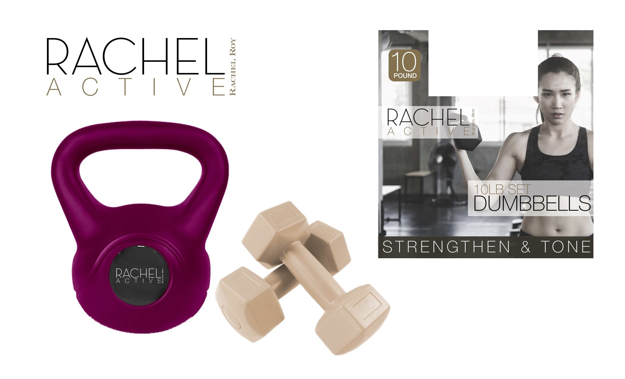
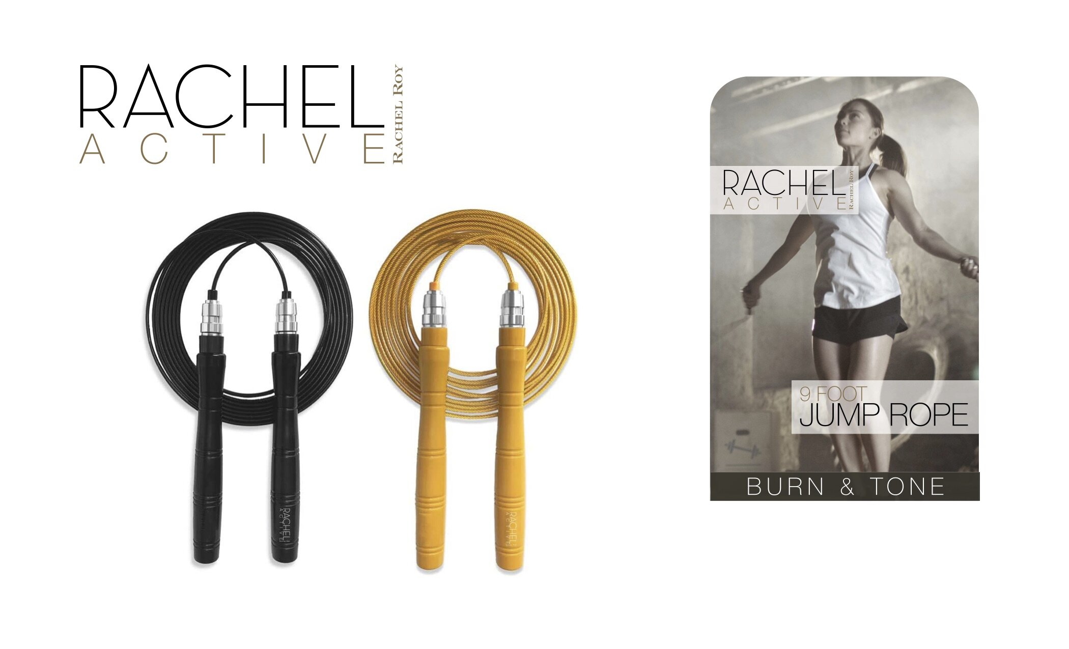
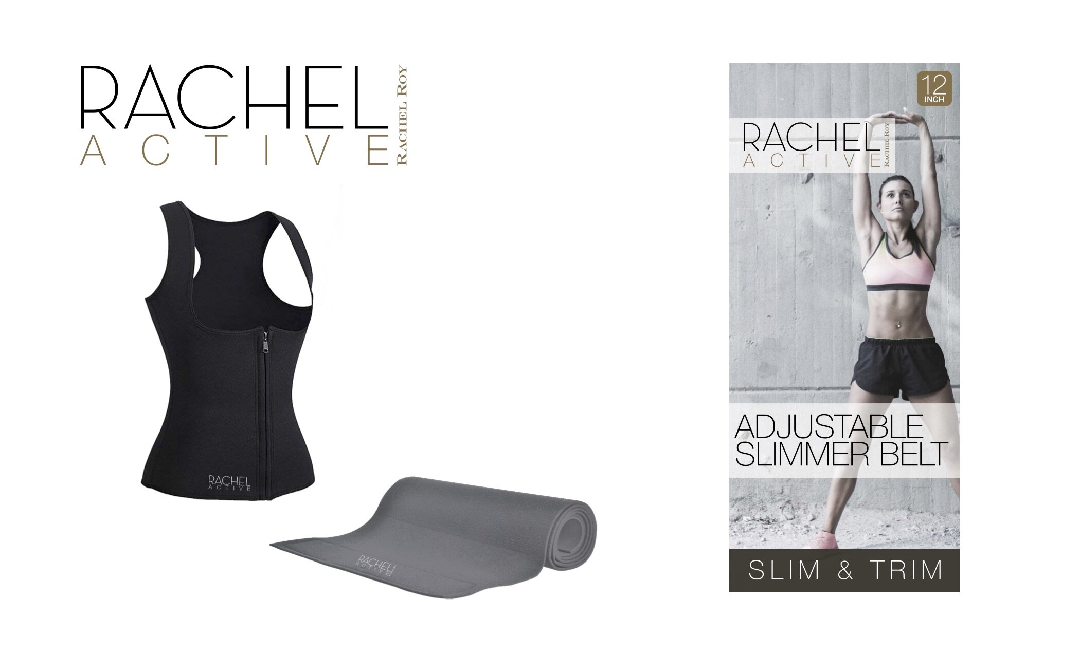
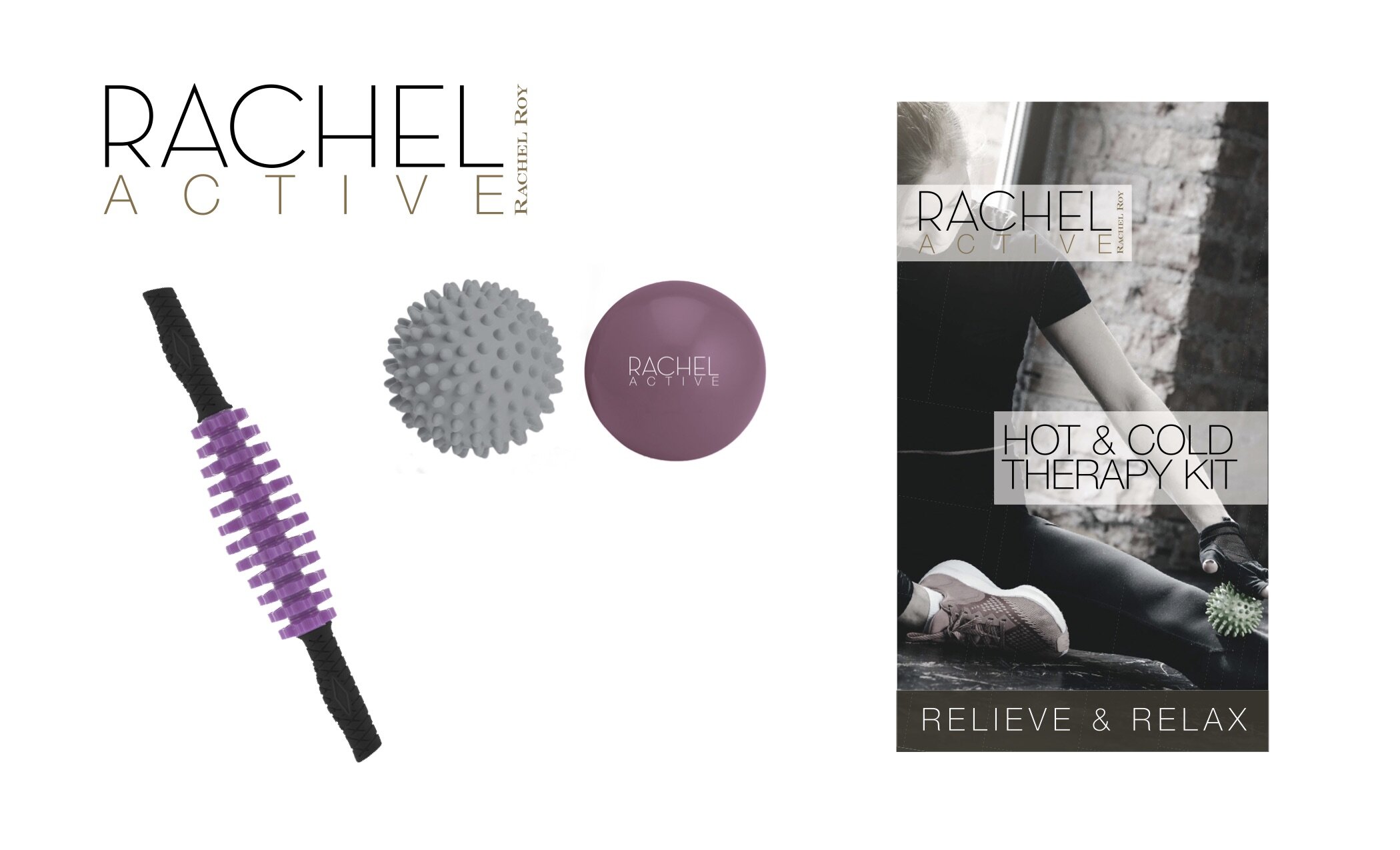
Rachel Roy
Art Direction | Brand Development | Graphic Design | Licensing | Packaging | Photography
Licensing requires the designer to be in the middle, between the retailer and the licensor. With Nicole Miller already a success we decided, to further expand our portfolio and add Rachel Roy to the mix, placing the packaging and tones of the product in black and gold, with jewel-tone highlights to provide a classier approach to the fitness category.

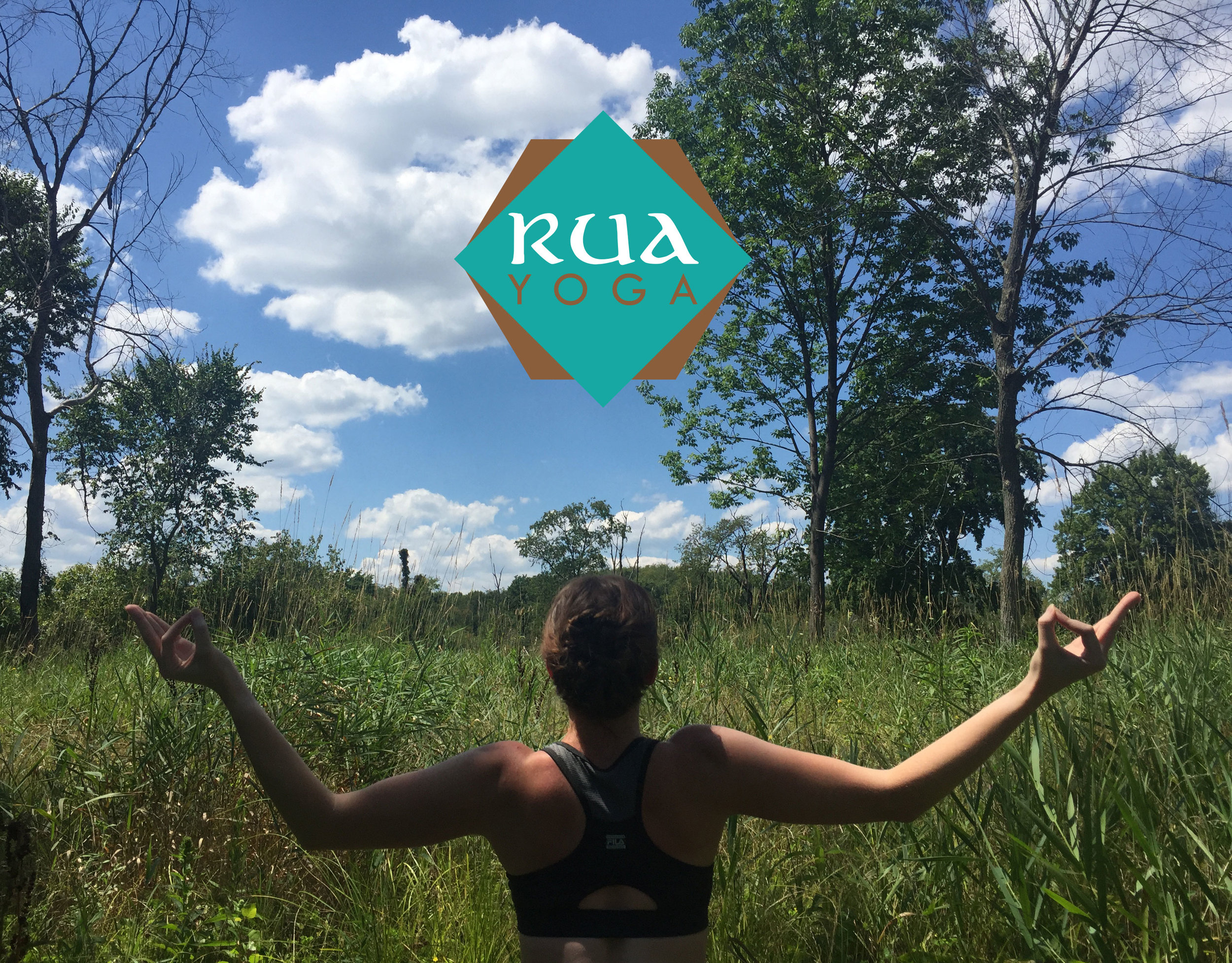
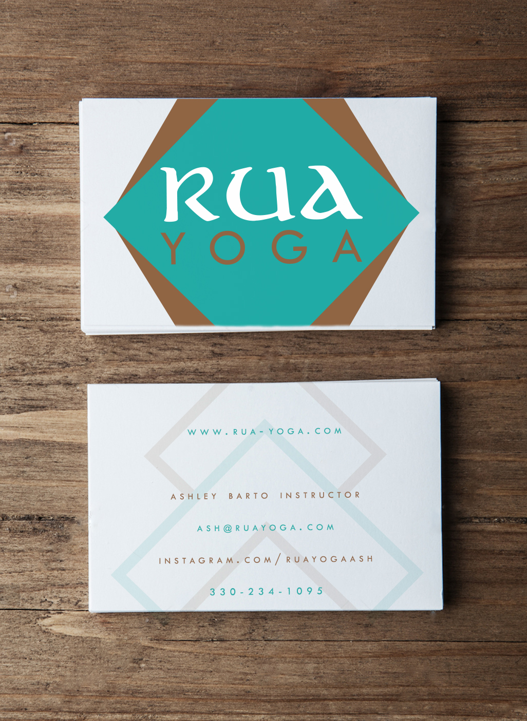
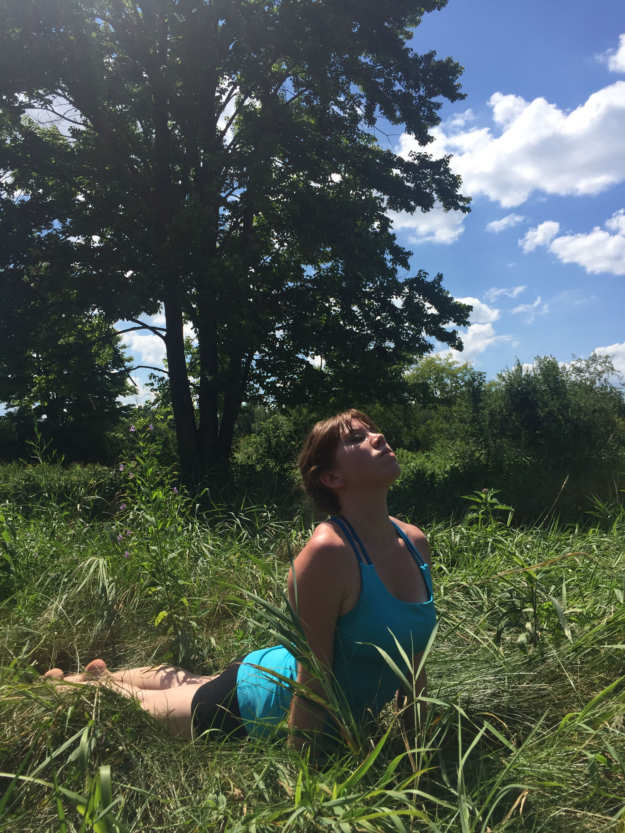
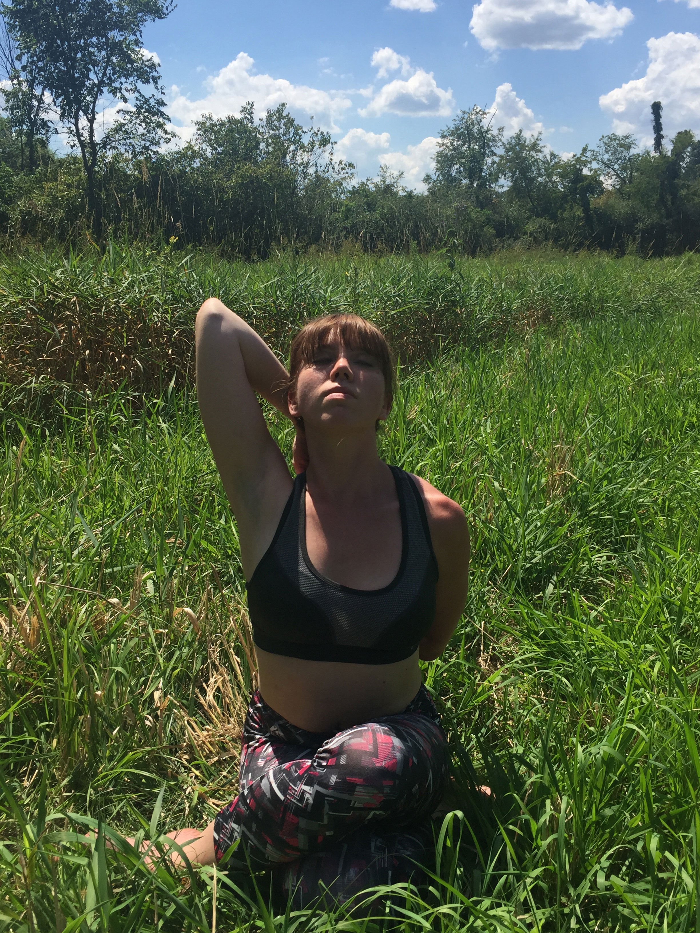
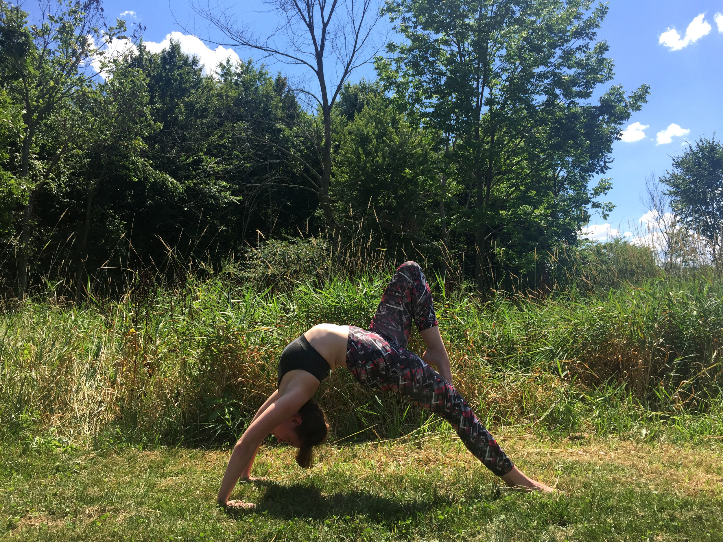
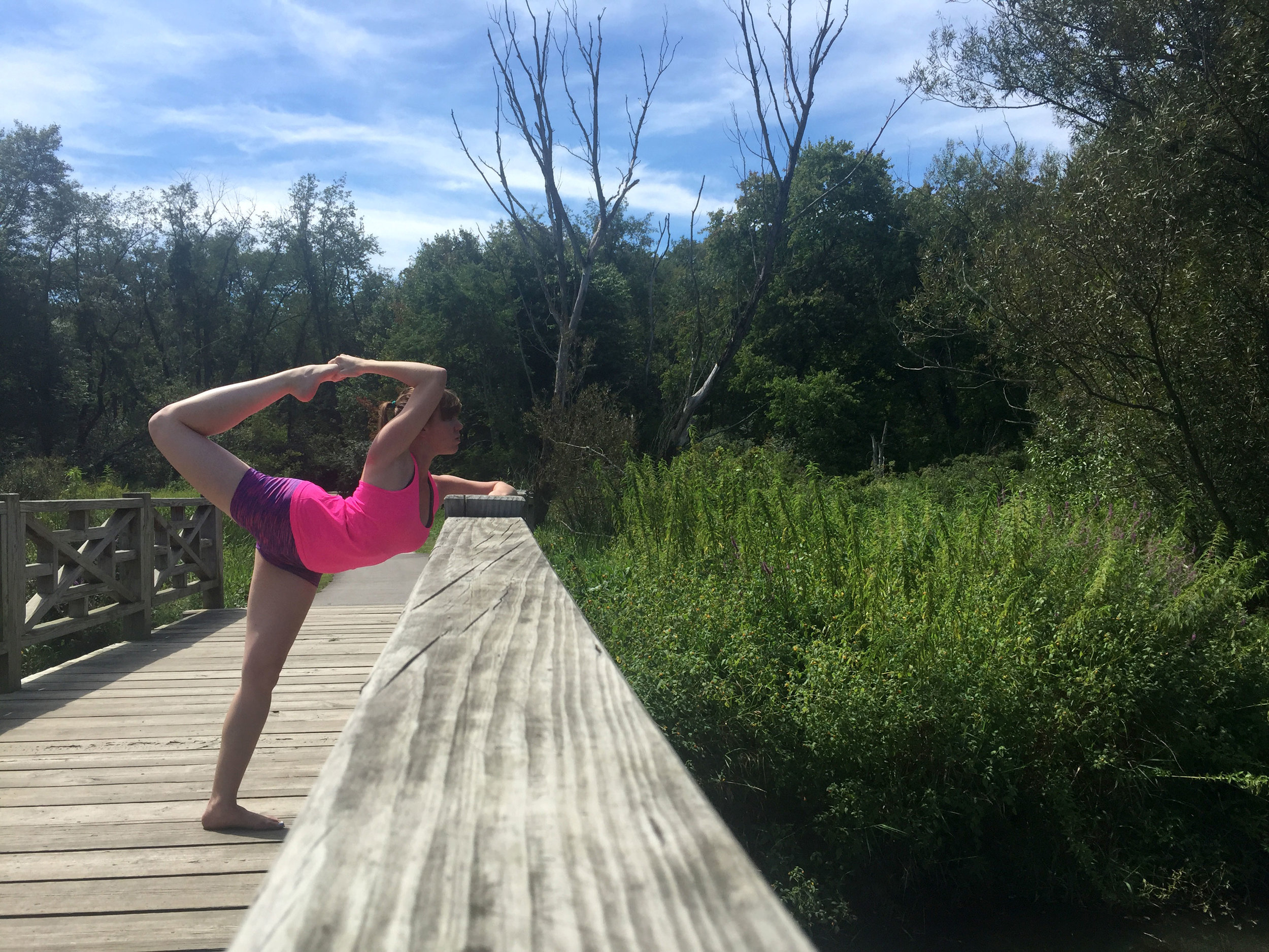
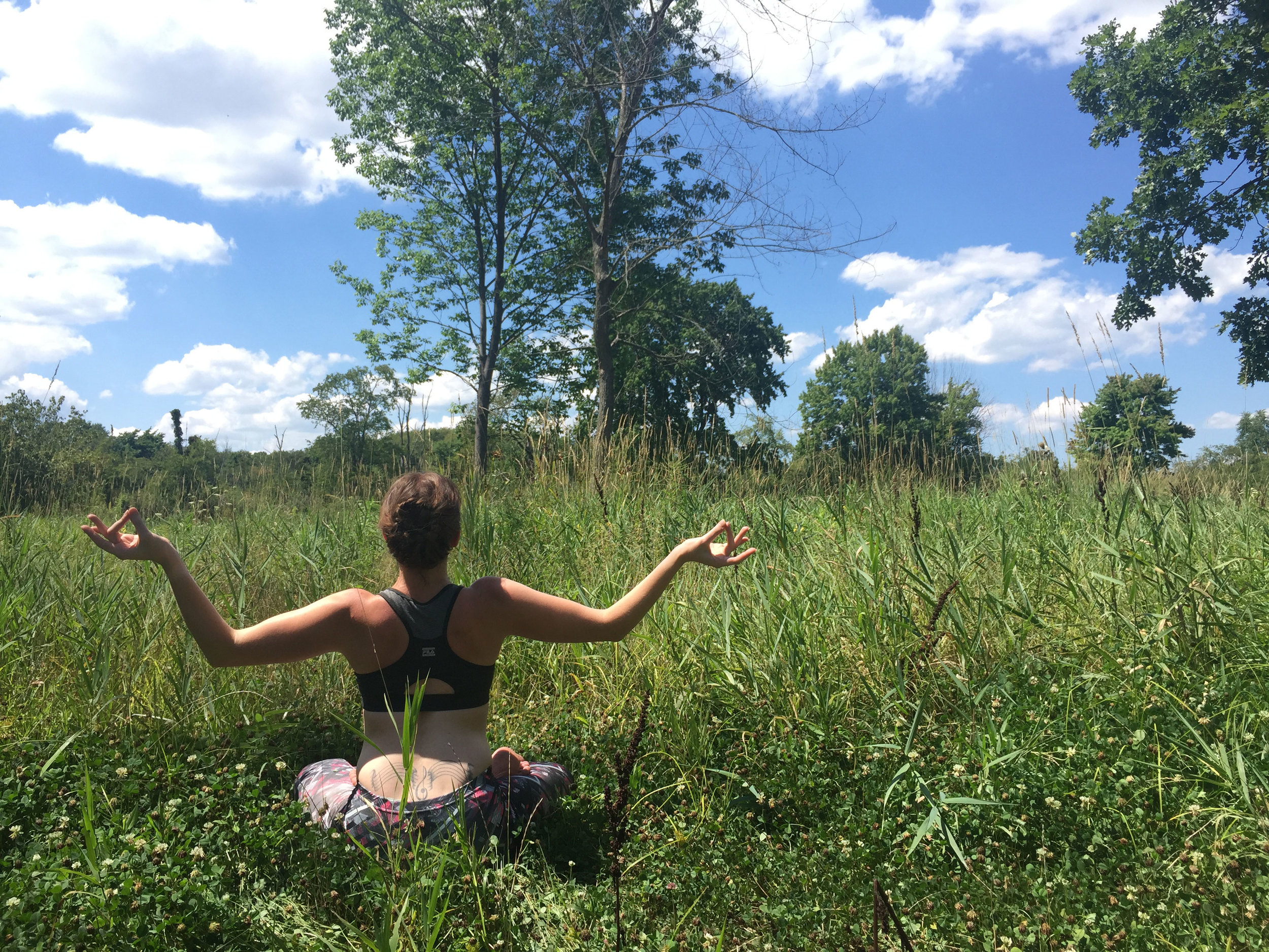
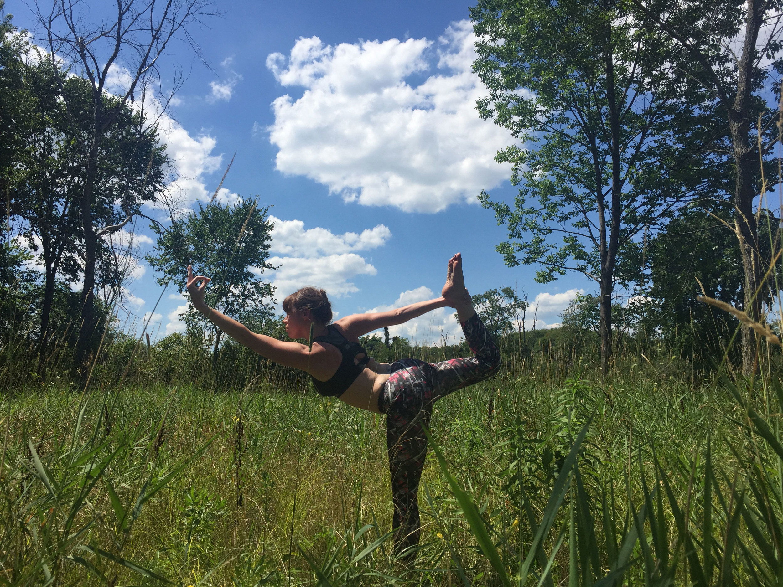
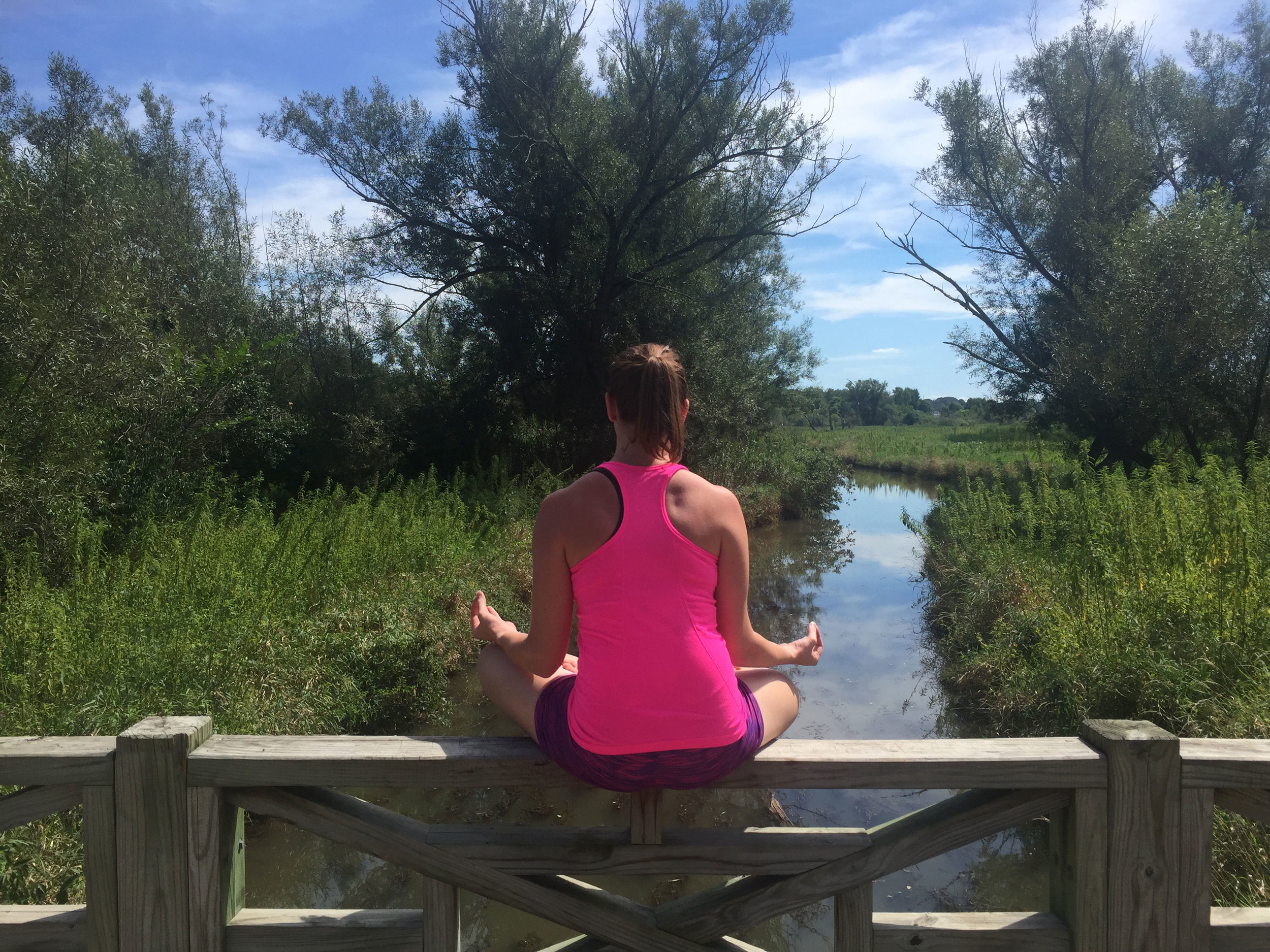
Rua Yoga
Brand Development | Marketing | Photography | Web Design
Rua is the Gaelic word for ginger. As a earthy, red-headed, Irish yoga instructor Ashley's yoga brand name it’s meant to evoke the same origins while suggesting her approach to yoga in a crowded marketplace. In creating her logo I shifted from the iconography of India to a modern interpretation of Celtic designs with a nod to the designs J.R.R Tolkien created for Elvish houses. The abstract stacked squares mimics the shape of actual ginger flowers and is used as a background symbol on any printed material.
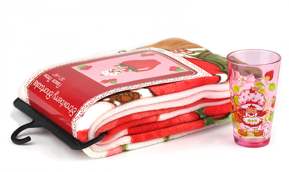
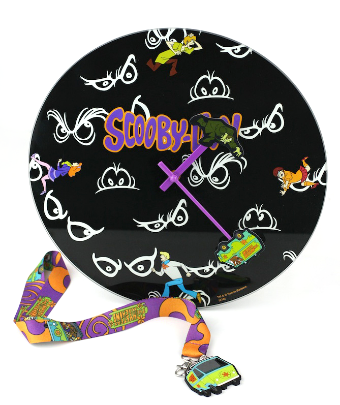
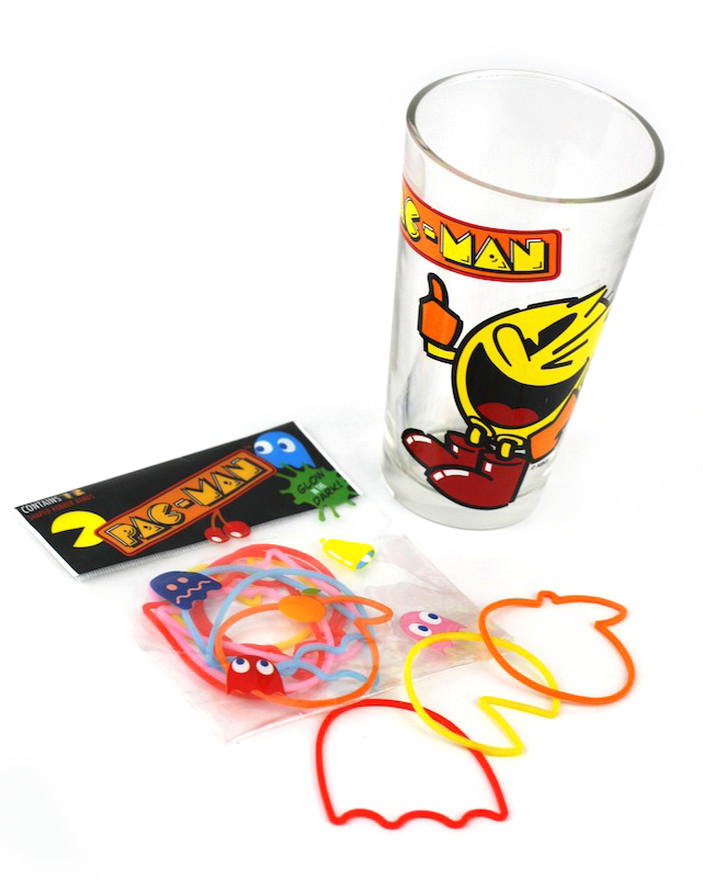
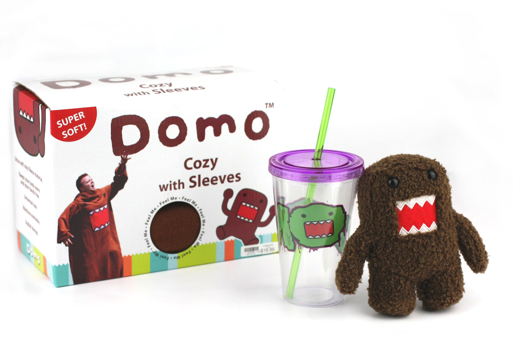
Toon Labs Ink
Brand Development | Graphic Design | Licensing | Marketing | Packaging | Product Photography
Product Development | Project Management | Sourcing | Quality Control
Prior to my arrival at Classic Imports the product range was focused primarily on classic rock wear and home decor. Toon Labs Ink was the new sub-brand that focused on retro animation, gaming properties, decor, and also beverage and impulse items. As one of the Senior Designers/Art Directors I was responsible for building the brand from the bottom up. In this role I pursued new license & designed great products on budget and on trend, while pleasing the licensors and our retail partners and making sure the product arrived on time and with the best quality.
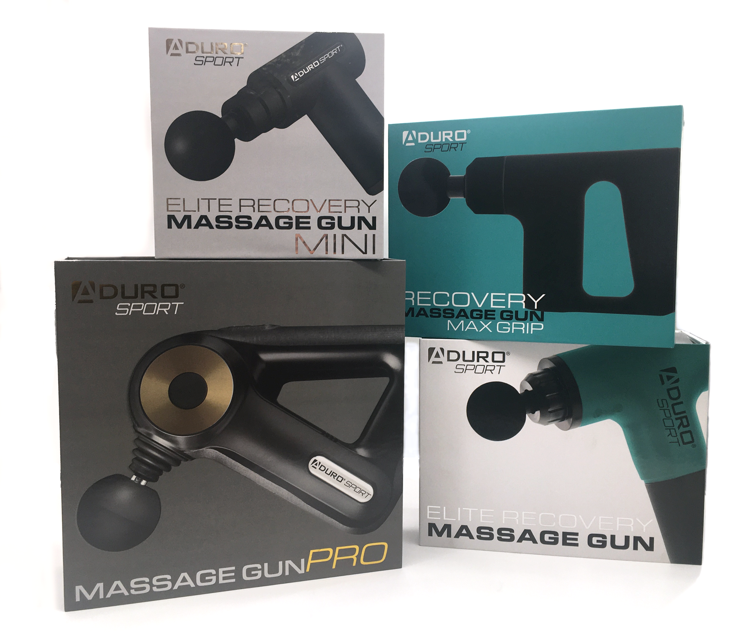
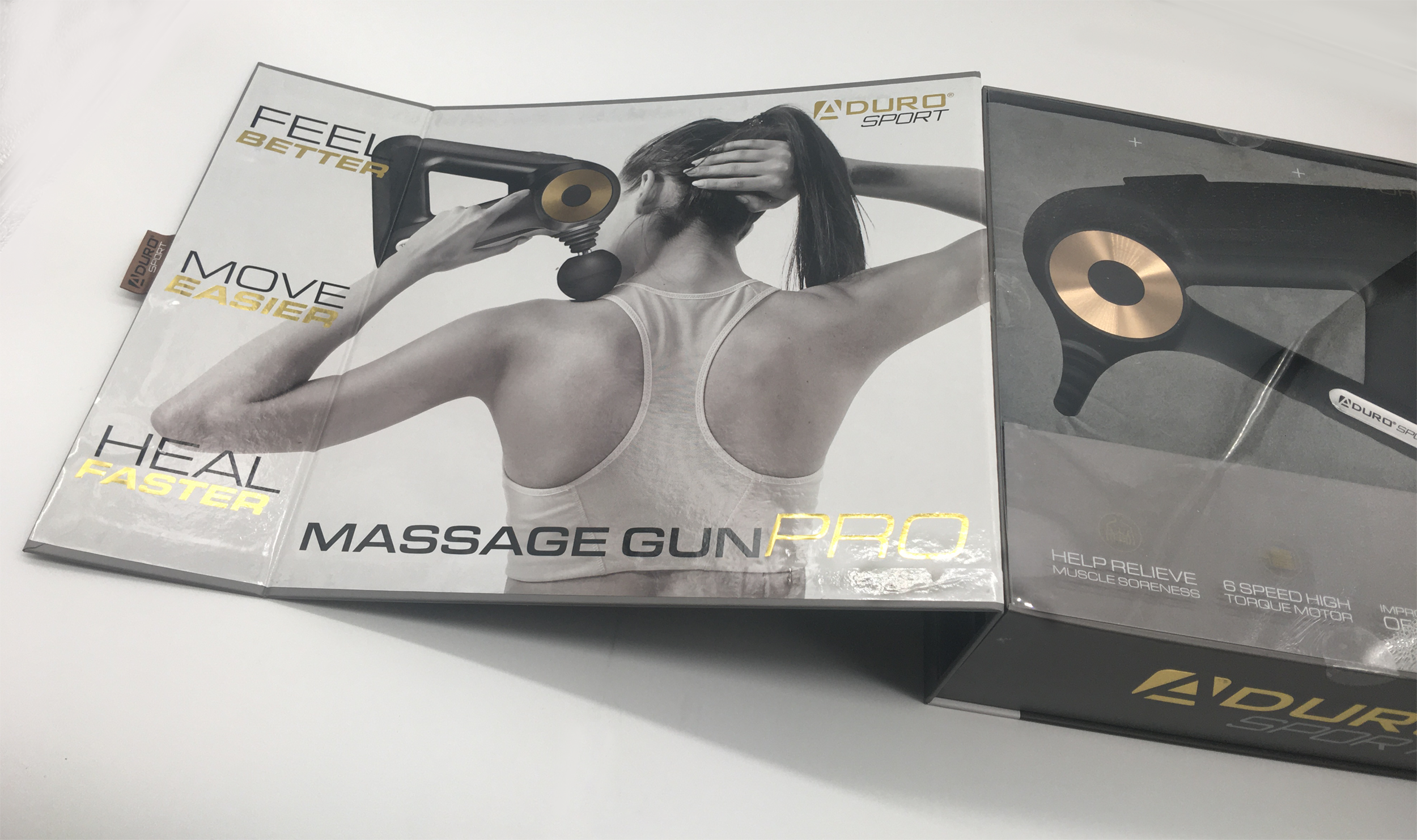
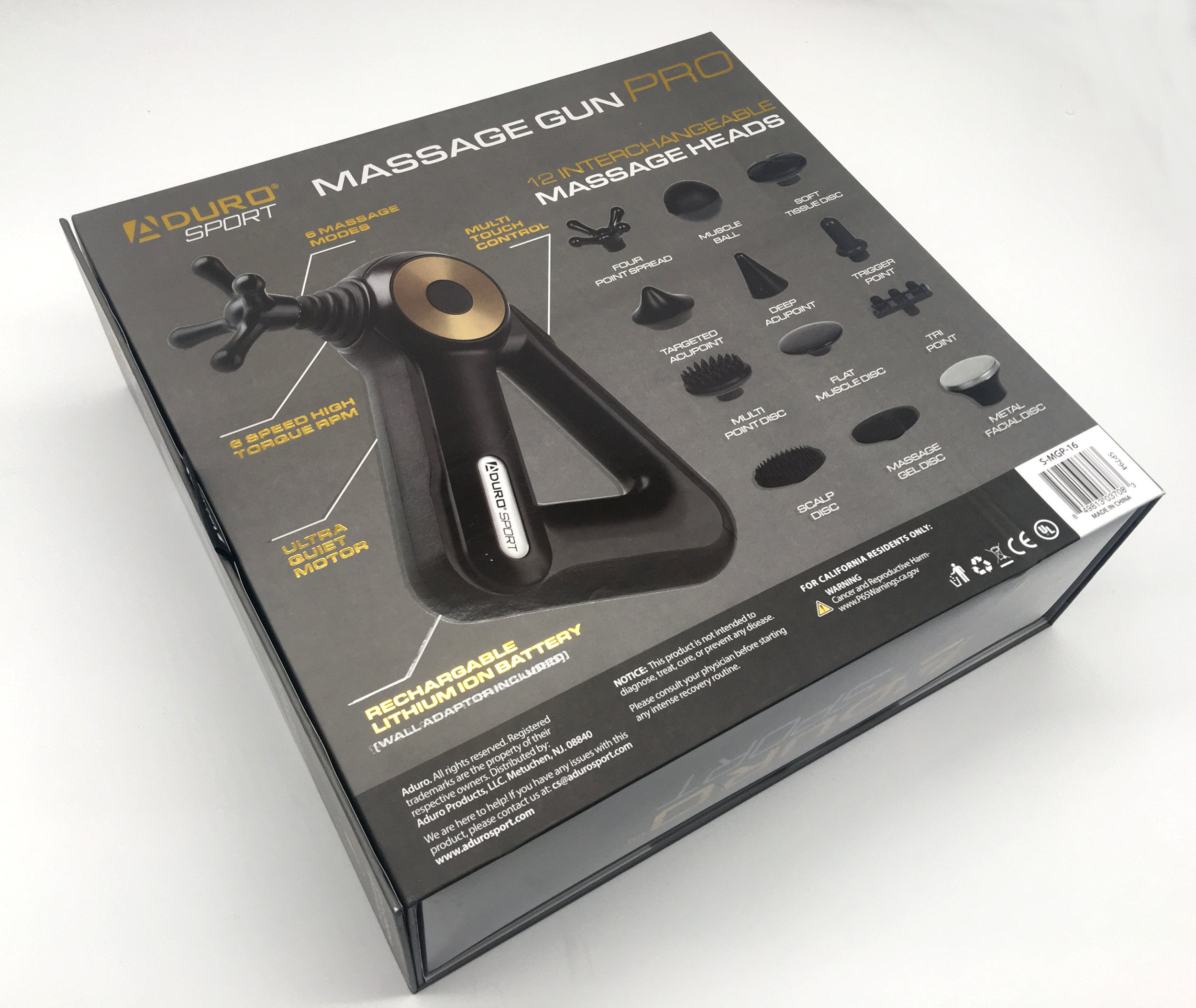
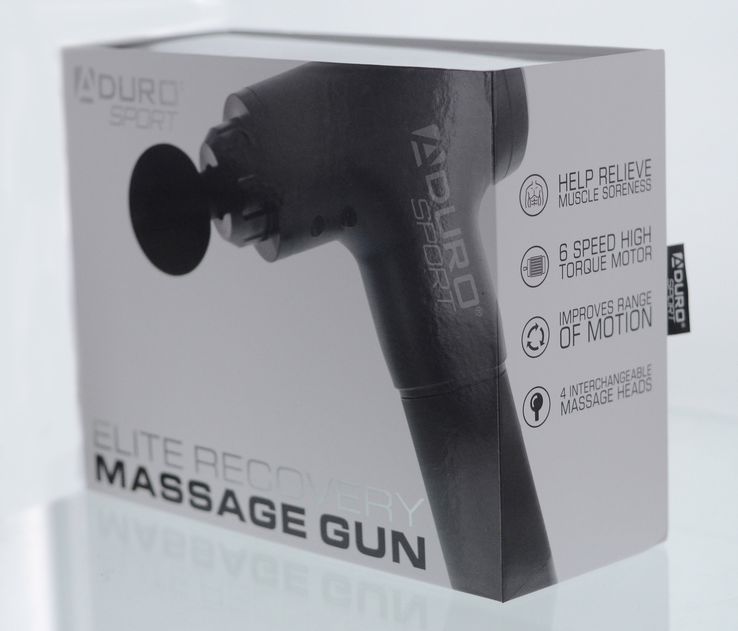
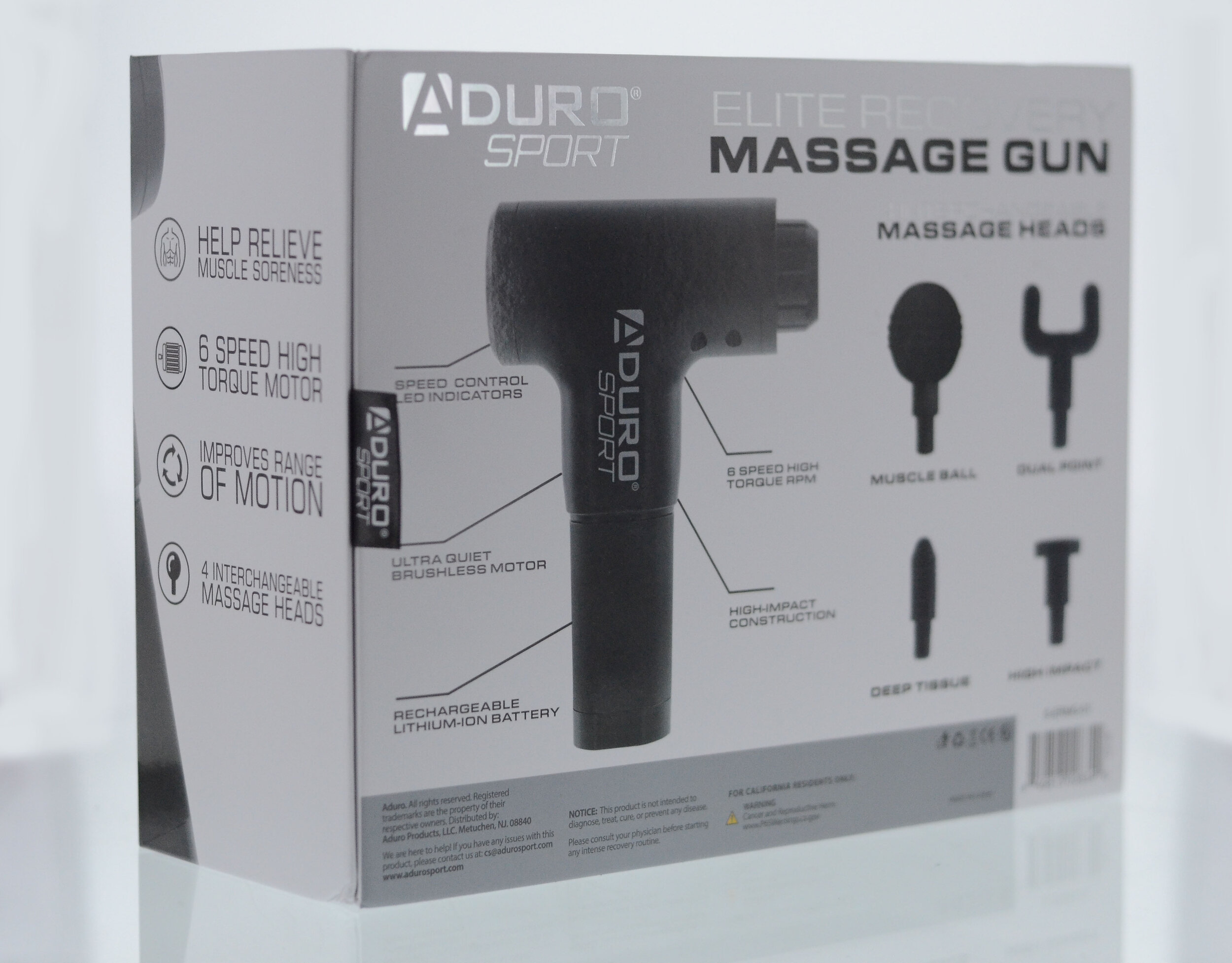
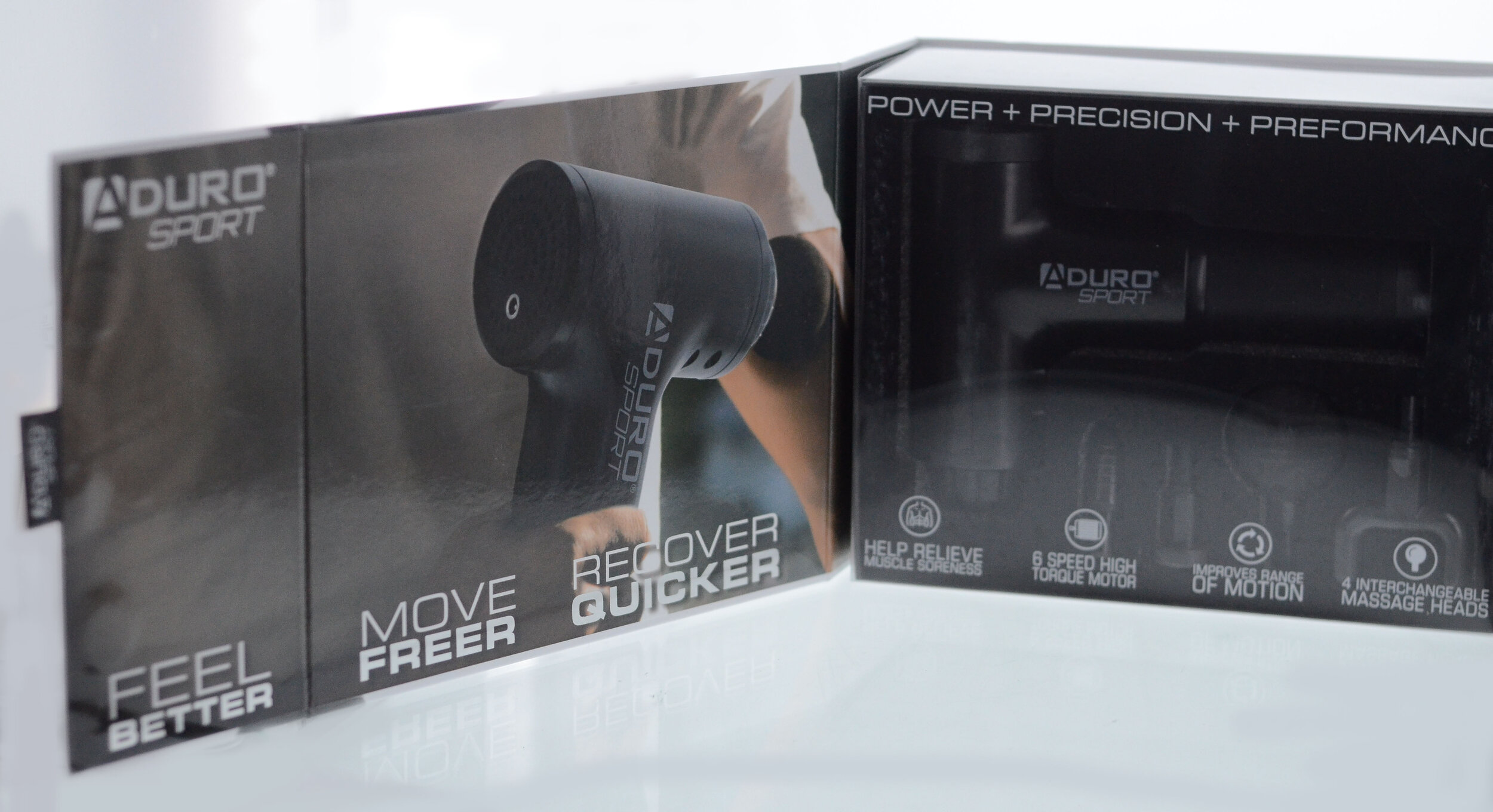
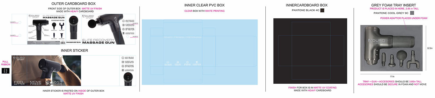
Aduro Products - Massage Gun Packaging
Art Direction | Brand Development | Graphic Design | Packaging | Photography
Aduro Products was not the first to the percussion gun market, but our sourcing and forecasting expertise led us to pursue the space. We decided to fill the space with a clean design approach, with lots of white space, that included a magnetic flap design that held a PVC box to clearly show the gun and attachments.
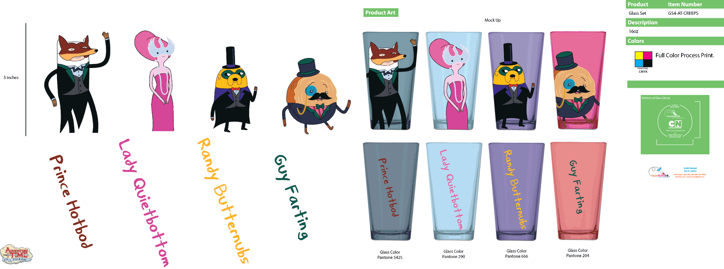
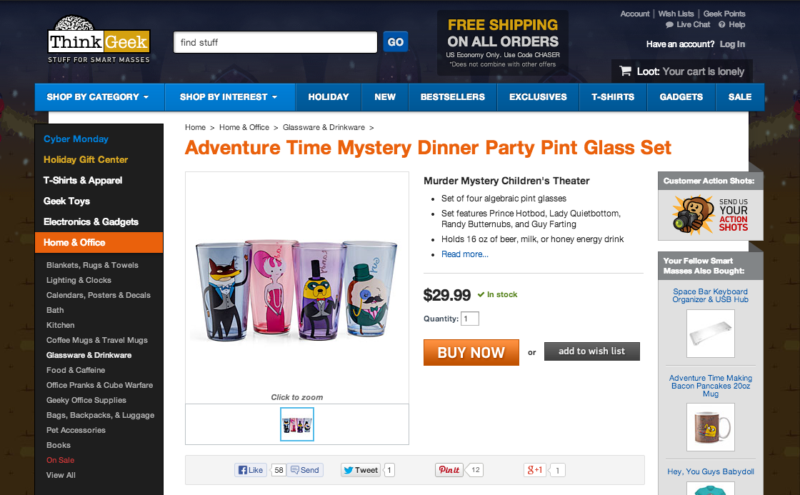
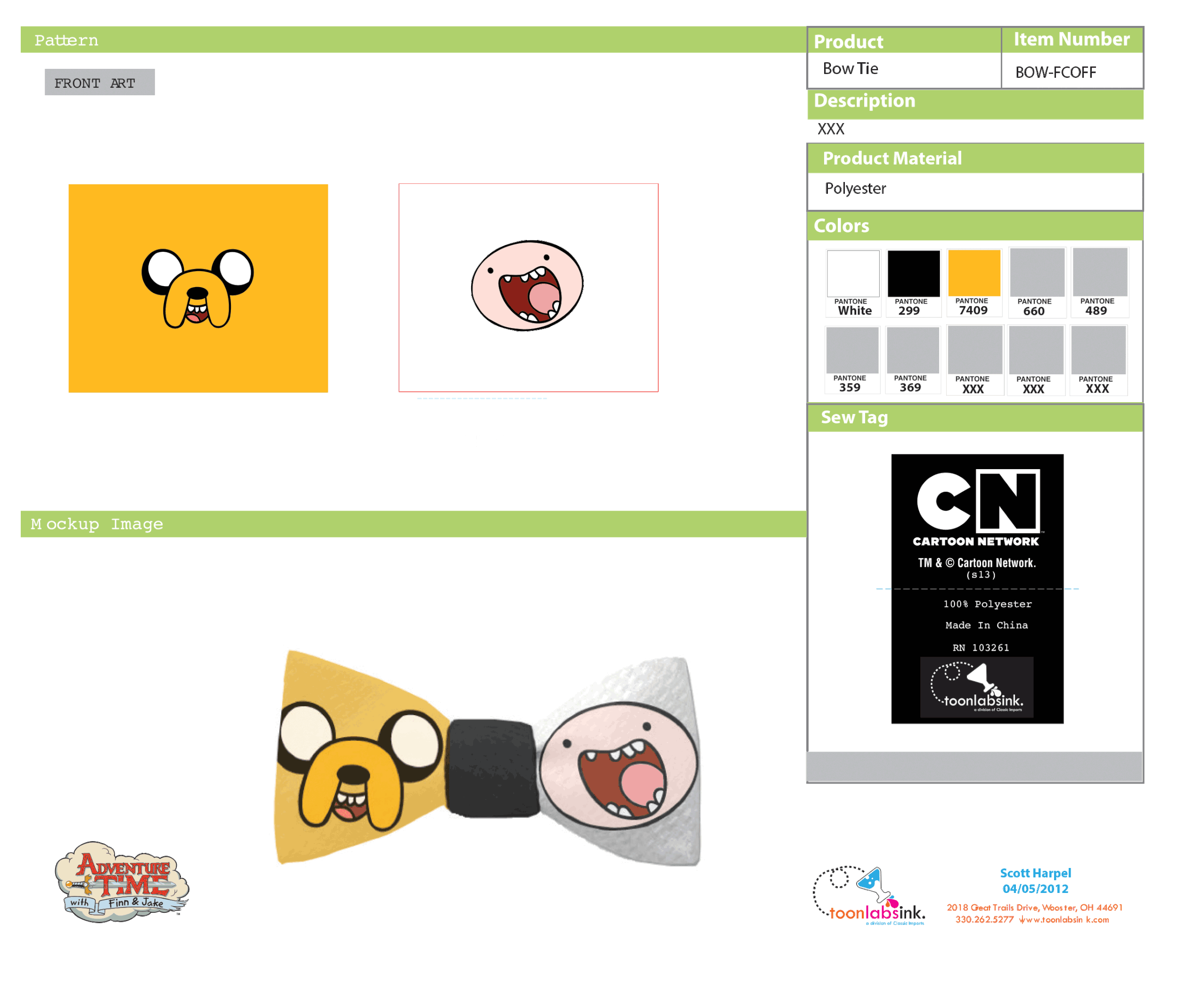
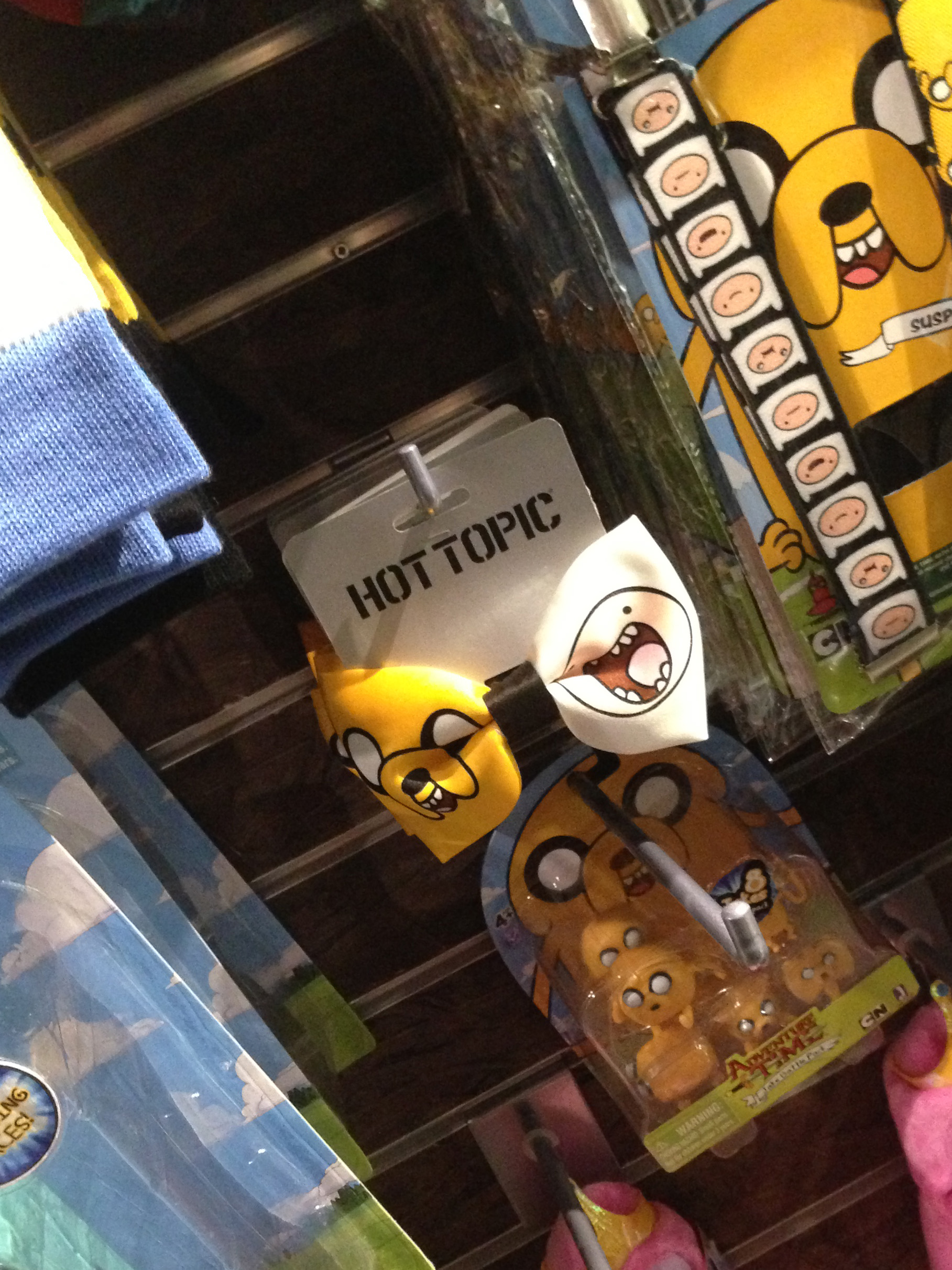
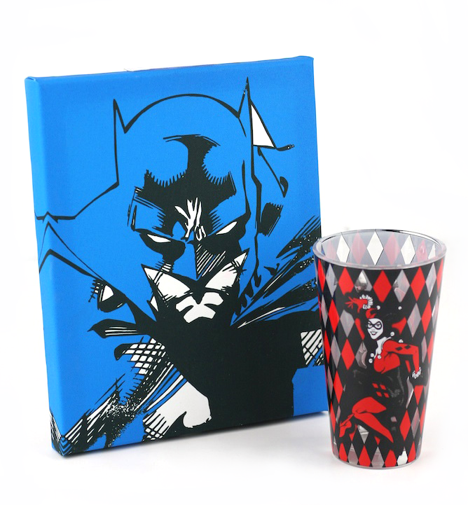
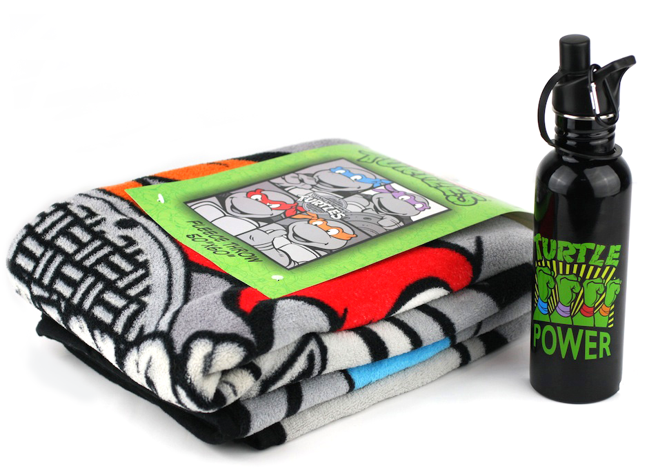
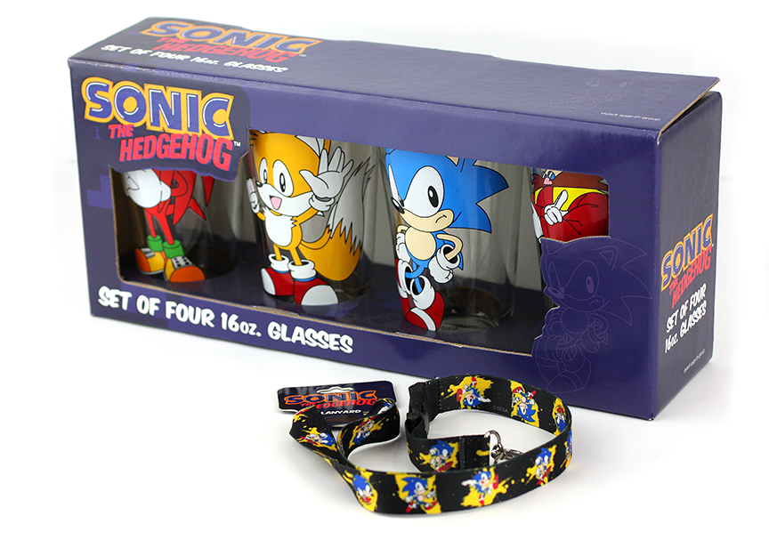
Adventure Time
Art Direction | Graphic Design | Packaging | Product Development | Project Management | Quality Control
Adventure Time was one of the first properties I suggested we add at Toon Labs Ink and which quickly became one of our best-selling properties. I knew that Cartoon Network wanted a unique approach to the merchandise, one that was designed by a fan for fans of the show. So the art for the above glass set is very specific to this particular show. Also since Classic Imports had no Pantone book our team created a standard illustrator template with the flat art, mock-ups, legal info and location and Pantone call-outs. The implementation of this system enabled products such as these to make it on time and without extra cost.

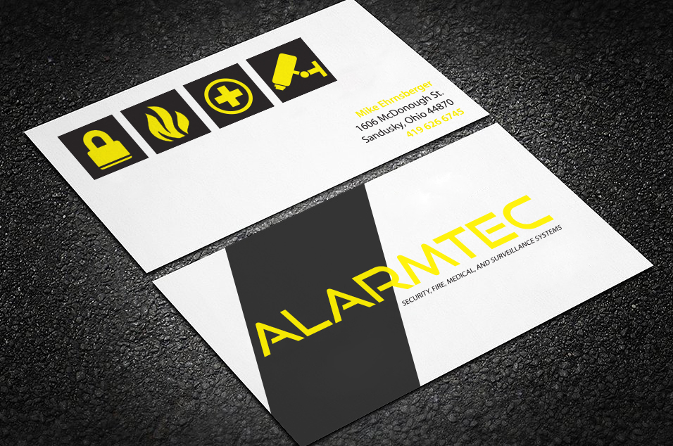
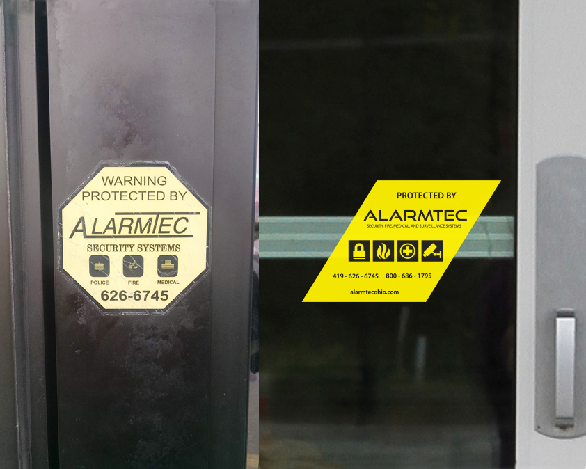
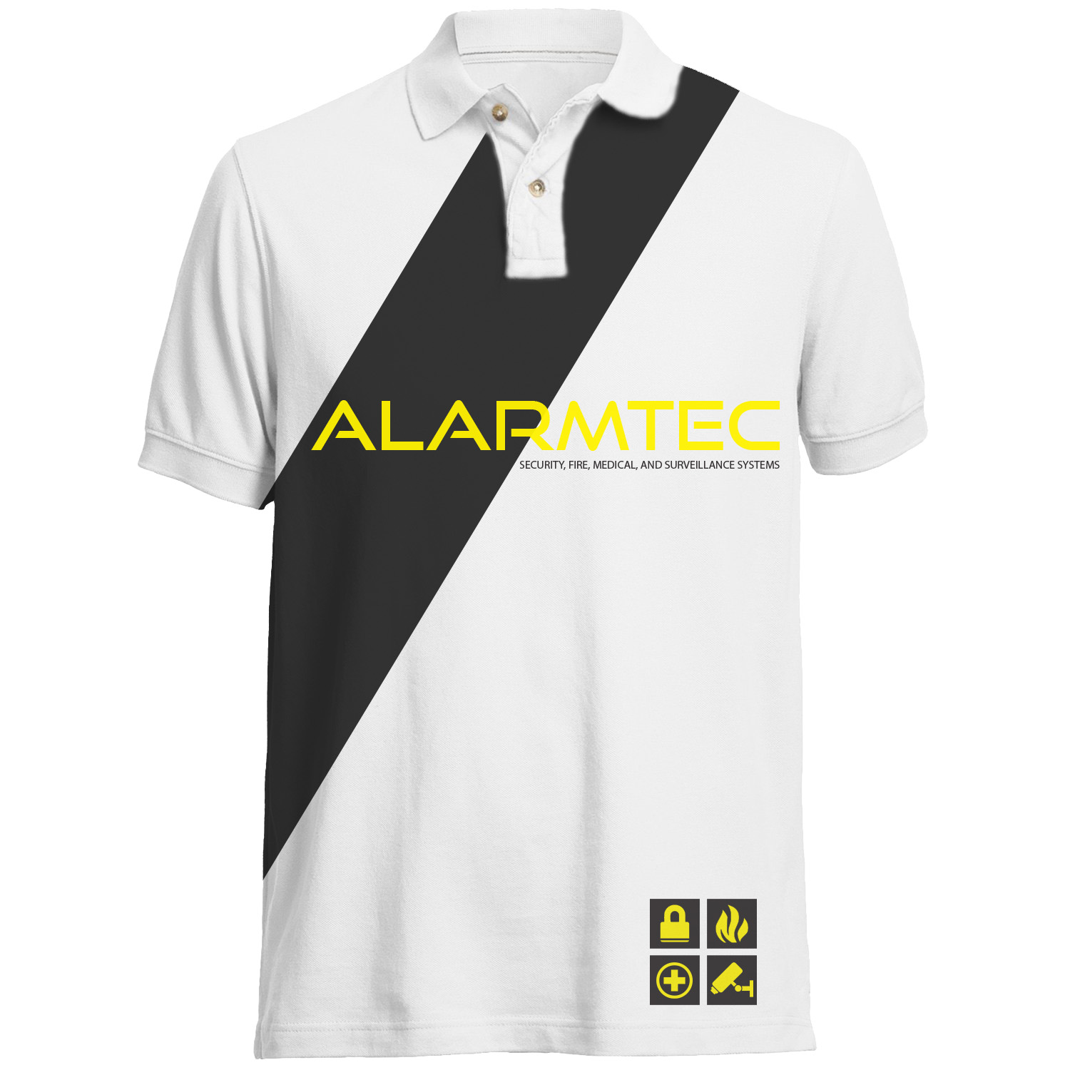
Alarmtec
Art Direction | Brand Development | Graphic Design | Marketing
Alarmtec is small family run security system installation and monitoring business with its routes in the eighties. The octagon protection sticker is ubiquitous across small business in the city its located, but with ADT growing and expanding, and Alamtec remaining in stasis for more then two decades, the logo and brand did not reflect that the business has evolved and kept up to date with technology. The evolution of the slash, and updating of the yellow was used to make the brand consistent and recoginable in any application.

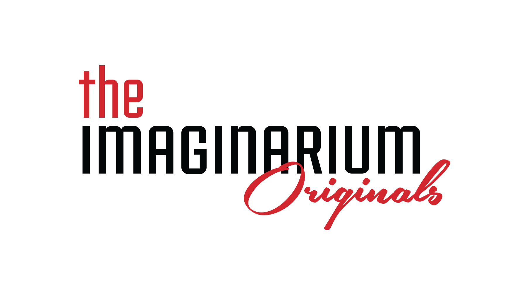
The Imaginarium Goods Co.
Art Direction | Branding | Style Guide
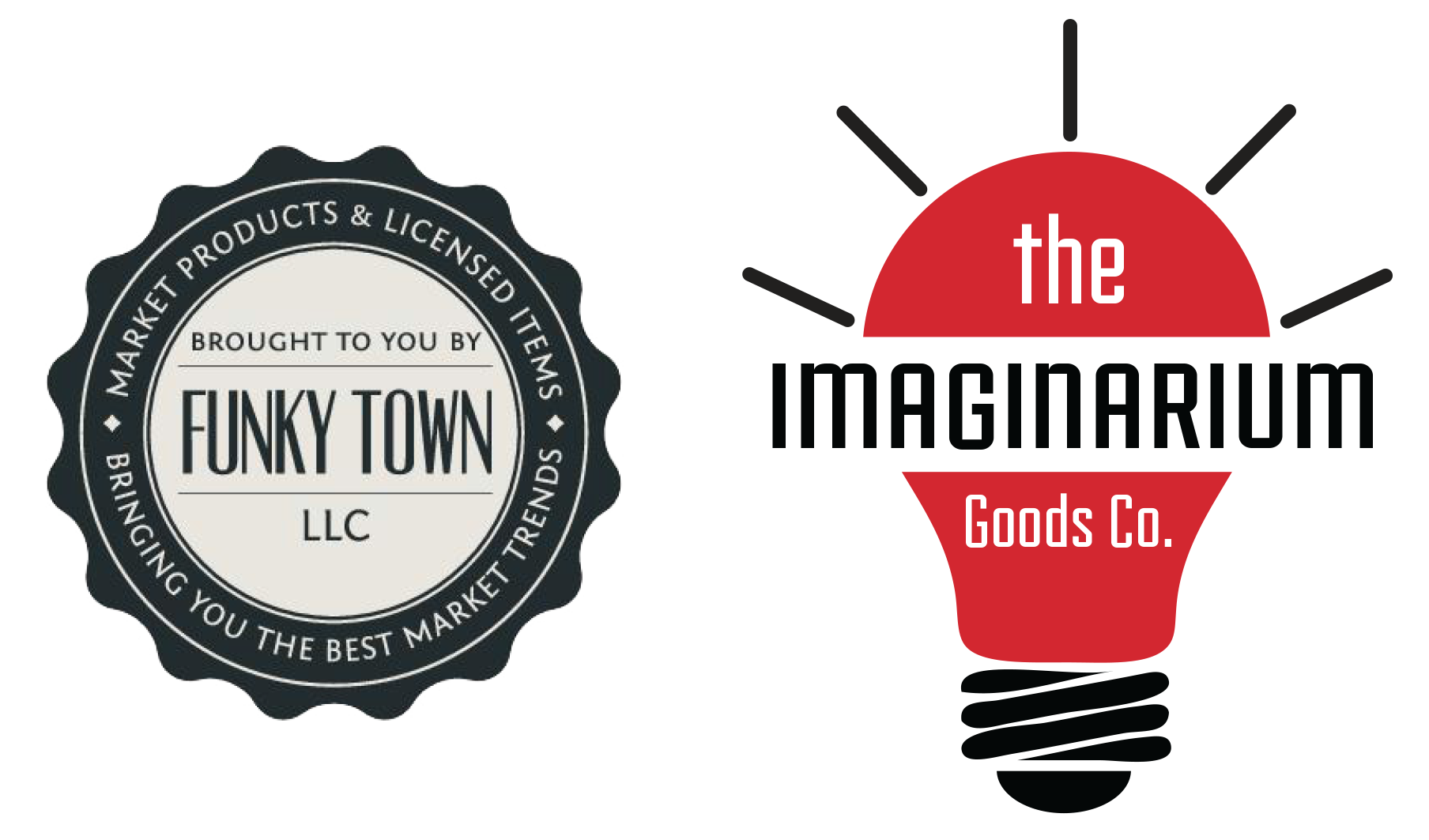
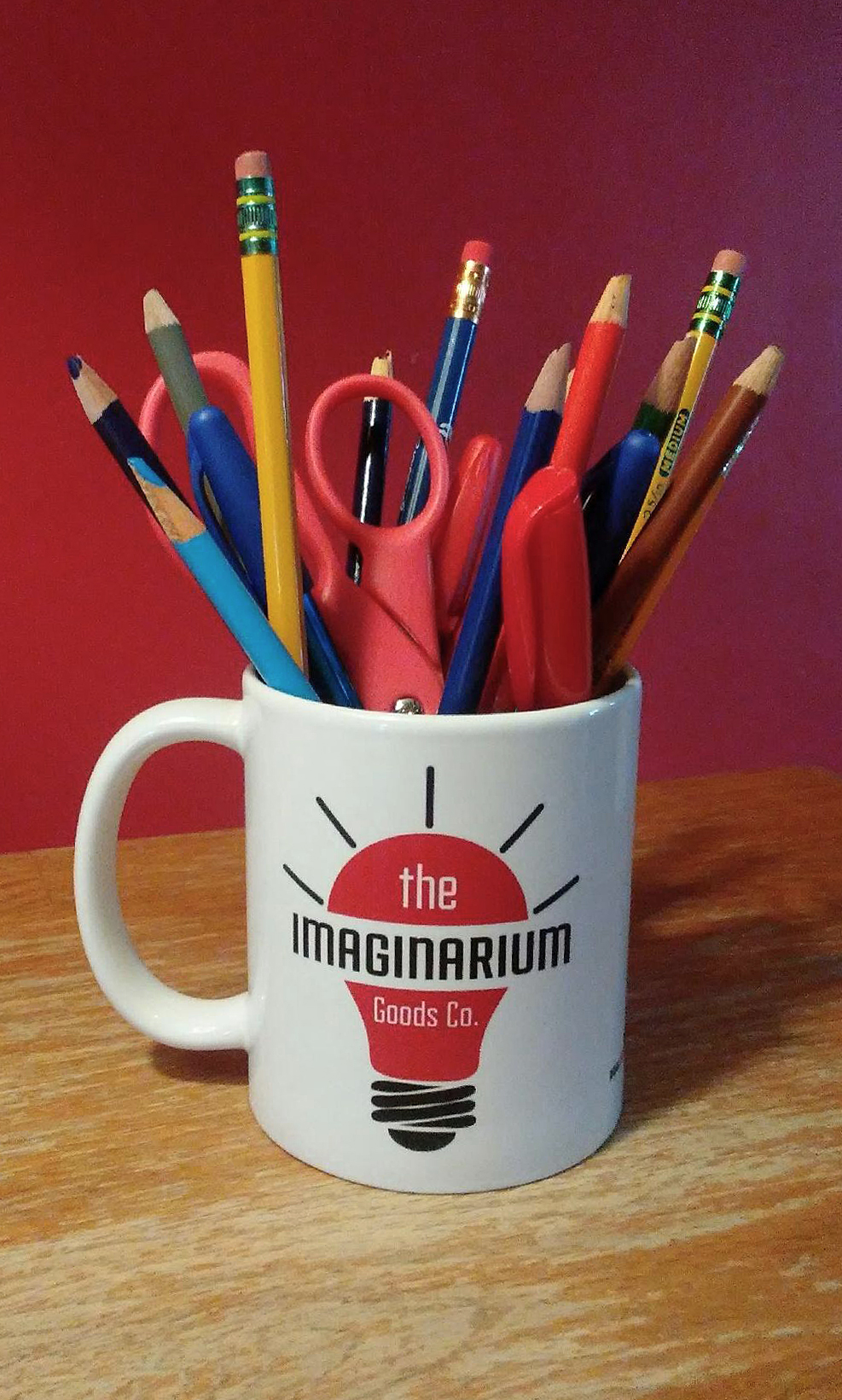
Funky Town was another licensed goods and creative product company that needed a strong new image to separate it from the competition. Besides a loose connection to the song Funky Town the seal logo and name did nothing to convey what products the company made. The move to a light bulb logo and a unique name in a throwback way implies so much more. After this change was agreed upon a brand guidelines deck was made so that from emails to the product on the shelves we had a consistency in communication and building a visual identity.
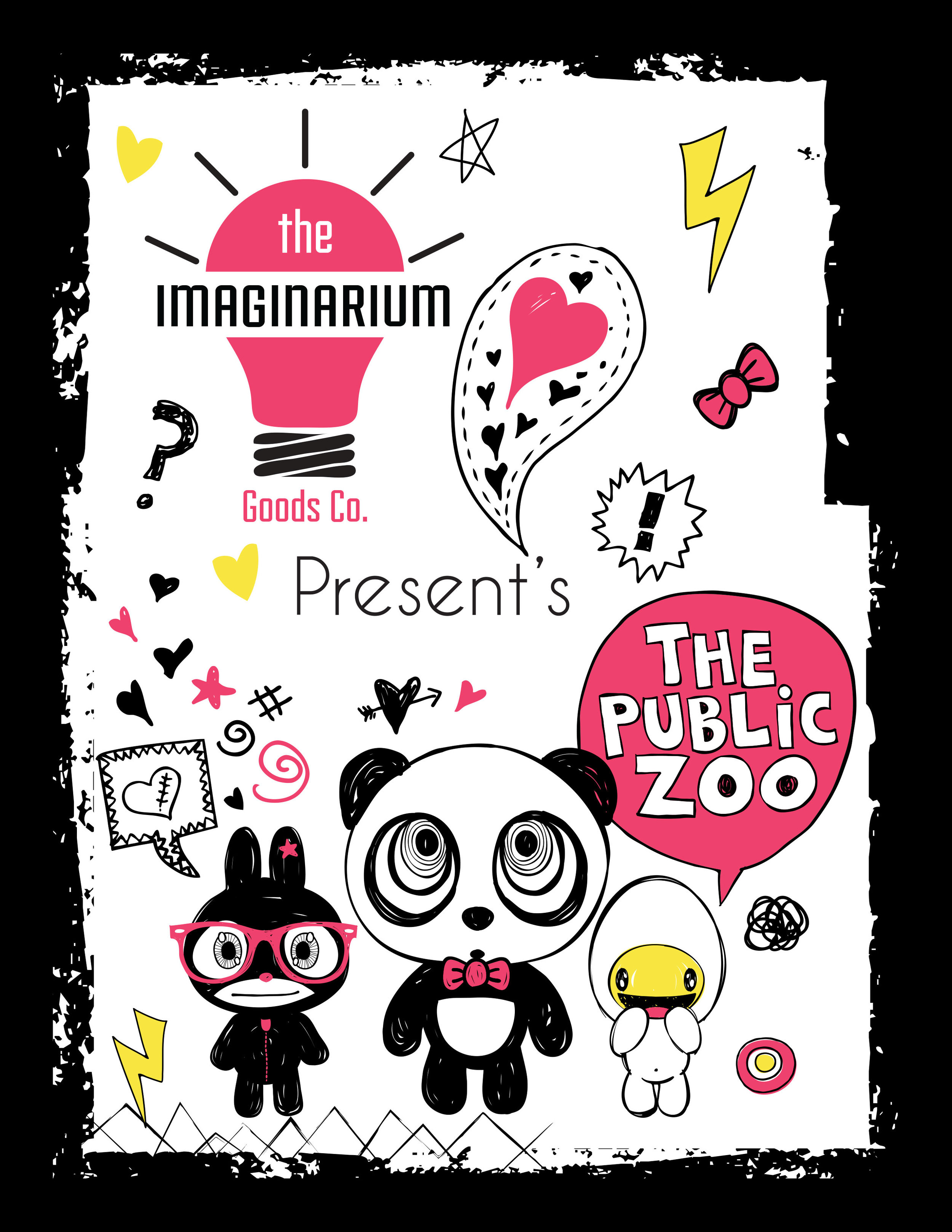
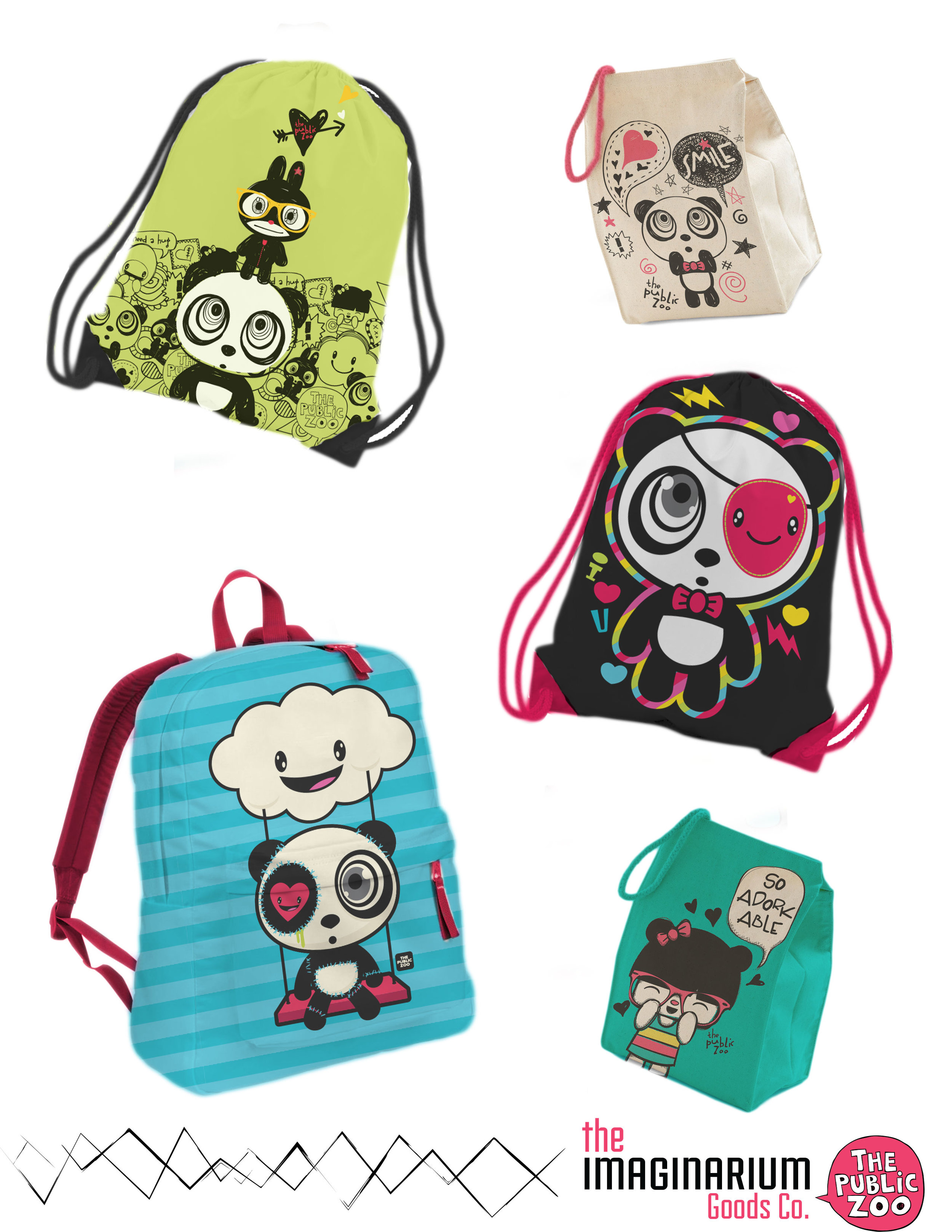
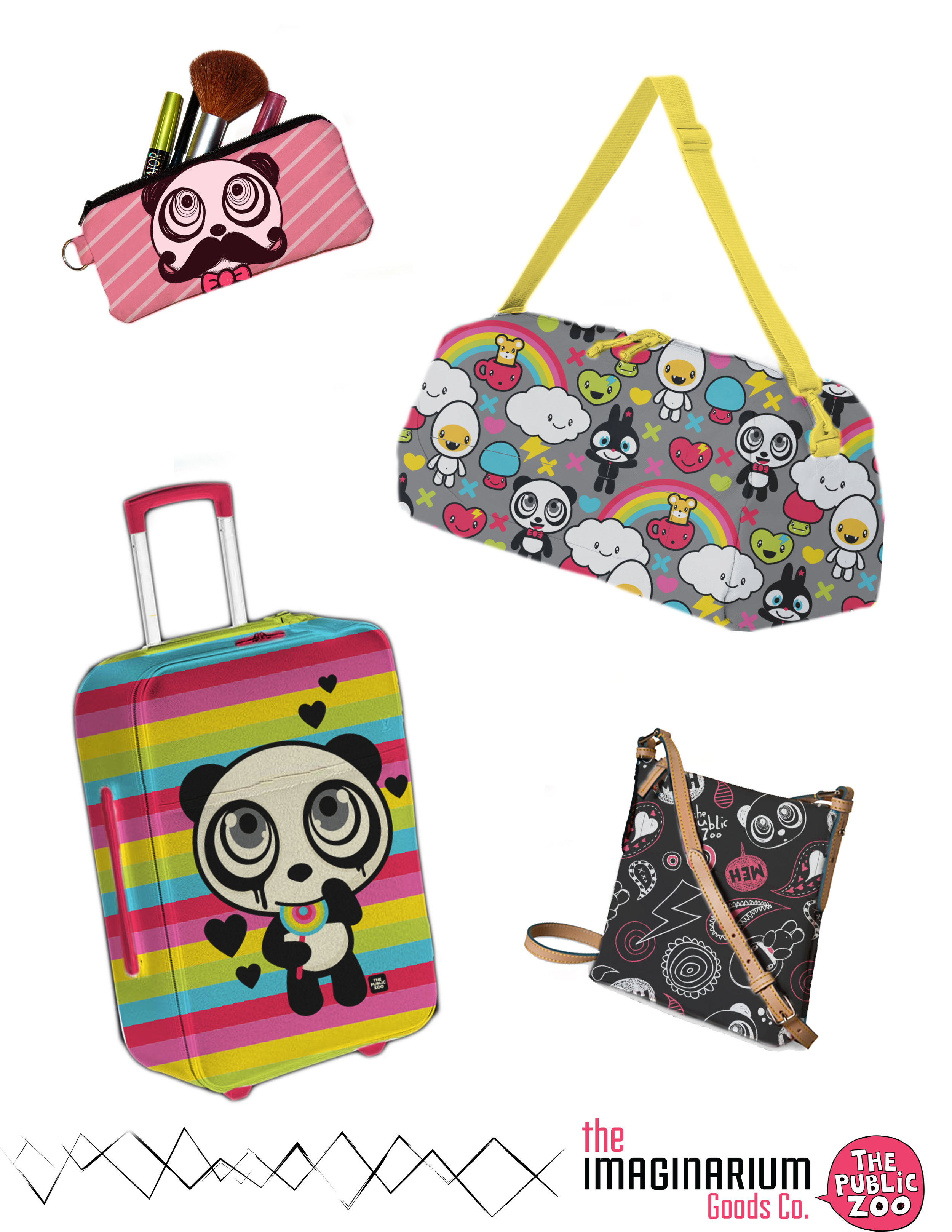
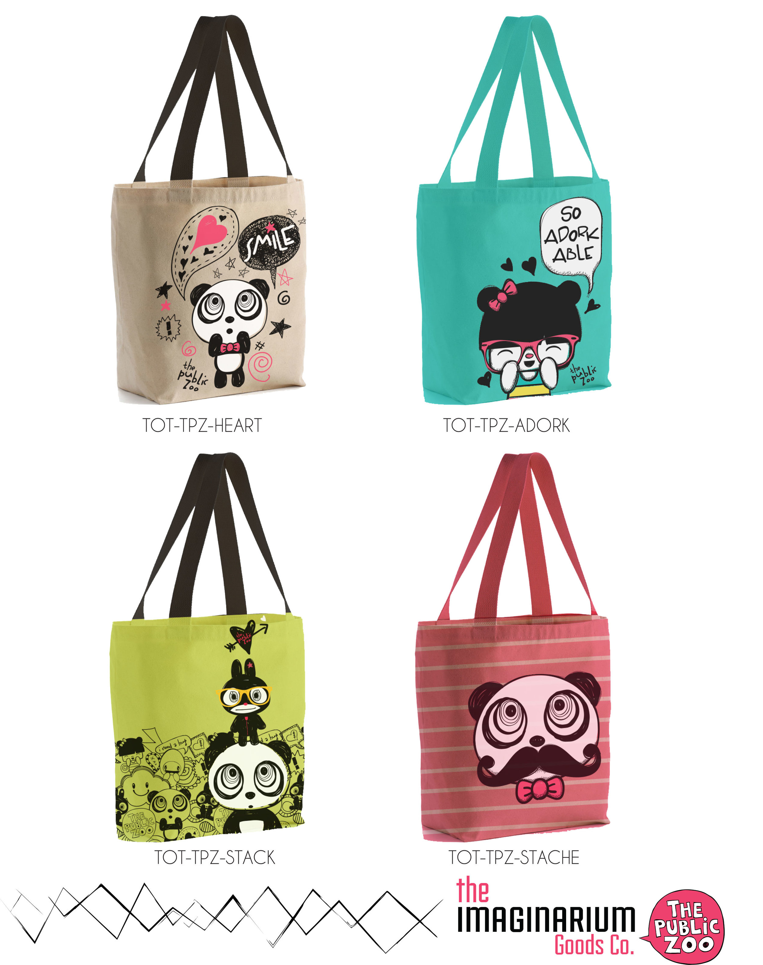
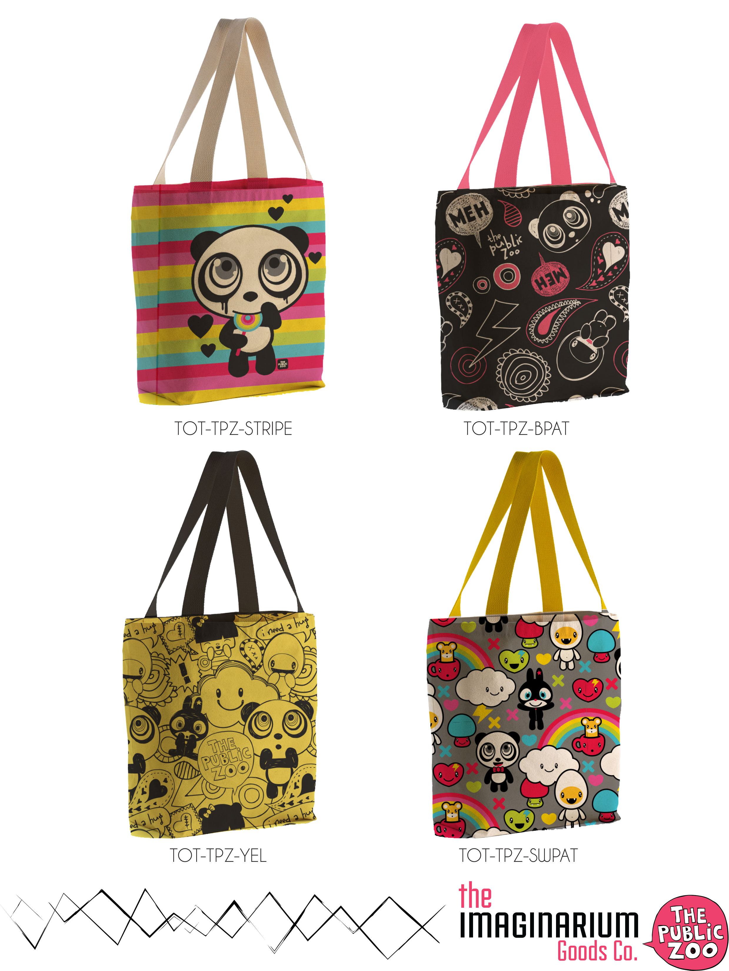
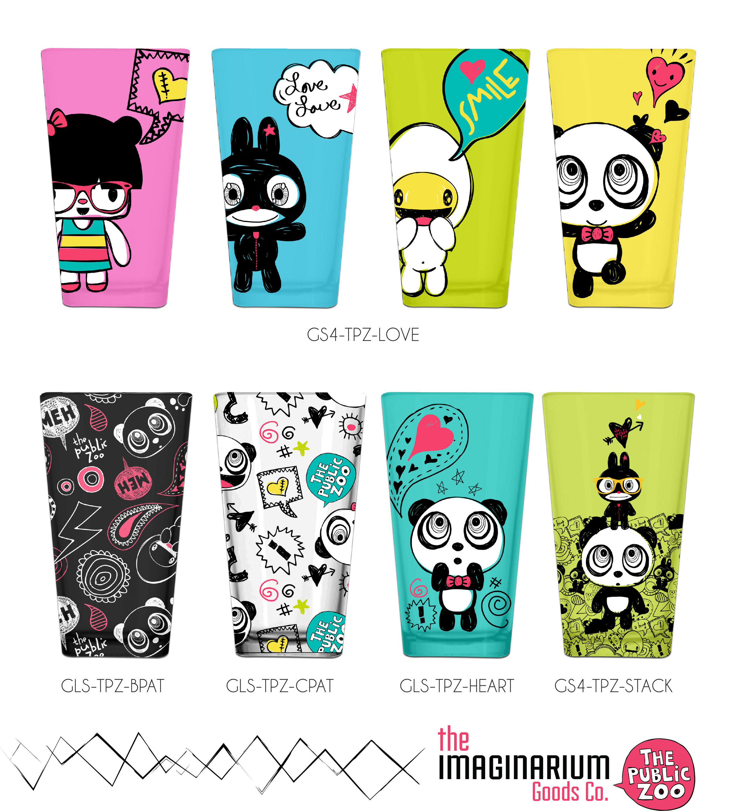
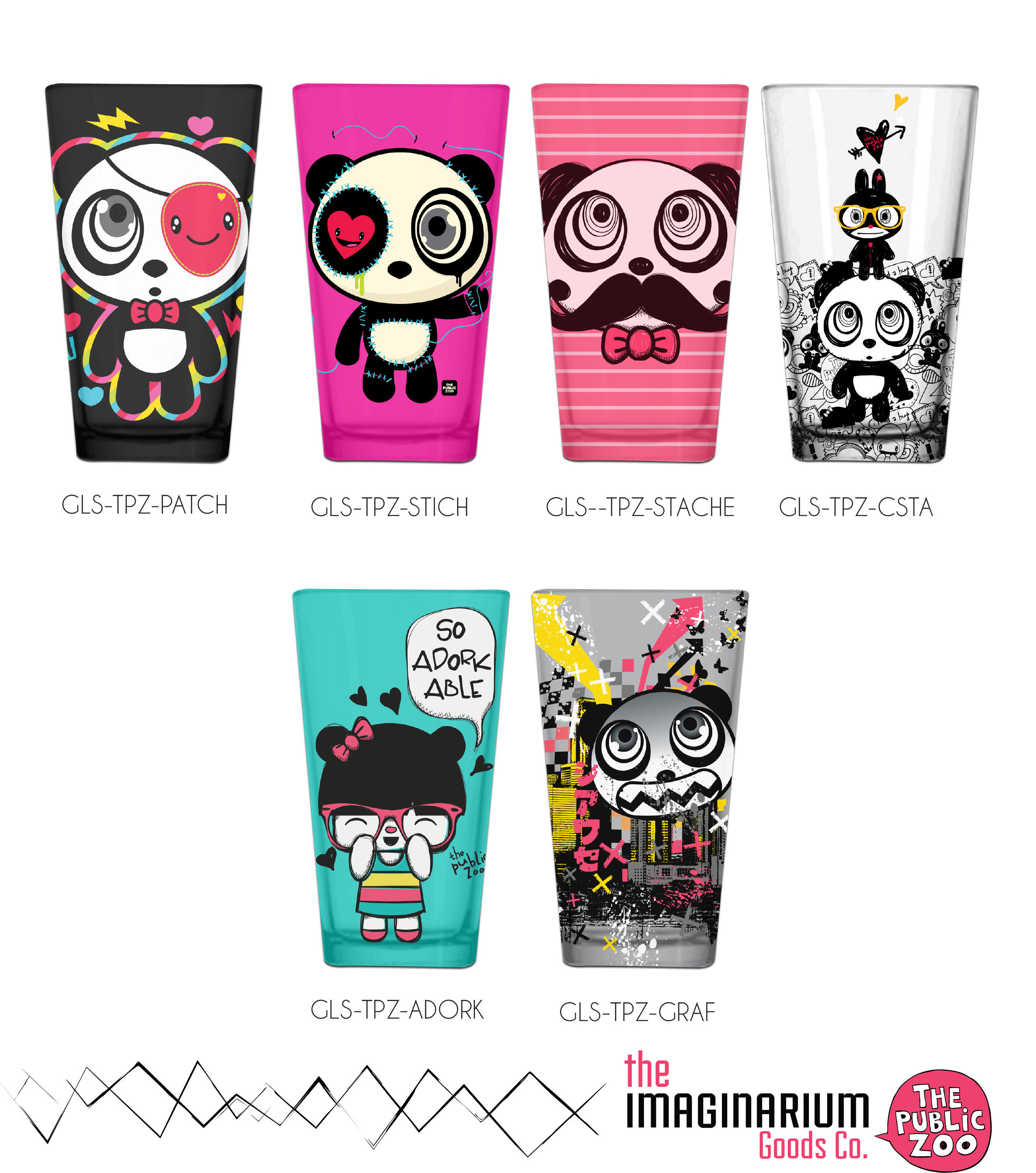
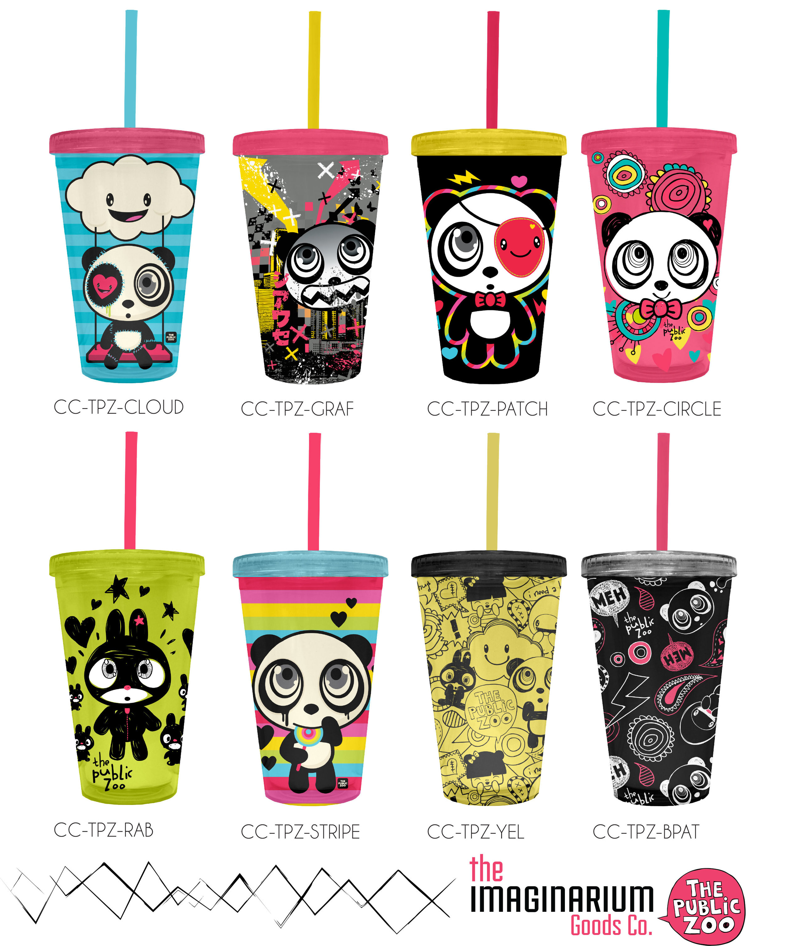
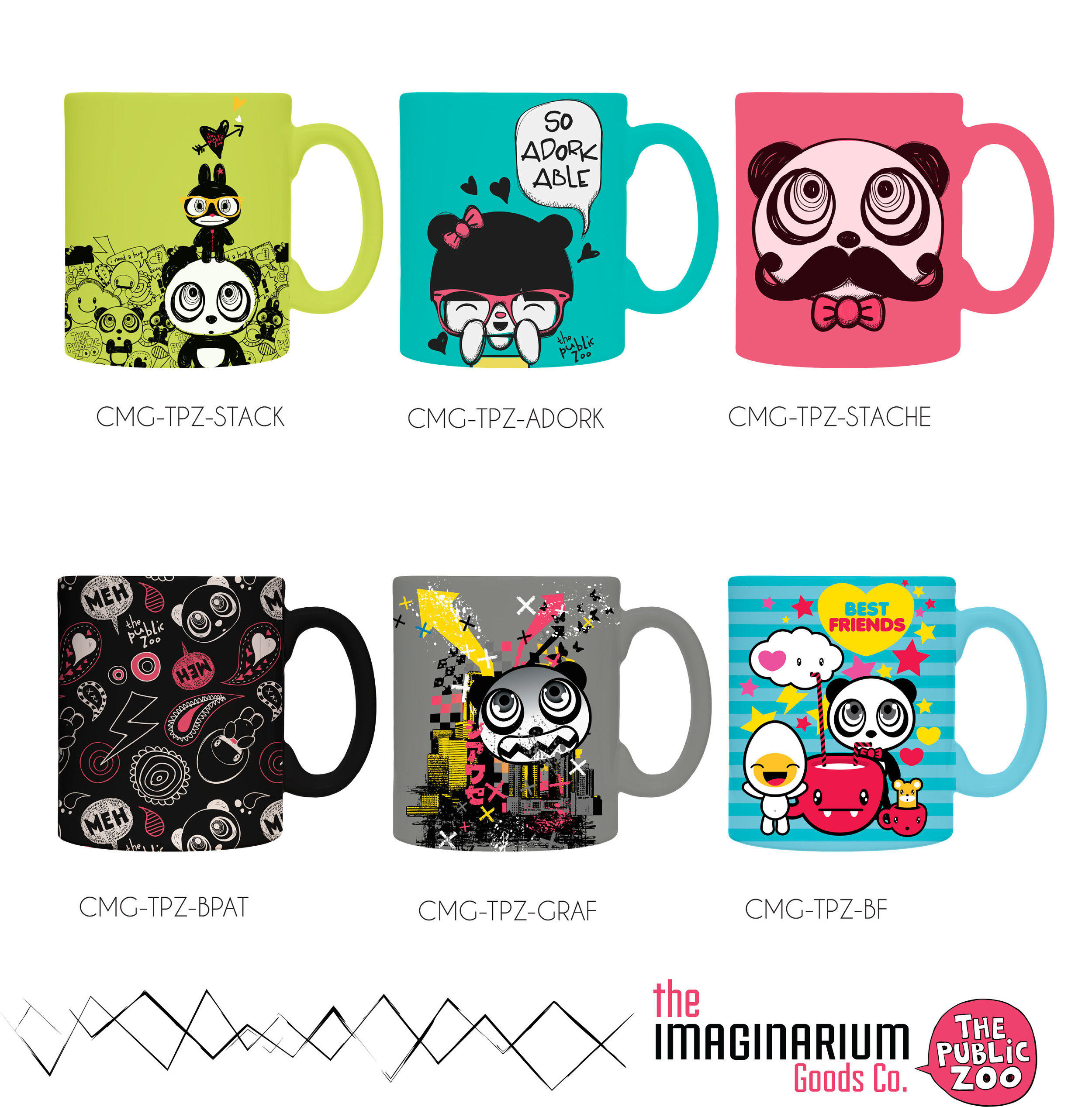
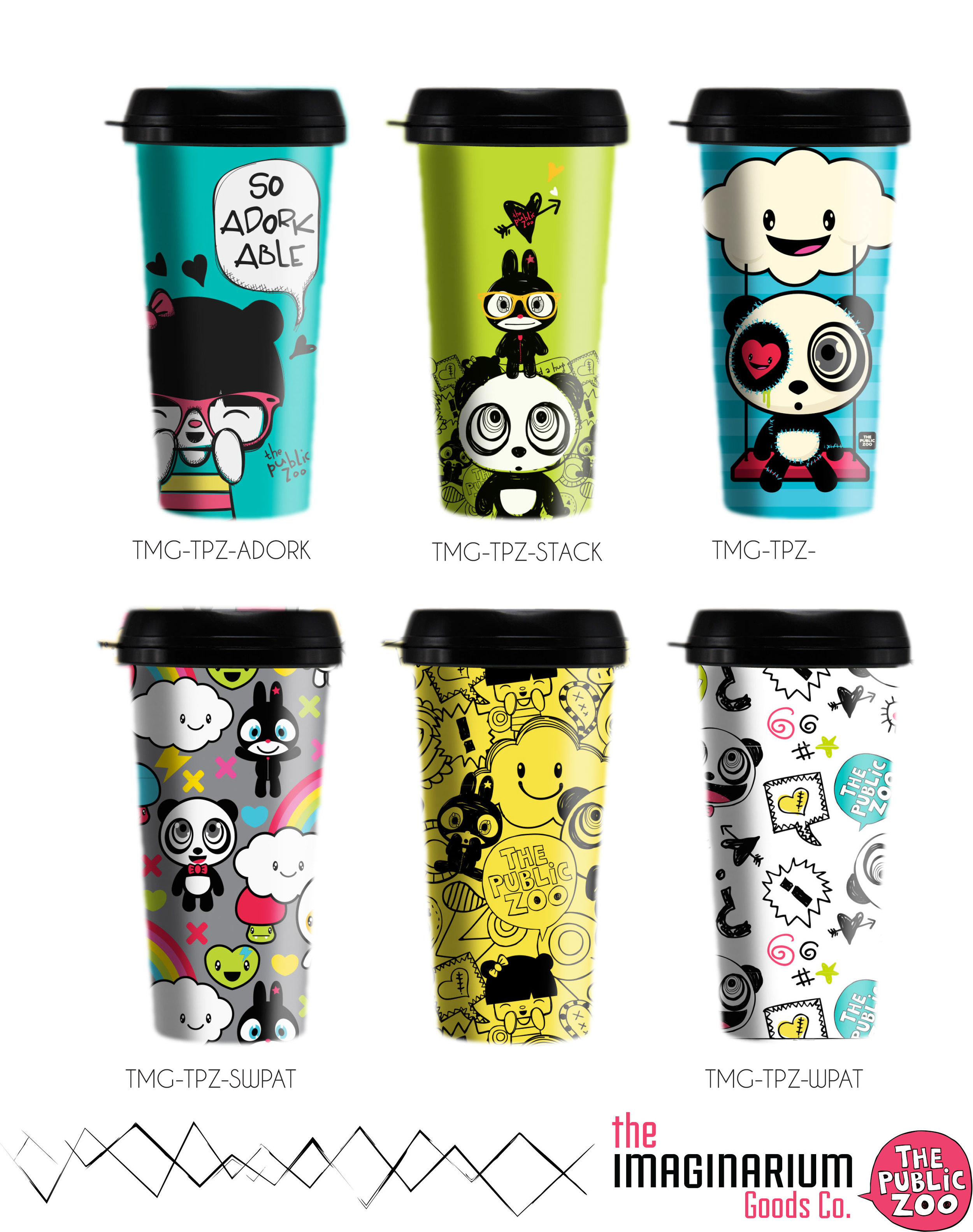
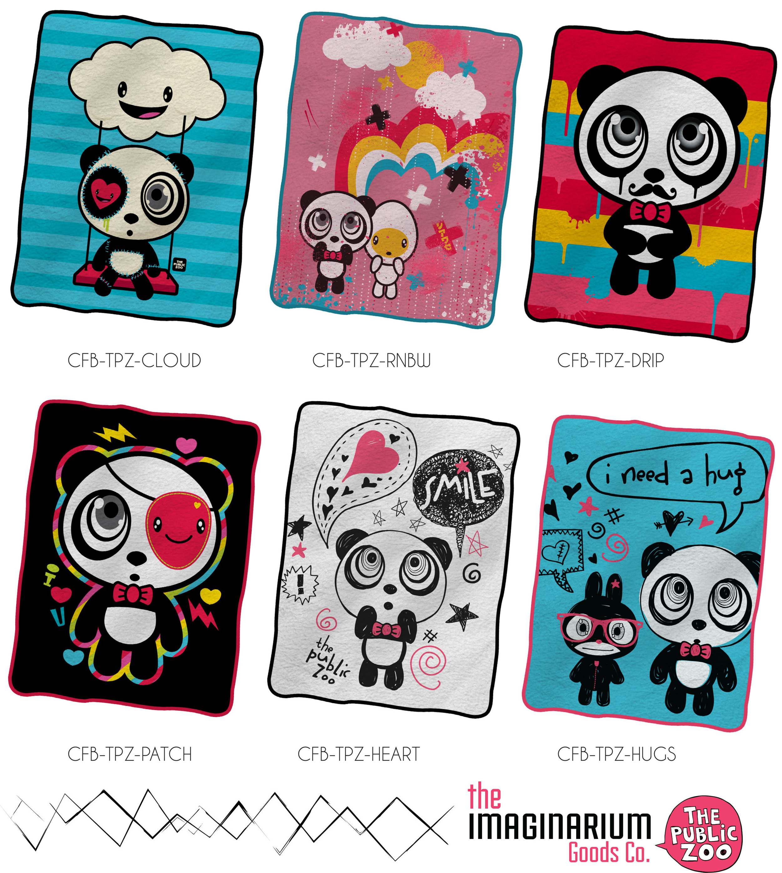
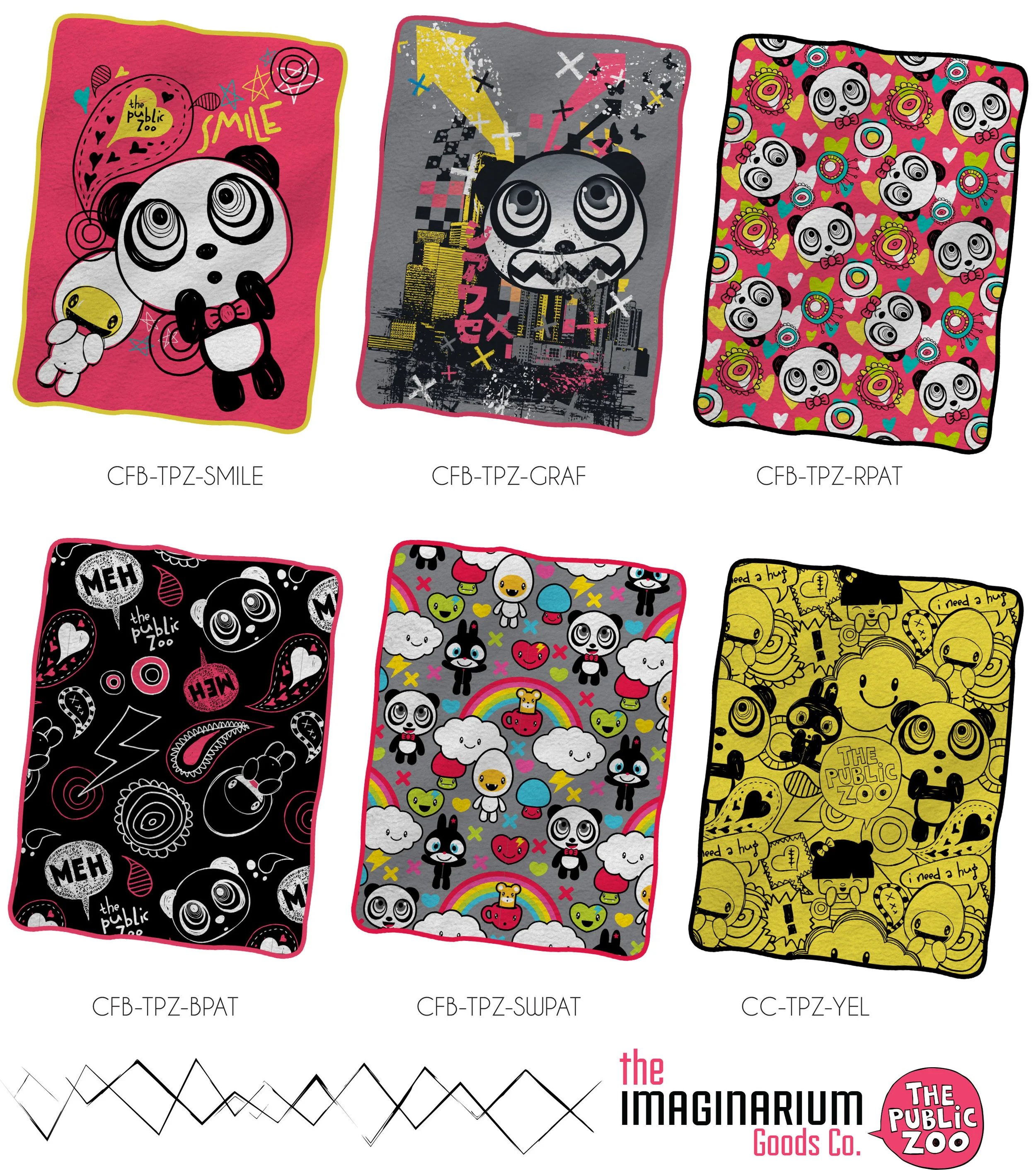
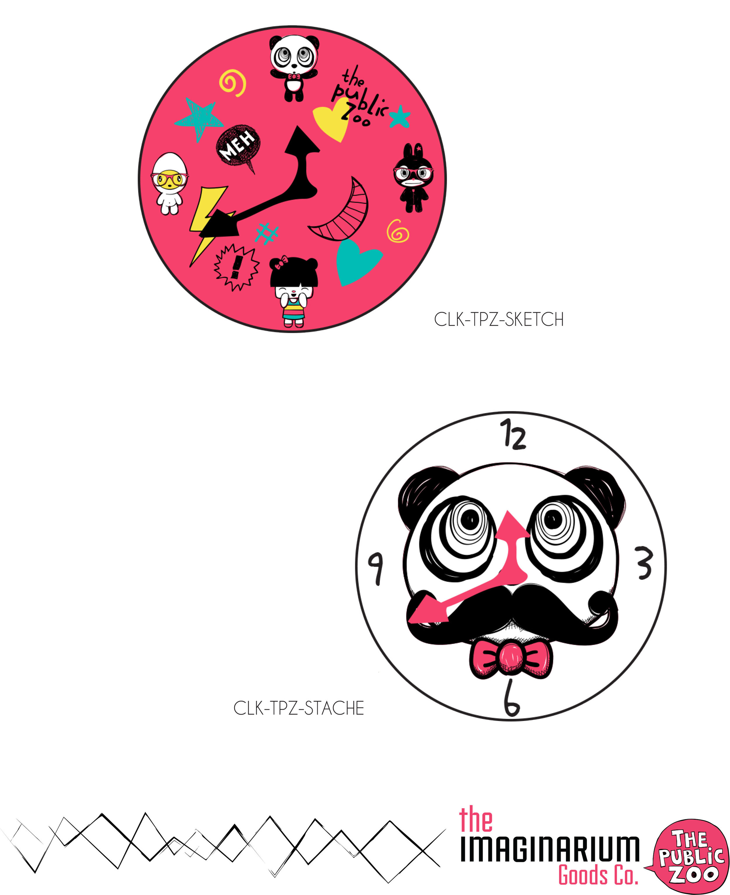
The Public Zoo
Art Direction | Catalog Design | Product Development | Sourcing
The Public Zoo is a great concept that unfortunately has not made it big yet, thanks to entrenchment of Hello Kitty in the marketplace. At the time this catalog and range was developed the brand had only had some moderate success with apparel. In deciding to expand the categories the versatility of the characters and the pallet used led to some great product that has yet to find a retailer brave enough to take a risk.
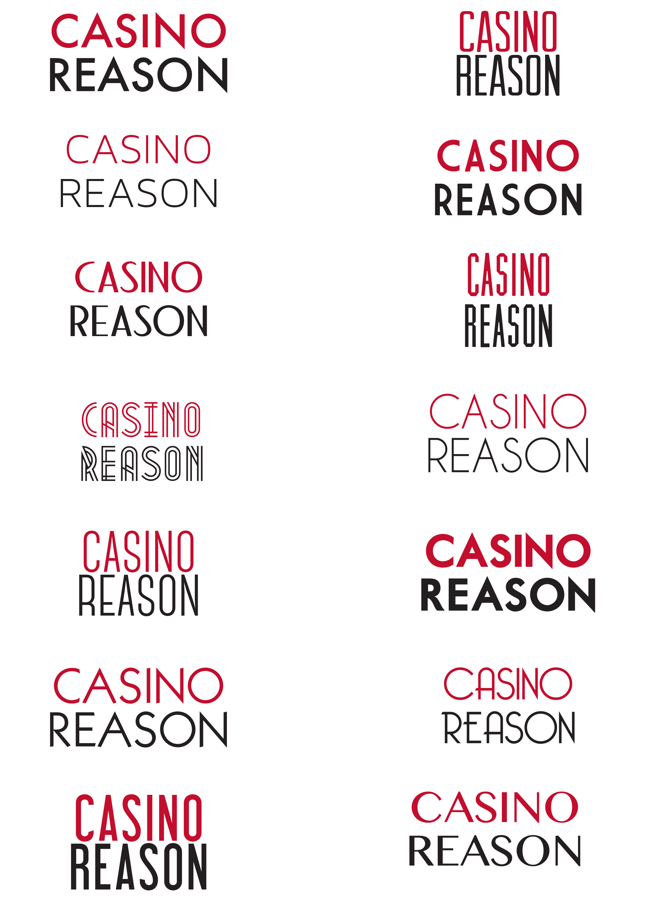
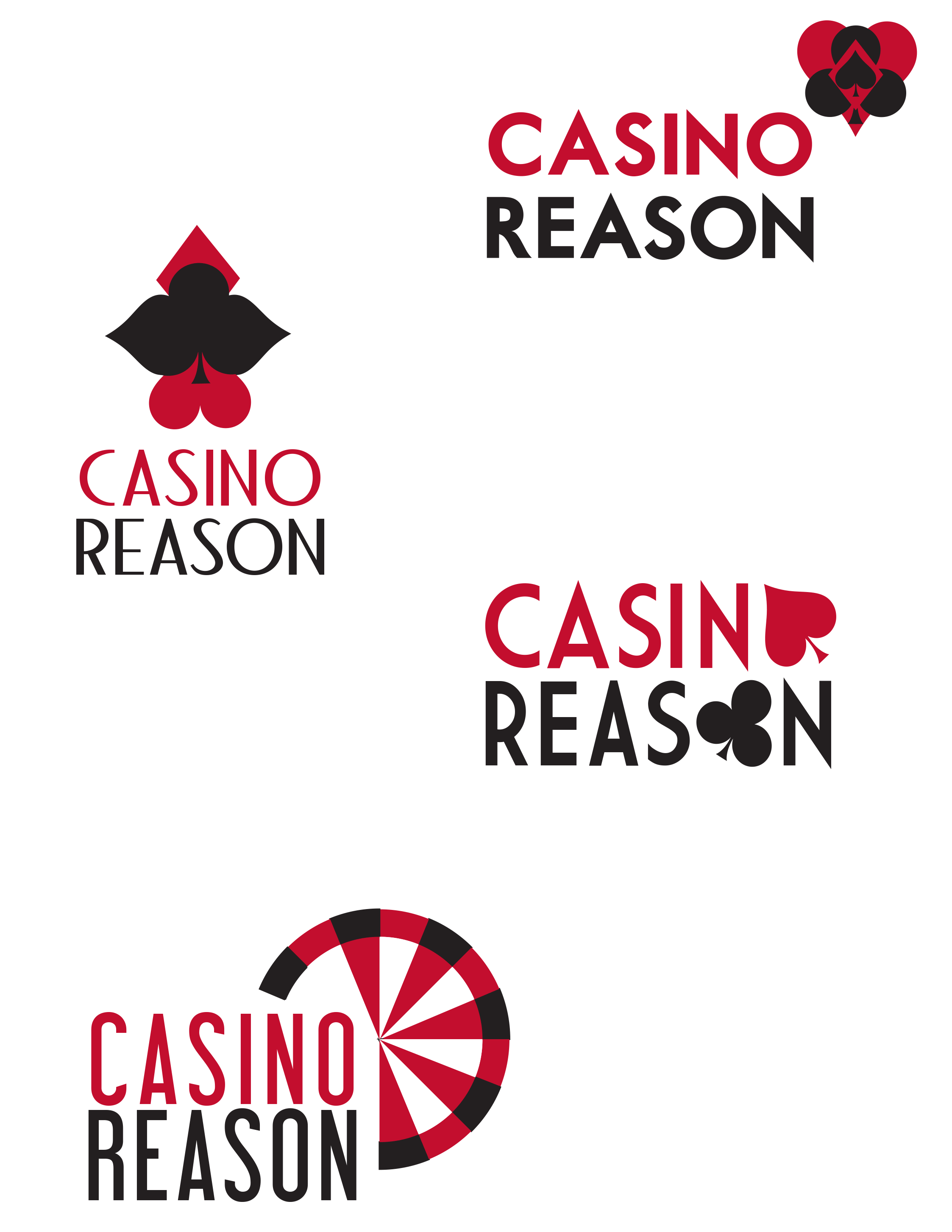
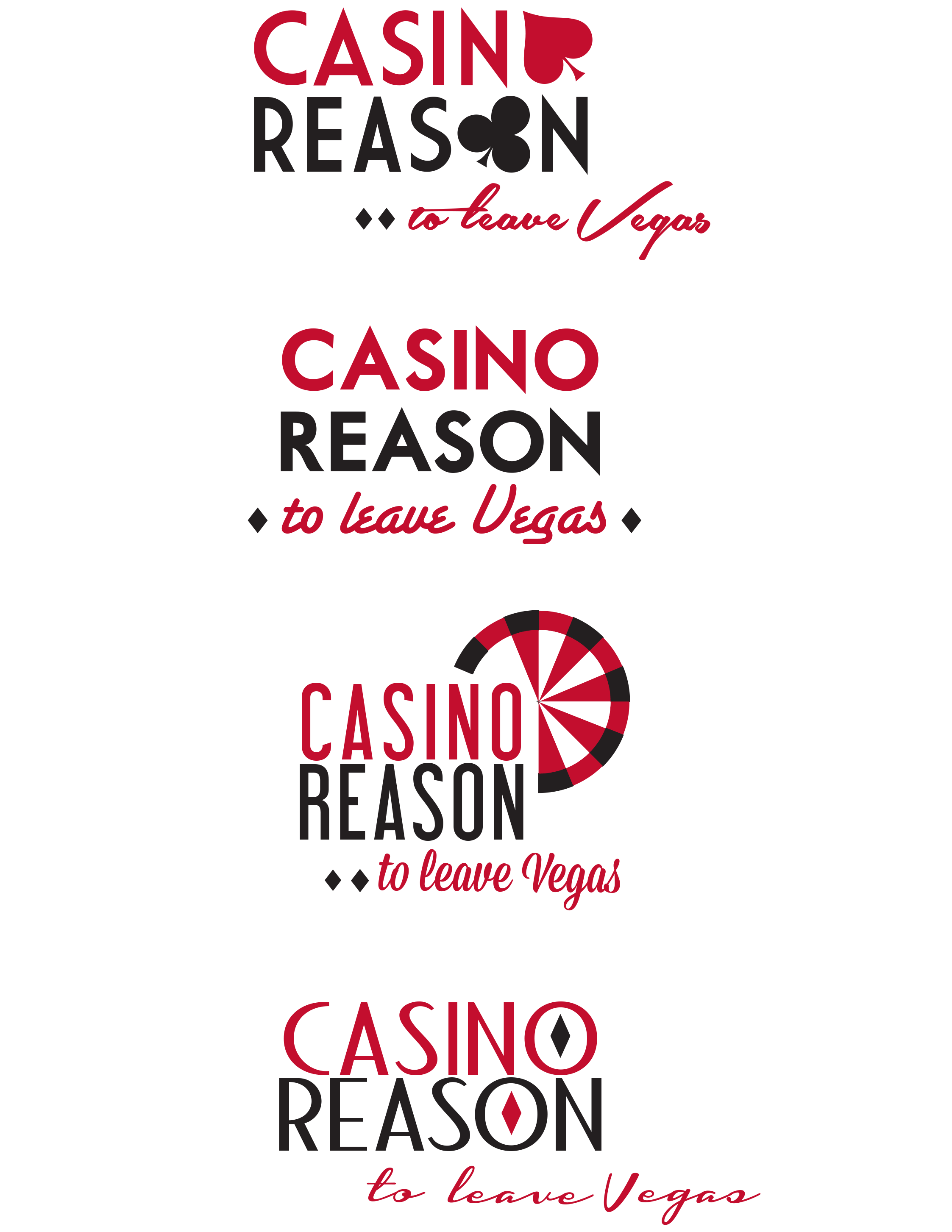
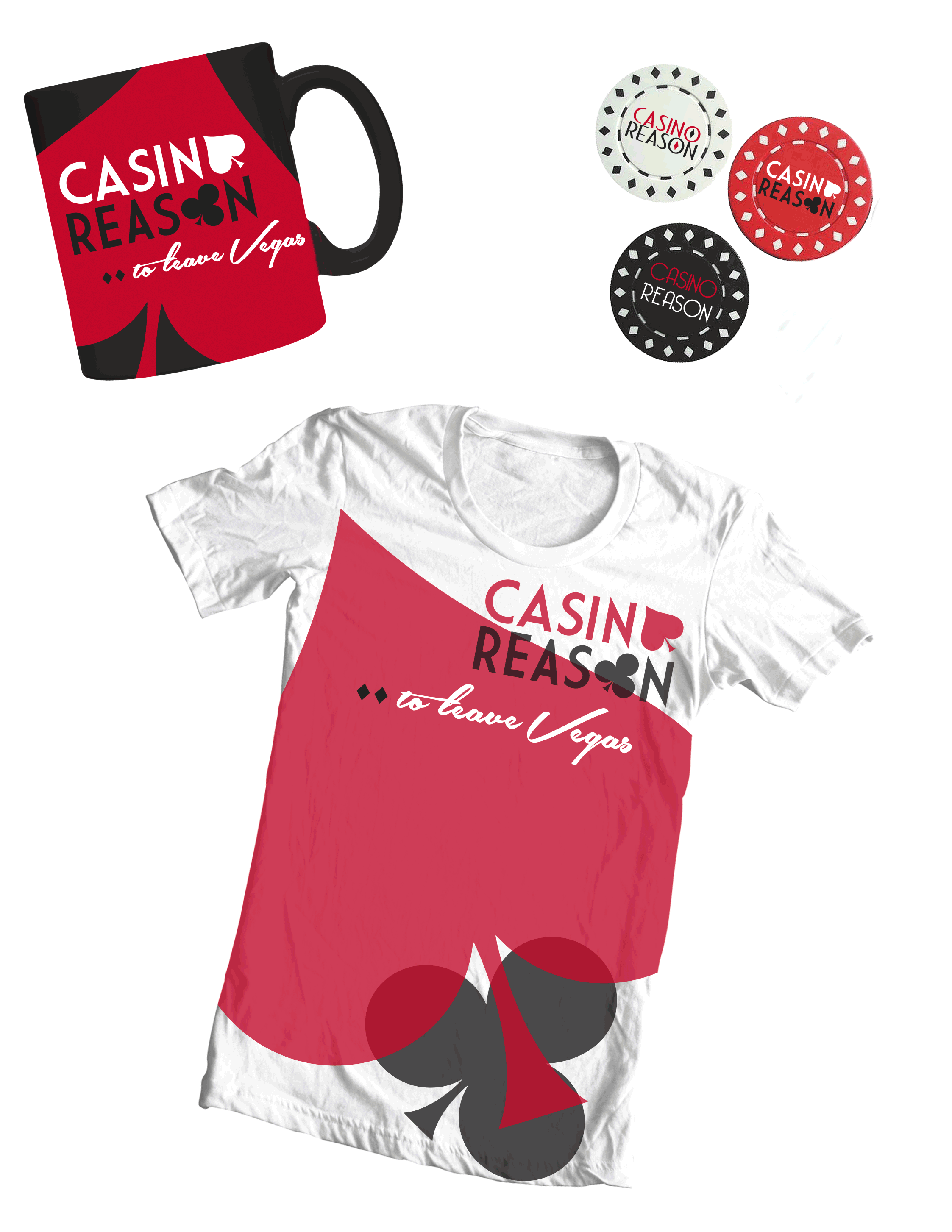
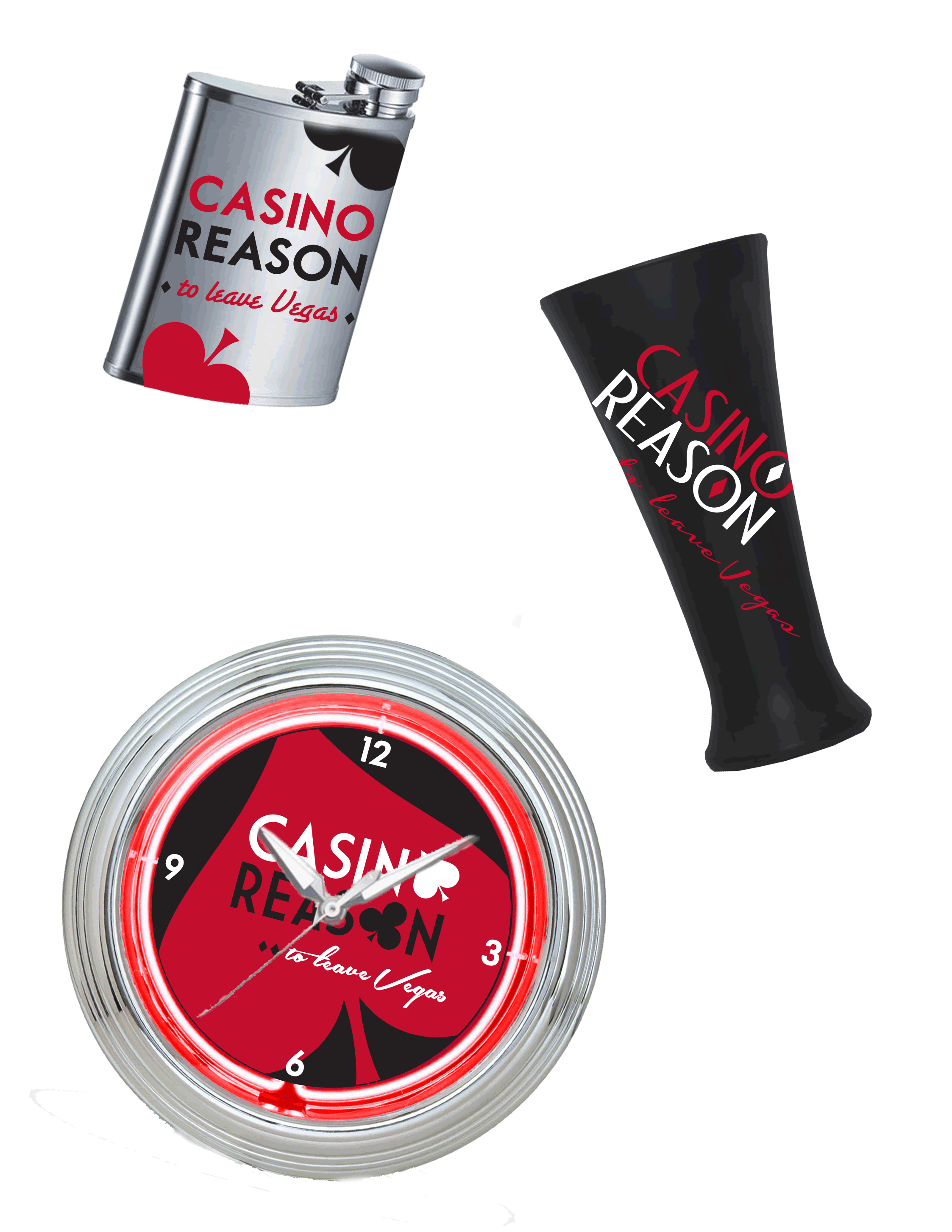
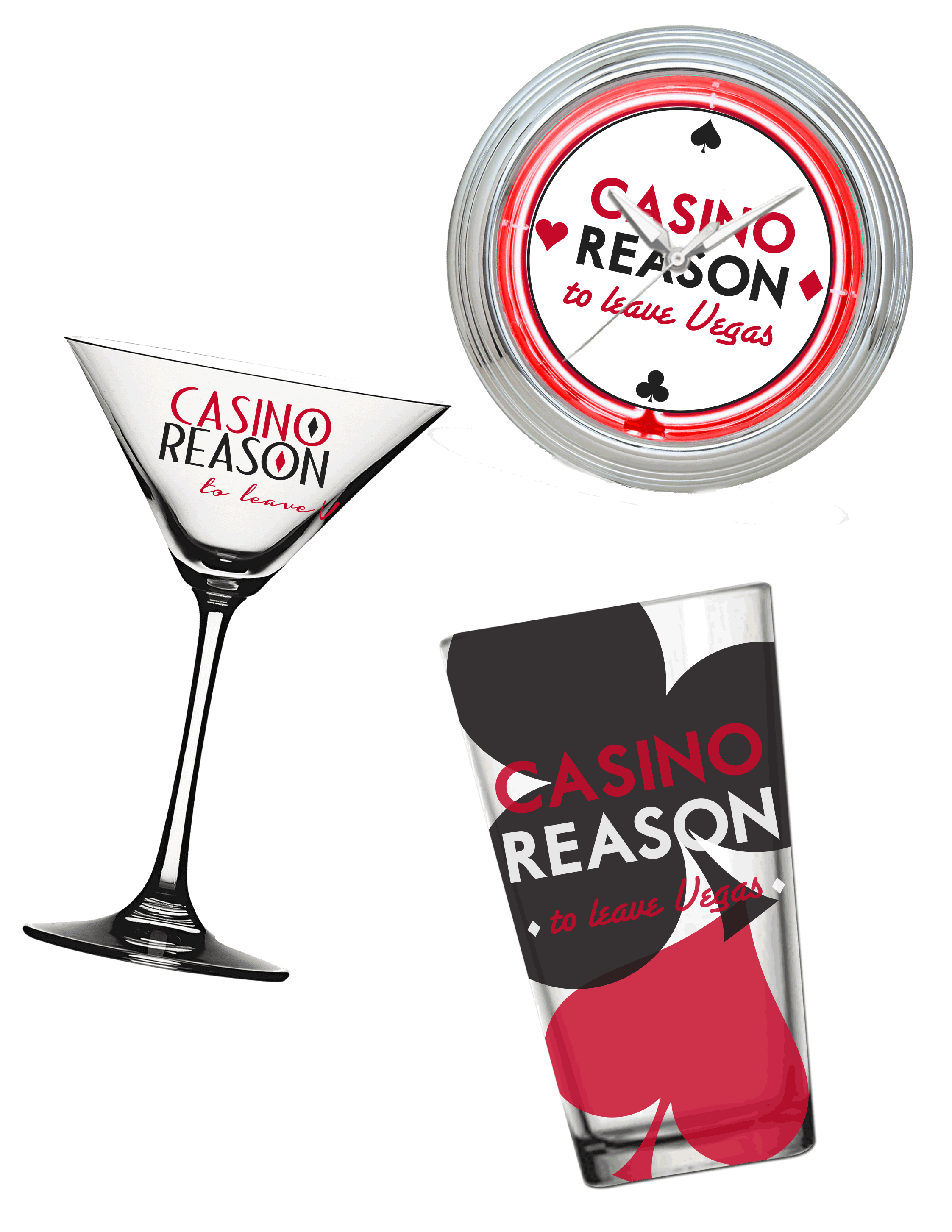
Casino Reason
Art Direction | Brand Devlopment | Graphic Design | Product Development | Style Guide
Casino Reason is a lifestyle gambling brand that uses word play as the basis for the line. Previous concepts by other designers looked like generic designs for online gaming. The client and I settled on moving towards a more deco/mid-century classic, based heavily on the suits. Here are some of the variations tested and applied to prospective product.
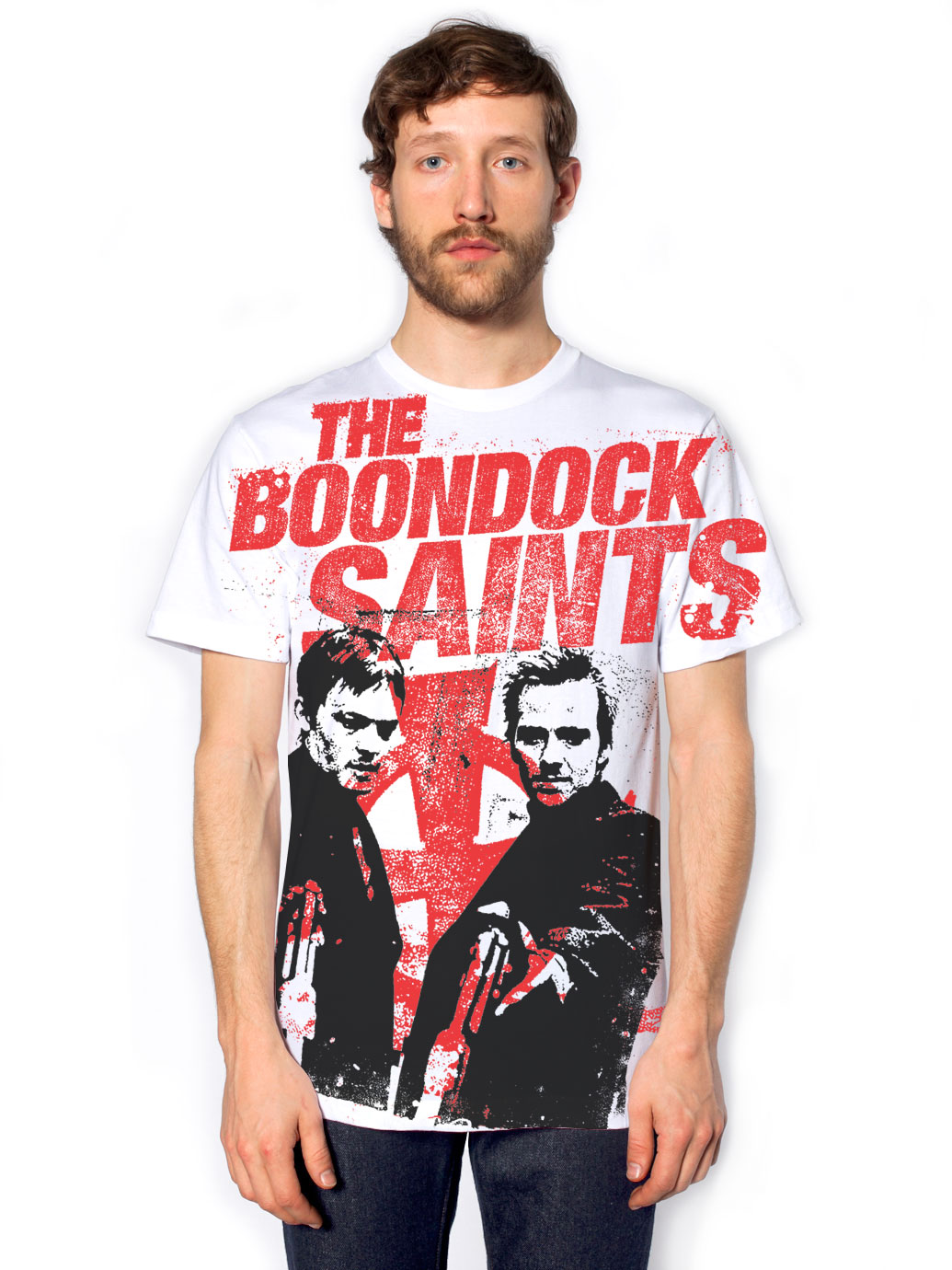
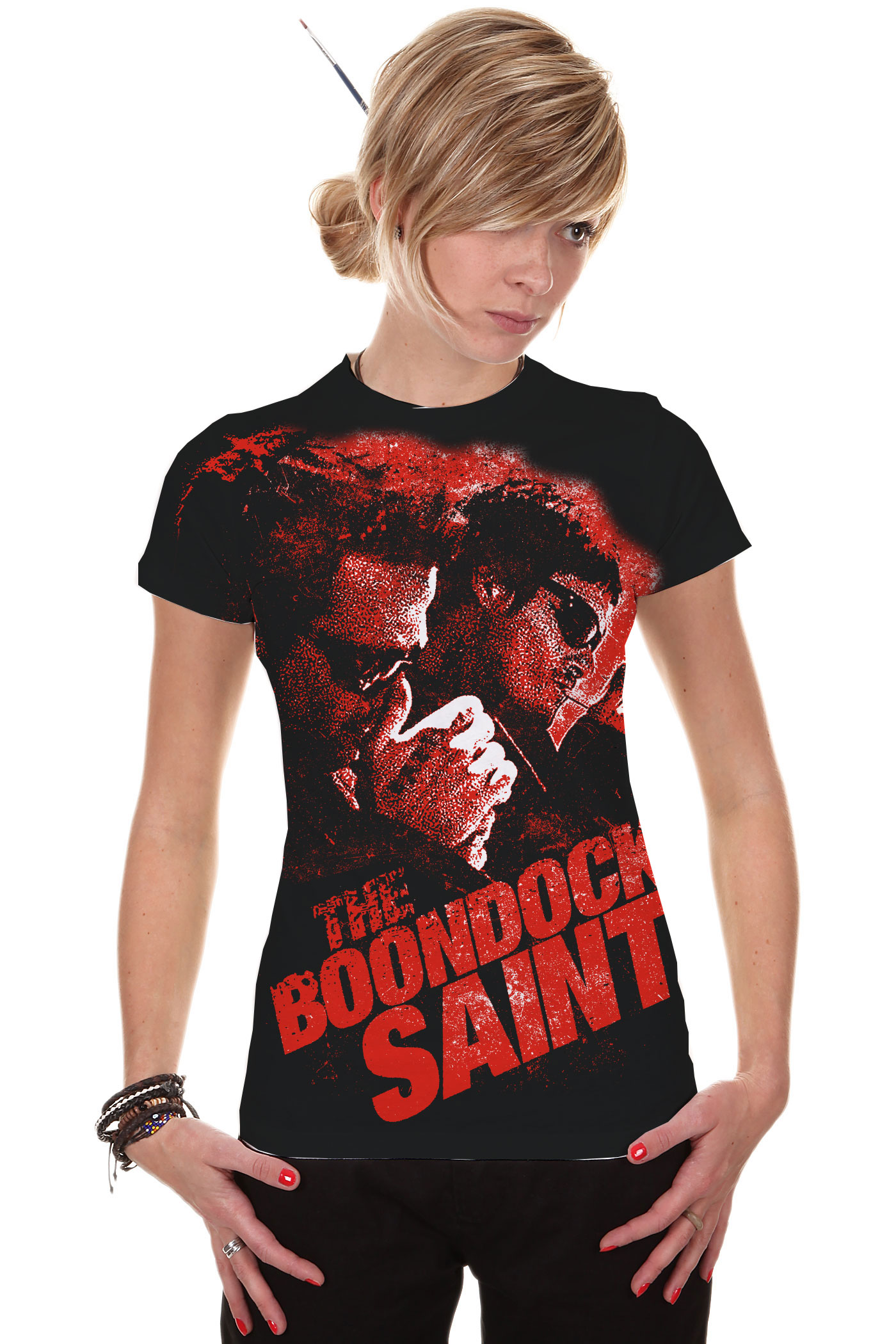
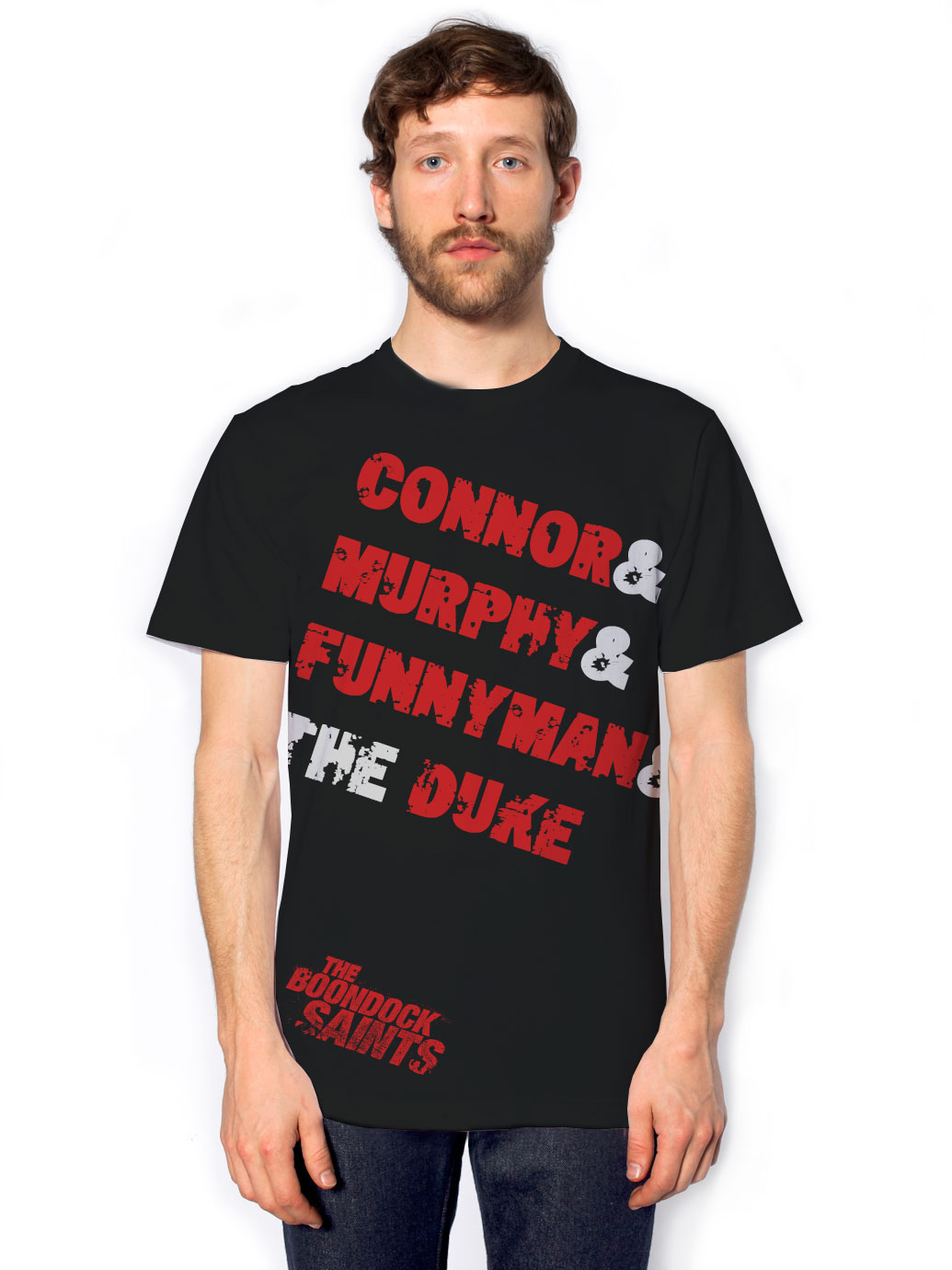
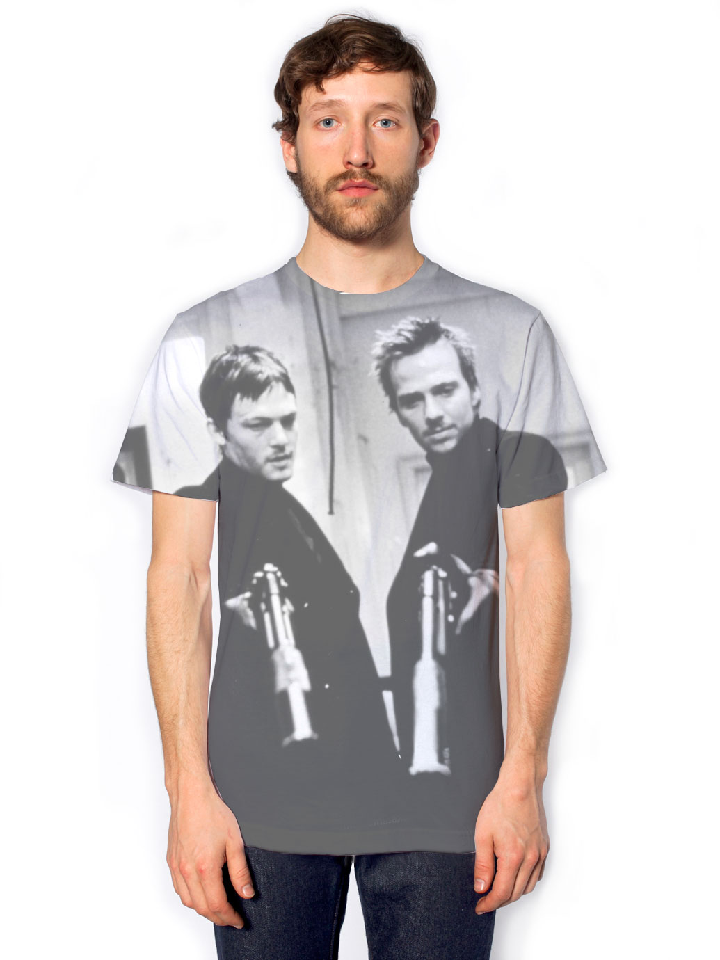
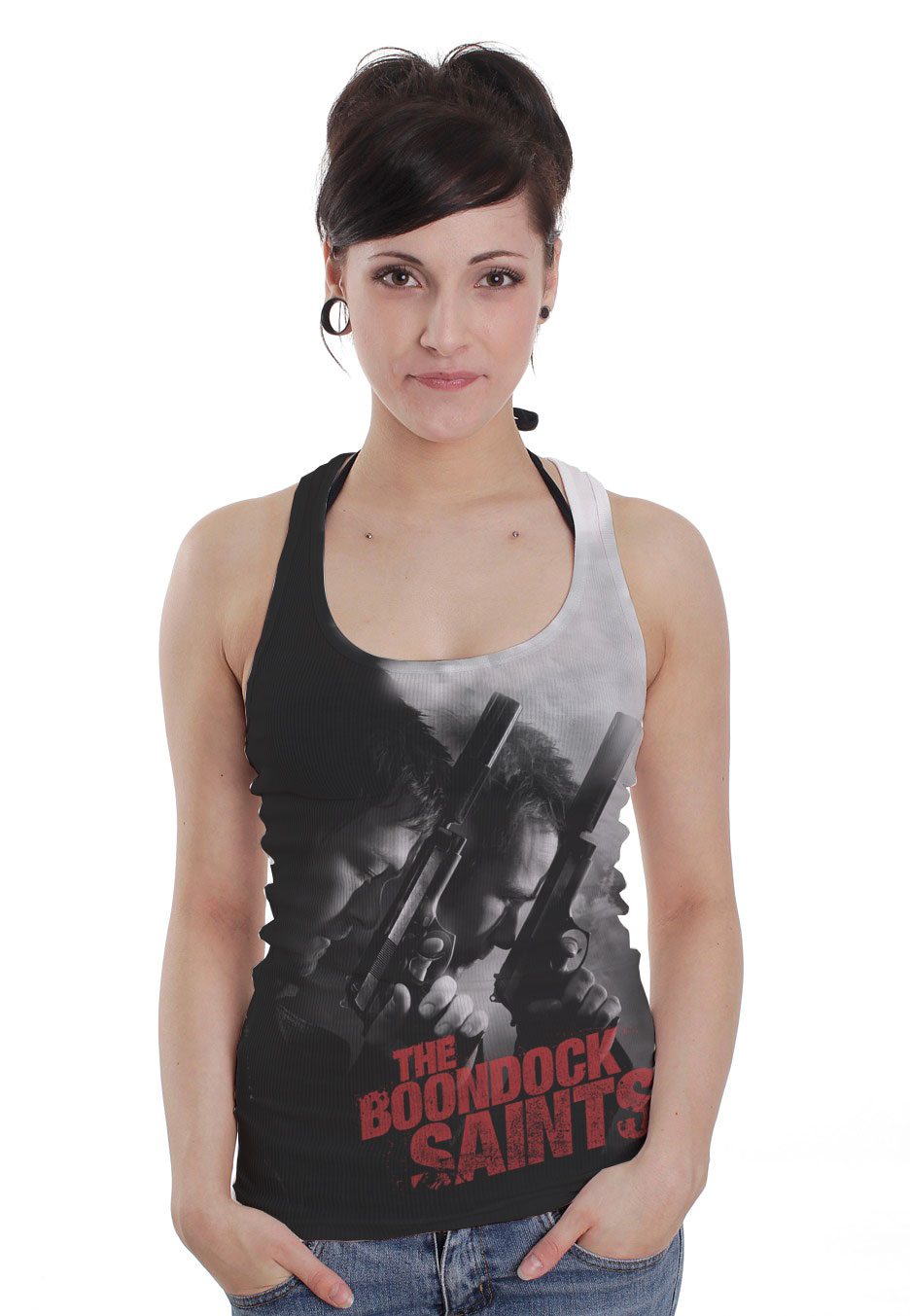
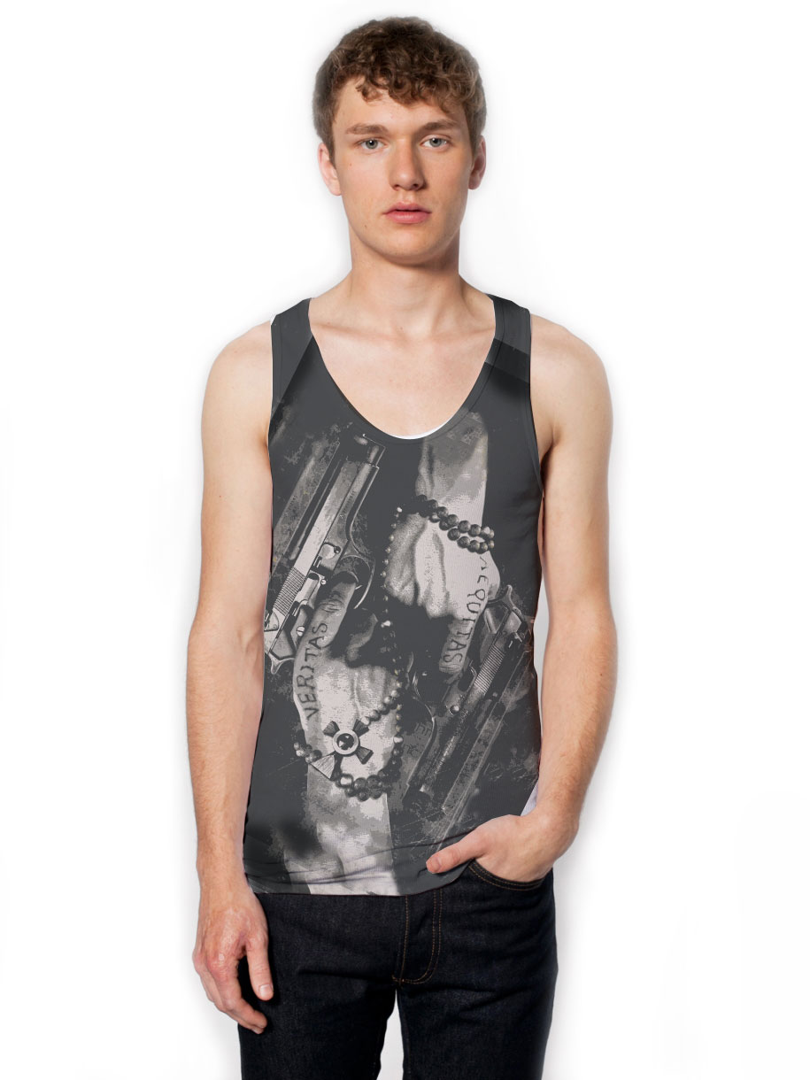
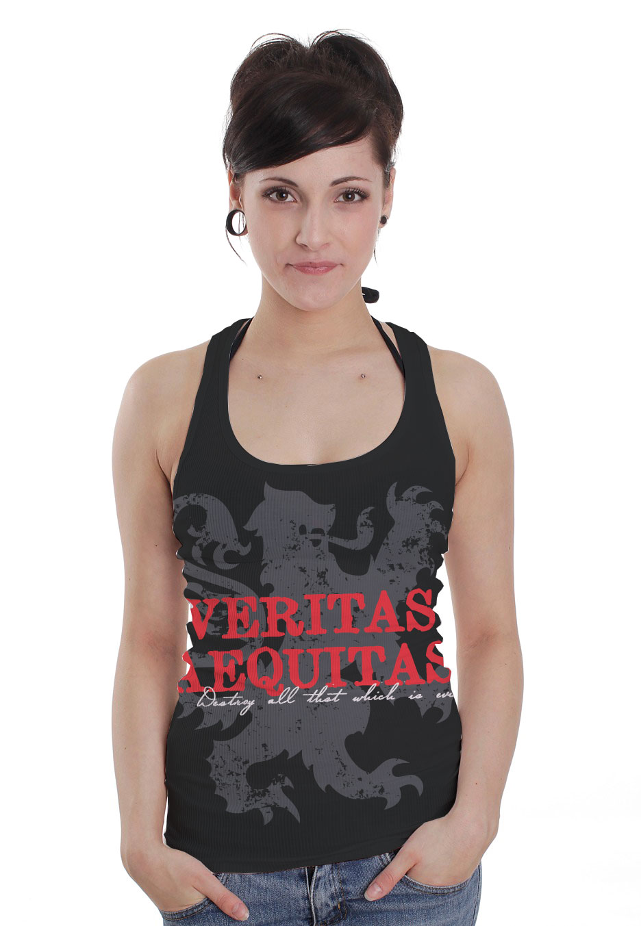
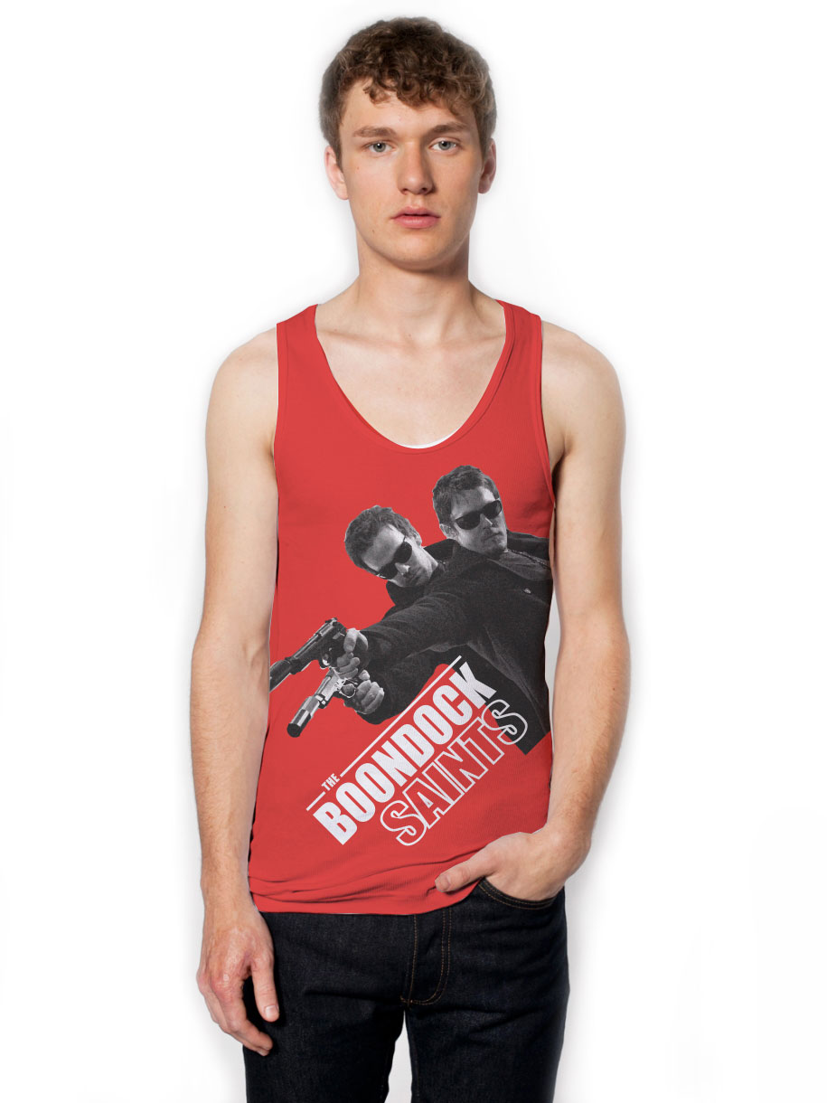
Boondock Saints
Graphic Design | Product Development | Sourcing
The tee shirt market is overly saturated and constantly shifting but the technology of sublimation printing has radically altered the possibilities. Until the development of this range most Boondocks shirts where basic colors and made via screen. This range takes full advantage of sublimation and pushes the limited art in new directions.
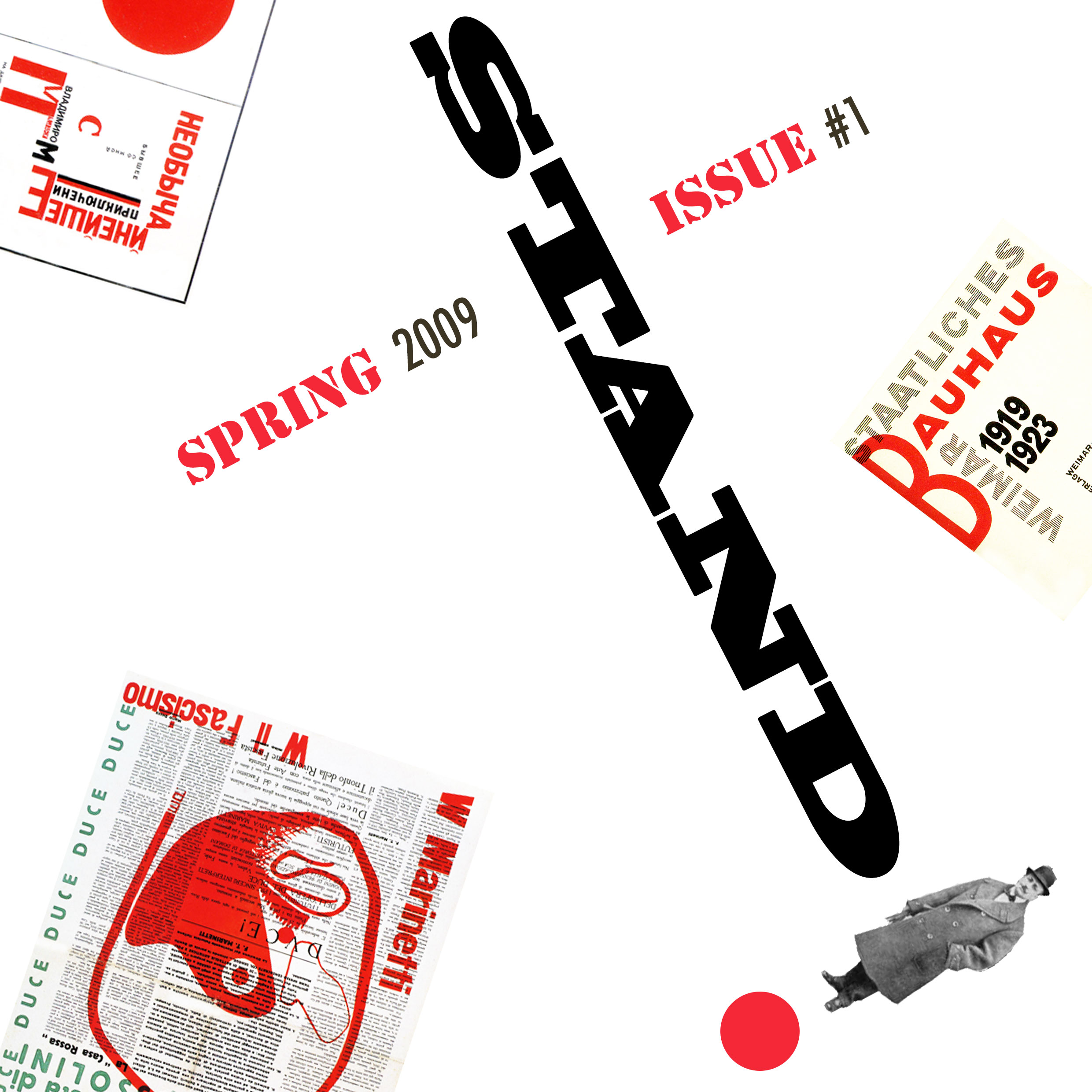
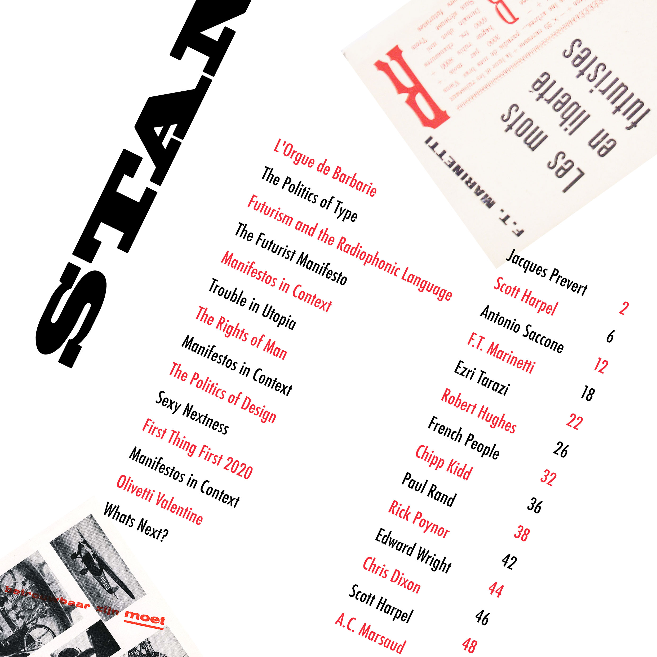
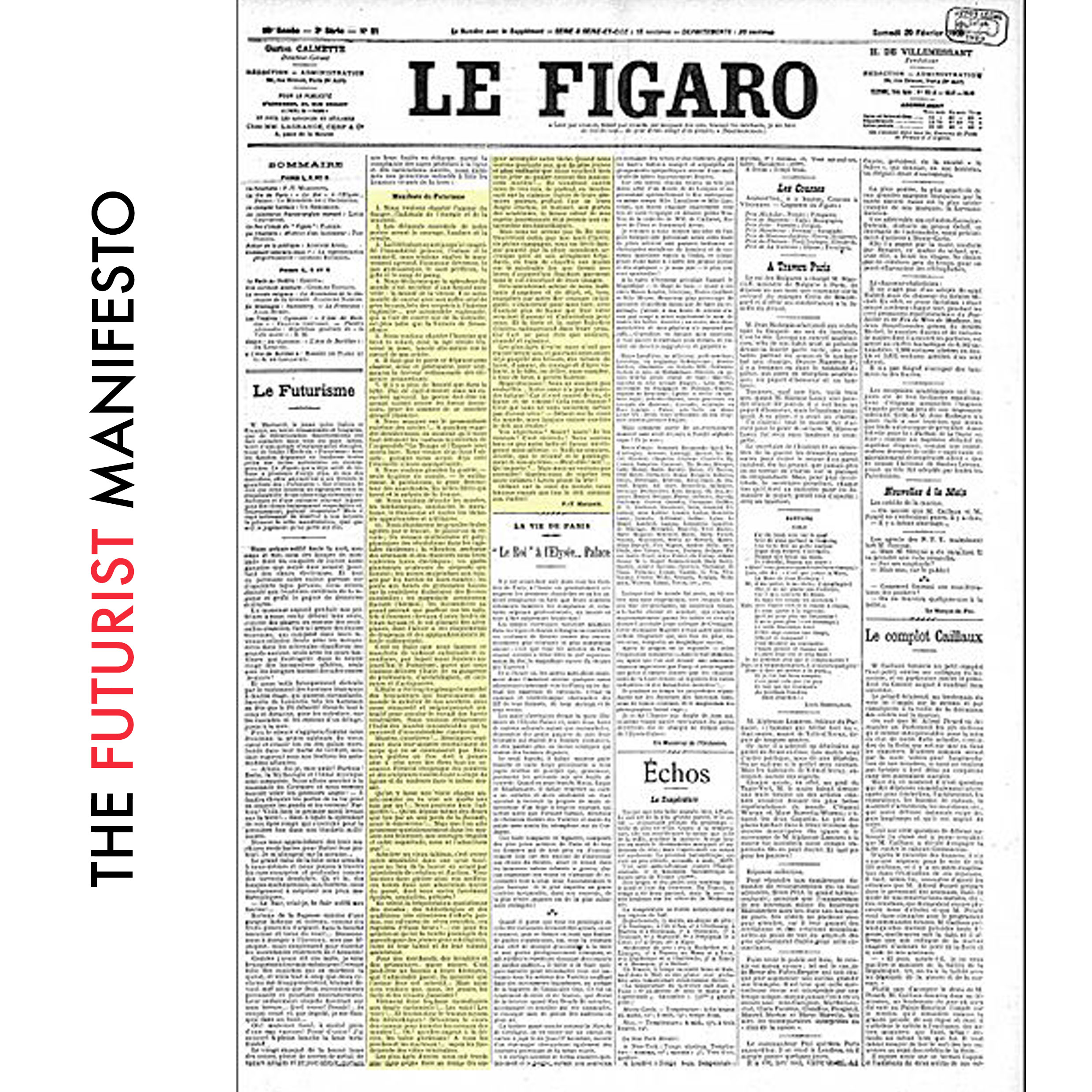
STAND
Art Direction | Brand Devlopment | Editorial | Graphic Design | Research
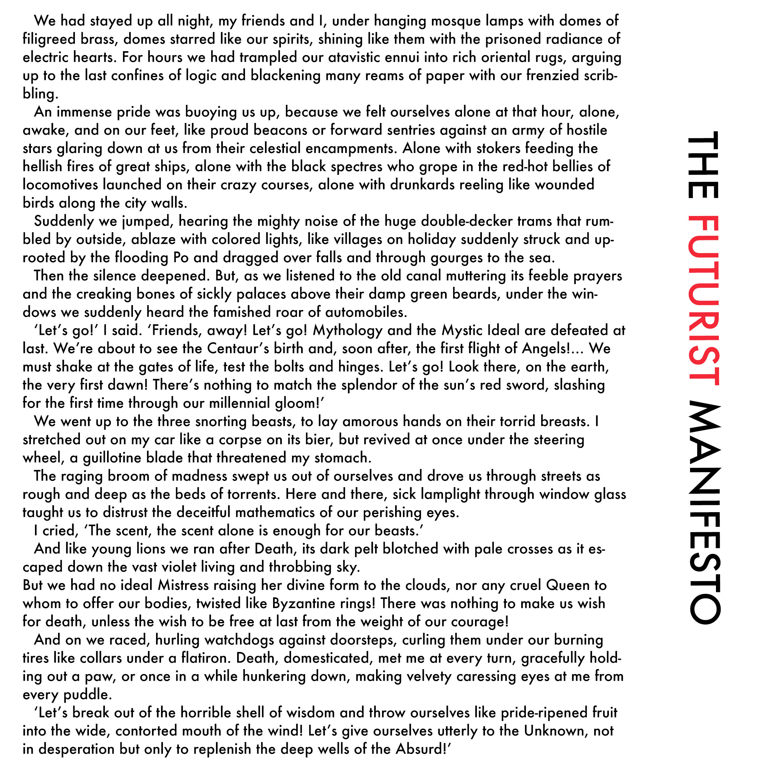
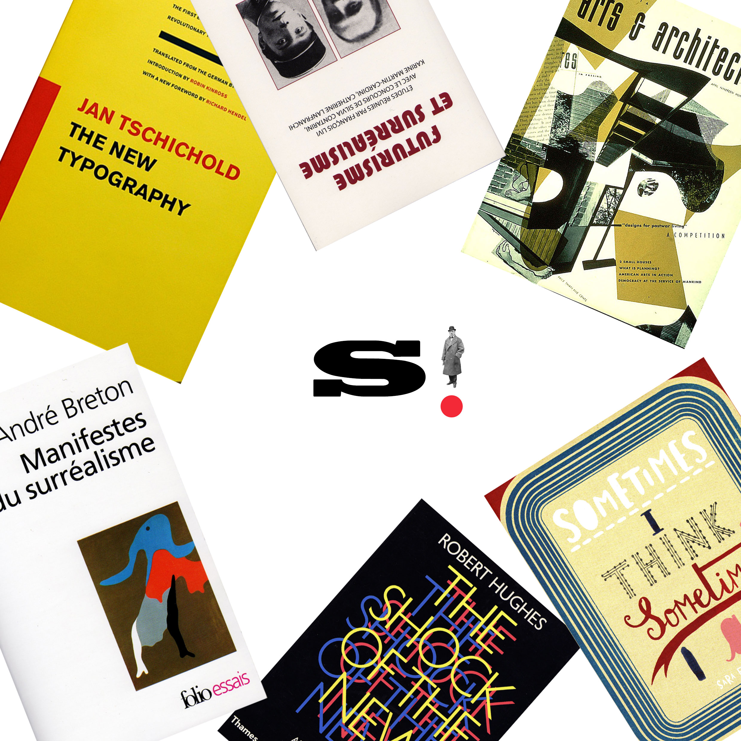
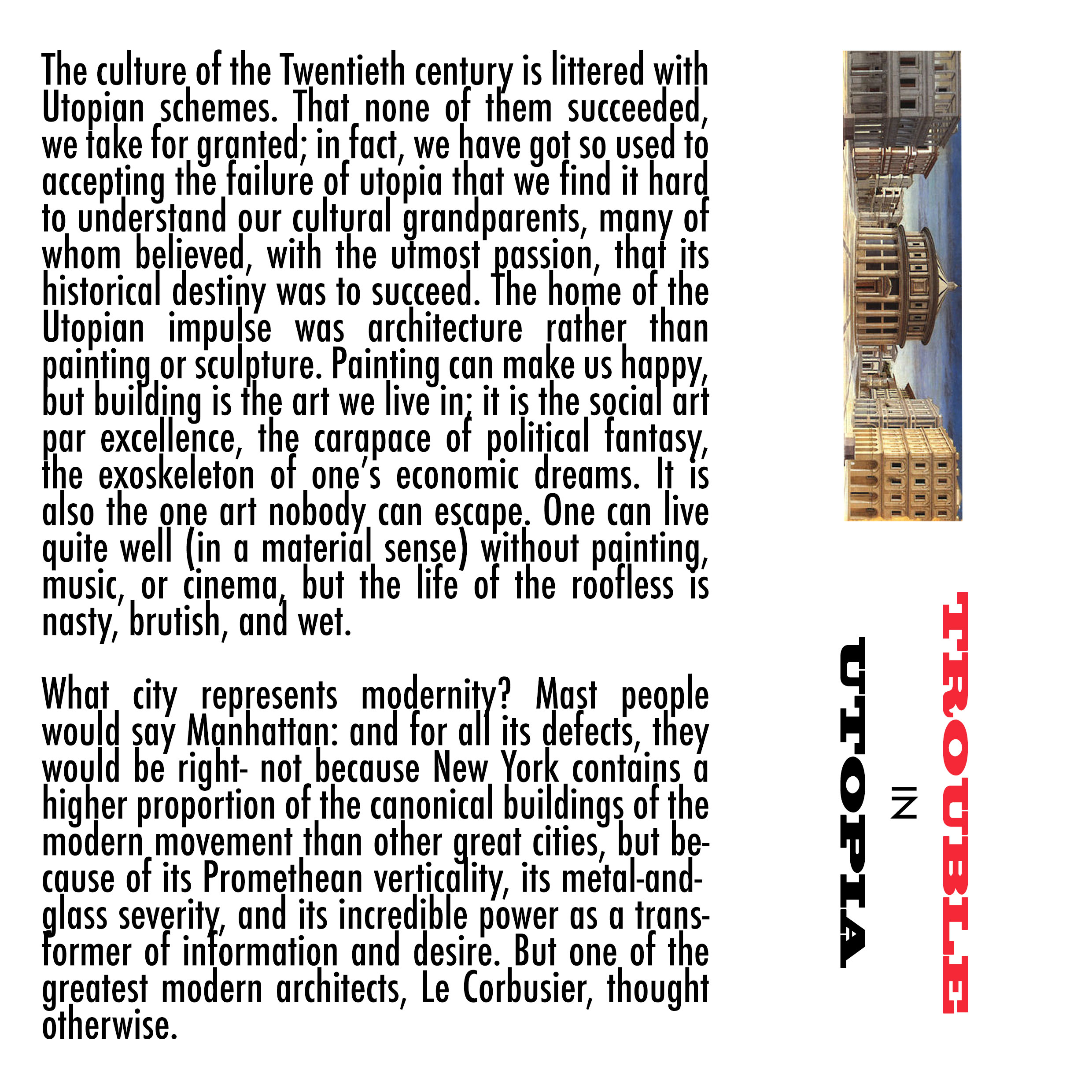
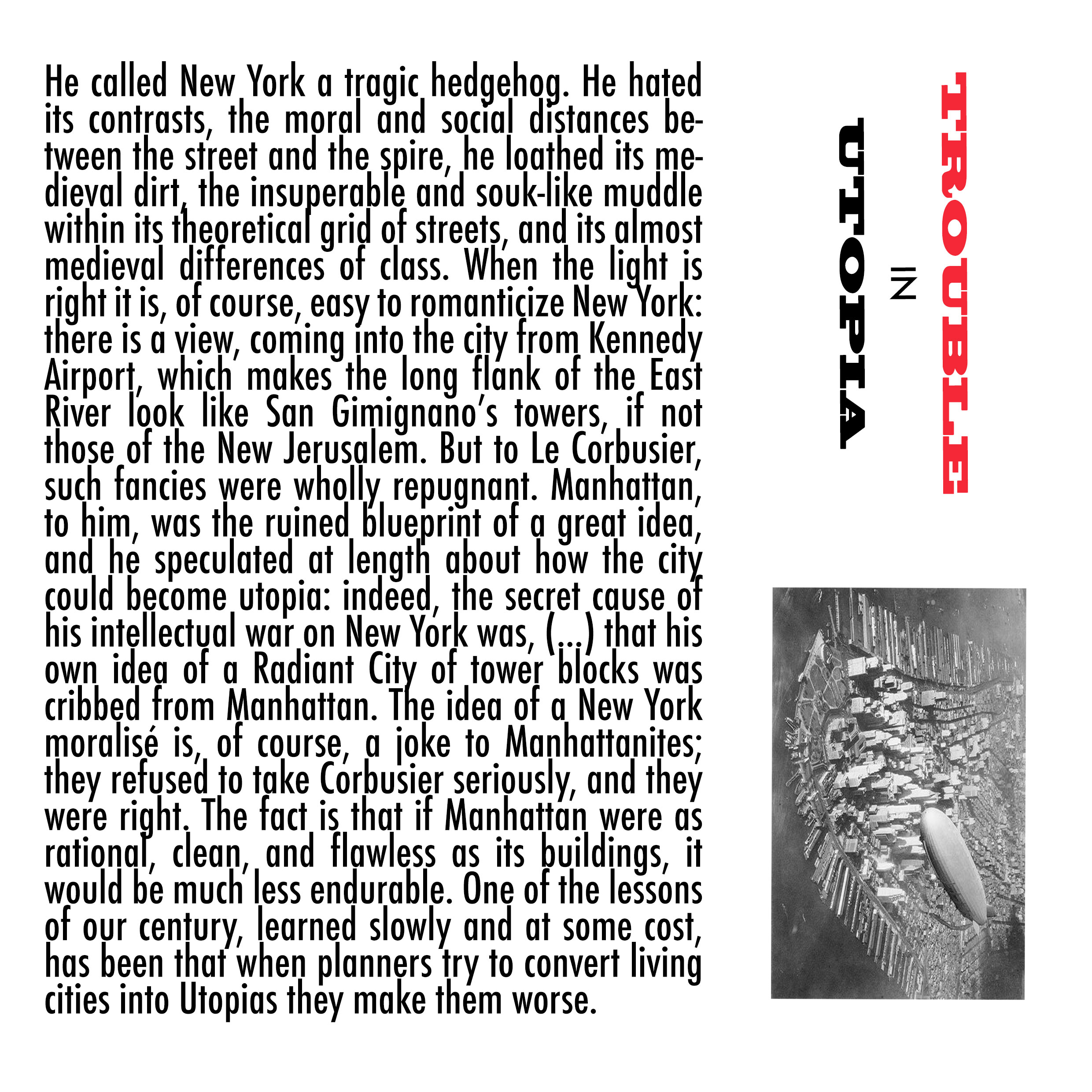
STAND is a design magazine that strives to straddle the middle ground between an in-depth picture academic journal and a glossy design magazine with no substance and many ads. Each issue is dedicated to a particular design movement and the design of the issue mirrors that movement. The launch issue’s focal point was Futurism whose impact is still felt on design today.